880
Game Cube rule
(telegra.ph)
I NEVER EVEN NOTICED THE C
Funny. I never noticed the real G. The C was always close enough for me.
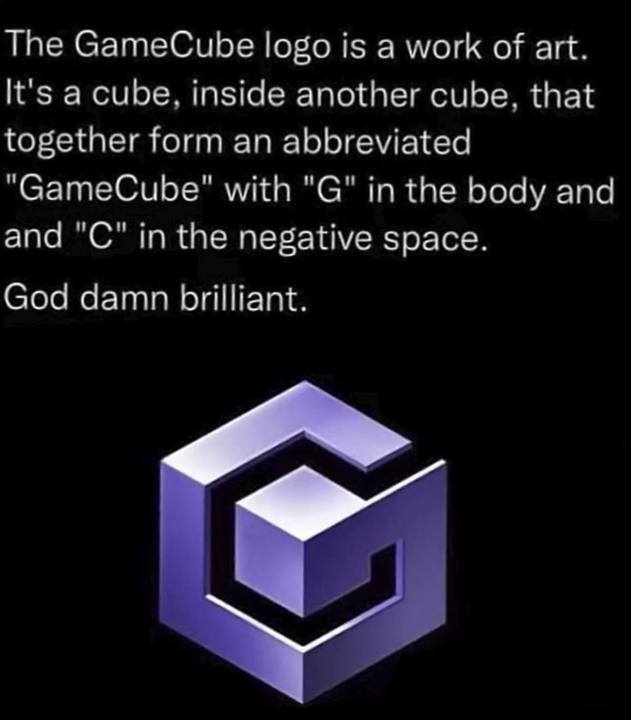
It really is a brilliant logo
I never noticed the real G
Motherfuckers act like they forgot about Dre
It’s because real Gs move in silence like lasagna
Mom's spaghetti
I never noticed C or G. Just saw a funny box
I can hear this logo
Plp. Do do do do - do do do do - do do do do - da da... PLOMP!
I've used this as a ring tone for at least 10 years.
I remember taking a design class in the 1990s right after GC came out, and the professor basically said "this will be used as a demo in intro design classes for the next century." I thought it was hyperbole, but people still talk about it.
But the GameCube was released 2001
I think the logo was teased at least a couple of years earlier, iirc.
Oh yes I am dumb, of course there was information about a console before release...
And don’t forget the ridiculously good sound design and animation to build it in. Happily burnt into the depths of my brain.
Dinka-dinka-dinhuh-dinkaah-dinka-dinka-dinkadinkadinkadadedink.
Womp.
Both this and the N64 logo were pretty great from a design aspect.
There's a building in Illinois that resembles the N64 logo.
Fun fact: the 3D model of the N64 logo has 64 faces and 64 vertices.
I always looked at it like it had 4 N's and 6 faces but your point is way more interesting.
I wanna walk up those “stairs”
You got 4m long legs?
And all the while the GameCube isn't actually a cube.
GameCuboid or GameRectangularPrism weren't as catchy.
it’s not even topologically a cube because of the ventilation holes! it’s first homology group has at least 64 copies of ℤ, it’s supposed to have none!
This thing goes all the way to the top!
Plus it makes Frank Zappa sounds
Lol, half the comments on your link talk about how Vai sounds Zappa-esque.
Vai worked for Zappa, didn't he?
I remember reading that he was hired to transcribe Zappa's live solos
Here is an alternative Piped link(s):
I thought it was Steve Vai sounds.
Piped is a privacy-respecting open-source alternative frontend to YouTube.
I'm open-source; check me out at GitHub.
Also, if you played the GameCube at all, you hear that cube walking across the screen every... single... TIME!
one does not simply turn on a gamecube without holding Z
Never had a GameCube… what’s holding Z do?
Changes the start up sounds sequence, if i recall correctly you could also hold L or R for other sounds as well,
It's clever but it's a pretty ugly logo.
And I say that as a person who LOVES the GameCube. Double Dash? Smash bros? The sweet handle to carry the cube around? Amazing system.
I think it really fit its aesthetic.
For the early 2000's this is pretty tight.
What's ugly about it? Wouldn't it be better to say, "I think it's ugly" or something?
We clearly have a different definition of “brilliant”. LMFAO
Don't worry, with a lot of hard work you'll be able to catch up. Good luck.
With comments like that, this guy probably works for Nasa.
Be sure to follow the rule before you head out.
Rule: You must post before you leave.