this post was submitted on 09 Nov 2023
883 points (100.0% liked)
196
16437 readers
1570 users here now
Be sure to follow the rule before you head out.
Rule: You must post before you leave.
founded 1 year ago
MODERATORS
you are viewing a single comment's thread
view the rest of the comments
view the rest of the comments

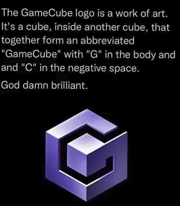
It's clever but it's a pretty ugly logo.
And I say that as a person who LOVES the GameCube. Double Dash? Smash bros? The sweet handle to carry the cube around? Amazing system.
I think it really fit its aesthetic.
For the early 2000's this is pretty tight.
What's ugly about it? Wouldn't it be better to say, "I think it's ugly" or something?