566
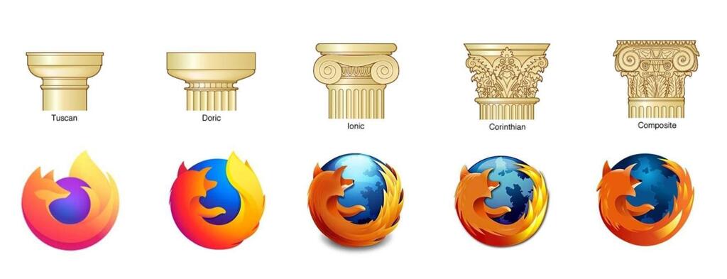
ancient Greek Firefox rule
(lemmy.dbzer0.com)
Be sure to follow the rule before you head out.
Rule: You must post before you leave.
Am I the only one who likes the new Logo? I mean its simplified but you can still clearly recognize the Red Panda. Plus I like purple
You're not the only one, people especially in niche spheres like Linux are very nostalgic of a certain era in computing and refuse to accept that change happens. For example there are people who absolutely hate apps with the slightest bit of white space even though that was proven time and time again to be more accessible and readable
Change can happen, that's fine
We can also dislike modern logo design trends, those are 2 completely different topics at hand
But it is supposed to be a fox!
Actually no
My life is a lie
nope
Edit: Dug a bit deeper and found the answer on Firefox's website
Wow I didn't know that, the logo definitely looks more like a fox though...
yeah i kinda feel like they're just making it up? like it's clearly a red fox, red pandas don't have a long snout like that and are overall rounder.
? In the very question you linked they state without a doubt that it's depicting a fox tho
"hi, the logo is clearly depicting a fox - however the red panda (common name: firefox) is also a cute mascot for our browser"
That means they have some red panda mascots (it seems like they use to actually have some live cams that you could watch them on too!) But the logo itself does infact depict a fox
So it's a fox but their mascot is a red panda.
Actually it’s supposed to be a fox
I think the one before the current one is my favorite. I feel like the current one is a bit blocky while the previous has a little more detail but still looks good when shrunk down. I don't hate the current one, though.
I like it too, it is just easier on the eyes. There certainly is a trend of minimalism that makes every company try to simplify their logos, but for firefox I feel it does fit nicely
I also like the smooth gradients. I'm a gradient appreciator.
Yeah, I like the oldest
No you're not alone, I honestly disliked the old one and always have but I really like the new one.
It's quite nice