this post was submitted on 22 Oct 2024
101 points (92.4% liked)
196
16444 readers
1643 users here now
Be sure to follow the rule before you head out.
Rule: You must post before you leave.
founded 1 year ago
MODERATORS
you are viewing a single comment's thread
view the rest of the comments
view the rest of the comments

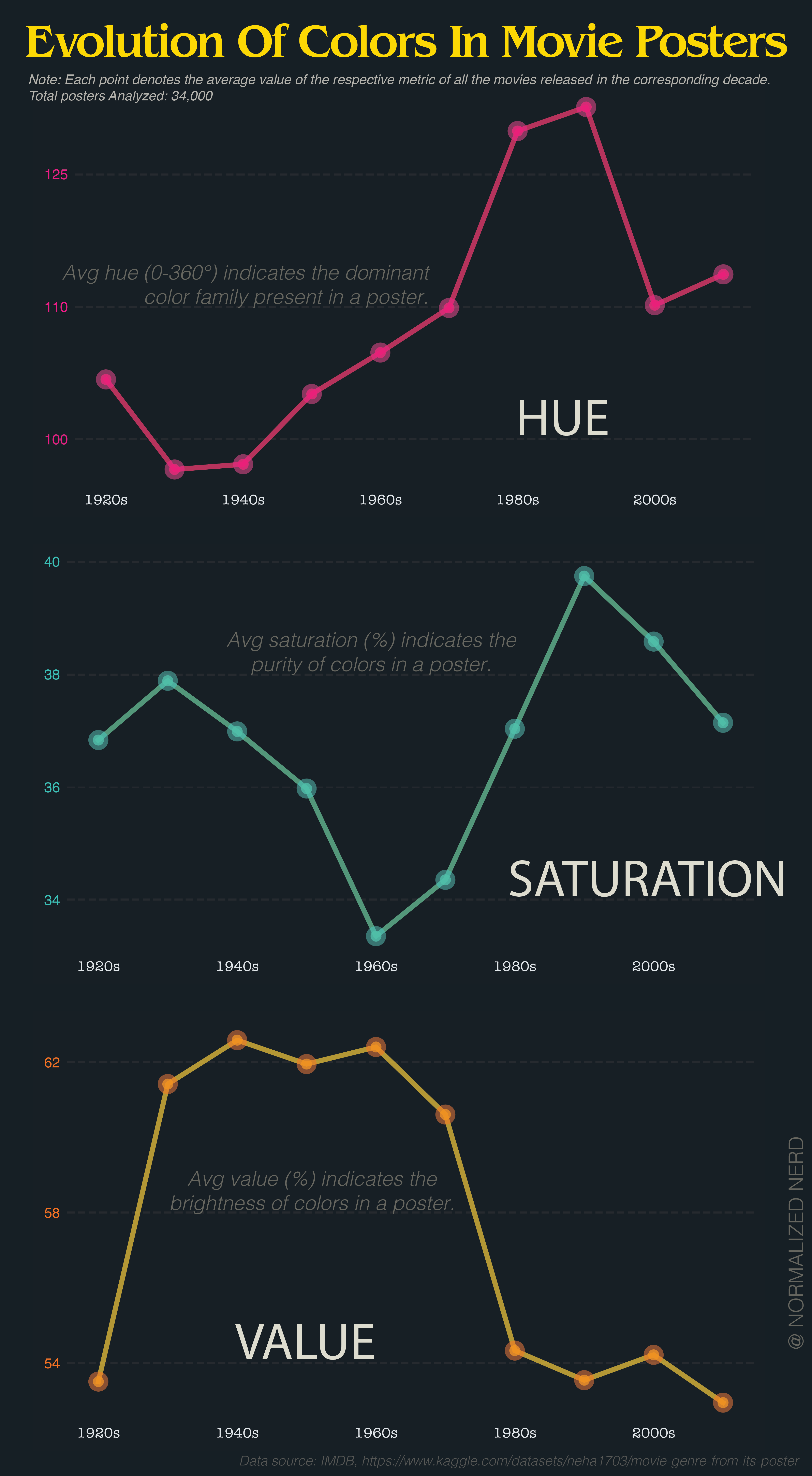
The problem is that averaging hue makes no sense at all because hue is not a longest scale.
If you take a red poster (0) and a blue poster (240), it averages to green. Or take red (0) and red (359), averaging to cyan (180).
The average of 0° and 359° is obviously 359.5°.
it's a radial scale.
By that logic, the average of red and cyan is both purple and lime. Still useless.
Not if there is a clear trend. If most movie posters are blue, three average will be blue.
But i agree, it is useless if there is no clear trend.
I wouldn't trust someone who tried to visualize hue like this to make that calculation correctly.
You know what, I completely agree.
It would have made more sense if they had shown the distribution of hue as a polar graph and just had one every decade to show how it changes over time.