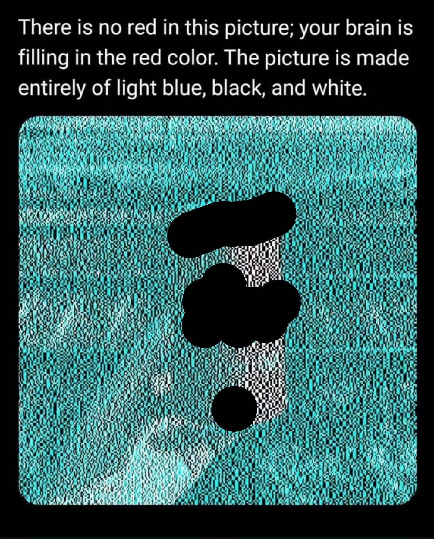
Red is complimentary to cyan.
If the cyan were switched with yellow, the can would appear blue.
Also, it's not our brains creating the red, it's our eyes. They get exhausted of seeing the cyan and replace it with red.
A place for majestic STEMLORD peacocking, as well as memes about the realities of working in a lab.

Rules
This is a science community. We use the Dawkins definition of meme.
Red is complimentary to cyan.
If the cyan were switched with yellow, the can would appear blue.
Also, it's not our brains creating the red, it's our eyes. They get exhausted of seeing the cyan and replace it with red.
It's not marketing, just colour theory. The same idea has been used by painters for ages.
It is when you use cova cola instead of, lolipop, santa, flag, flower or some other red object.
That's so weird. You can stare at a pixel and go "yep that's red". Zoom in, still red. Zoom more, BOOM IT'S BLACK!
Oh weird, I assume this is just because the white is relatively red compared to the cyan, right? As in if you took any image and coloured it in the same way then it would also look red.
Yeah, there seems to be a lot more going on here than just marketing. If you mask the logo, the red still works. I believe it has to do with the combinations of white/black, white/cyan, black/cyan and the relative size of the blocks to produce a red hue through complimentary color persistence or whatever it's called.
Nonsense. My phone screen uses red, green, and blue to make up each pixel. The white pixels have their red component all the way at full brightness. Therefore there is a lot of red in the picture.
You could also see this by opening up the image and looking at the red channel which would not be completely black.
I think there's something more going on here than just "marketing". Because if you look at the tiny thumbnail in the OP it's very clearly red, and you can even load that thumbnail into an image editor and zoom in to see slightly reddish pixels.
So something happens when scaling this image that actually results in a red hue, and I don't think my computers image scaling algorithms are also falling for "marketing". I would guess it's actually some kind of sub-pixel trick that makes it seem like there's colors there which aren't, and that's why the image scaling algorithms also reveal the same colors you see.
Jokes on you, I'm moderately red green colorblind so I wouldn't realize it if there was red present

That's wild as fuck. If I actually concentrate on the "red" it becomes white and then only becomes red again if I look away for a moment.
Still red with no logo.

White light has red in it. Cyan does not. We fatigue blue and green cones everywhere but the white can, and we only stimulate the red cones on the white can. The result is it looks red.
I need to grab a color dropper but I am sensing a little warmth from the White even when I zoom in
This is a screenshot of it zoomed in...

You tell me if the white looks warm
https://www.color-hex.com/color/fffcf9
Looks warmer than #ffffffff that’s for sure
There’s no disputing our minds are filling in red because we see a Coca-Cola can. But it does appear to me that there is a very very light thumb on the scale to make it easier
our minds are filling in red because we see a Coca-Cola can
Our minds are filling in red because of the cyan
Is this because our brains have been programmed to see Coca Cola can as red? Or does it have something to do with the way the black and white boxes are organized? (I.e. if it were a sprite can, it would still be red)
I think it's a bit of both. The light blue color used is so called "complement color", meaning it's exactly the opposite on the color wheel to the Coca Cola red. Black and white pattern suggests to our brain to play with contrast. And of course we all know Coca Cola from all the marketing.
Btw, After staring at it for a while I can kinda switch between red and white at will. Anyone else?
Someone did a color swap and the can looks blue when the cyan pixels are instead yellow
It's effectively your brain doing automatic white balance, it sees everything being tinted cyan so it just sorta subtracts cyan from the area, which results in white being reddish
you can do this physically (by tiring out the colour-sensing cells in your eyes) if you stare at a colour for about 30 seconds then quickly look at a white surface, you should see the inverse of the first colour.
The cyan is the one playing the trick. I can see the black and white nature without zooming when focusing on the logo or something. Sometimes it randomly changes from b/w to red
It’s actually all just white light at different wavelengths, which tricks your brain into seeing different “colours”.
White light is the combination of all those wavelengths. It is only the combination that makes it "white" in exactly the same way that a smaller range of wavelengths are "red" or "blue".
I only see the red when its small, in the thumbnail its red, but when I open the image its very black and white.
The white has more red in it than green and blue, so that's probably the cause of the illusion.
I'm colorblind this trick doesn't work with me

When its small thumbnail I can see it but when I look at the full size image I appear to be able to turn the effect off at will.
If I zoom in just a bit it's white, turns instantly red at some point of zooming out.
If you zoom in to see that it's black and white, and then zoom back out again, it stays black and white. But if you look away for a bit to forget, maybe change the angle you're looking at it, it turns red again.
Here is an 8 minute video that goes into more depth on how this works. https://www.youtube.com/watch?v=0FjjJha7HMI
This is one of those actually cool optical illusions