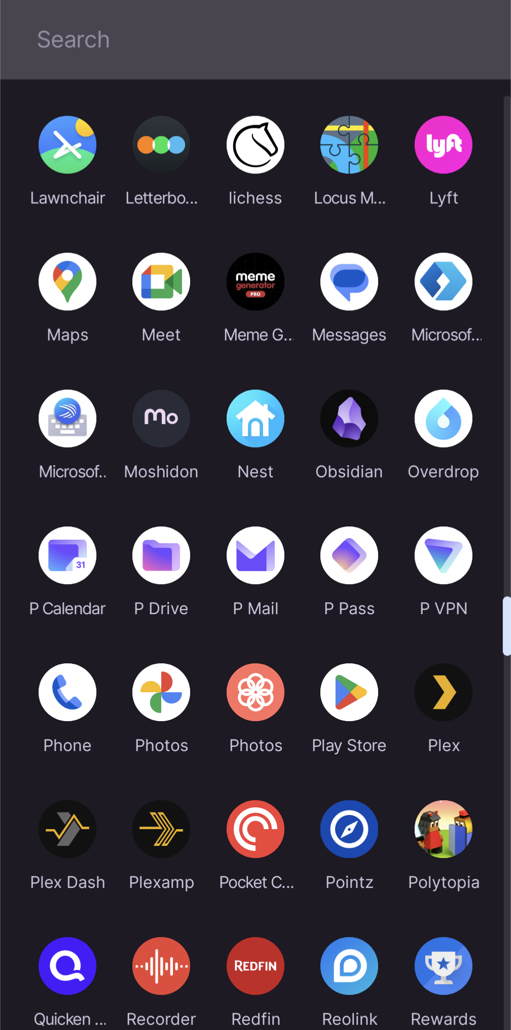
The icons can be hard to distinguish, on the fly.
Proton
Empowering you to choose a better internet where privacy is the default. Protect yourself online with Proton Mail, Proton VPN, Proton Calendar, Proton Drive. Proton Pass and SimpleLogin.
Proton Mail is the world's largest secure email provider. Swiss, end-to-end encrypted, private, and free.
Proton VPN is the world’s only open-source, publicly audited, unlimited and free VPN. Swiss-based, no-ads, and no-logs.
Proton Calendar is the world's first end-to-end encrypted calendar that allows you to keep your life private.
Proton Drive is a free end-to-end encrypted cloud storage that allows you to securely backup and share your files. It's open source, publicly audited, and Swiss-based.
Proton Pass Proton Pass is a free and open-source password manager which brings a higher level of security with rigorous end-to-end encryption of all data (including usernames, URLs, notes, and more) and email alias support.
SimpleLogin lets you send and receive emails anonymously via easily-generated unique email aliases.
What would you like to use today? The proton square? The proton rhombus? Or the proton triangle?
Yet another reminder of why I love the Niagra launcher so much.
This app may share these data types with third parties
Location, App info and performance, and Device or other IDs
This app may collect these data types
App activity, App info and performance, and Device or other IDs
Why?
Im trying to figure out why the icons all need a white circle behind them.
All of my icons are circles. Are yours not?

I was just commenting about how it’s half-assed design to just slap an existing icon against a white background and call it a day. Compare to the lawnchair icon, locus, or even the Lyft icon in your screenshot. You find the names annoying, I find the design laziness annoying. Companies do it on iOS as well (including Apple).
