Lemmy Shitpost
Welcome to Lemmy Shitpost. Here you can shitpost to your hearts content.
Anything and everything goes. Memes, Jokes, Vents and Banter. Though we still have to comply with lemmy.world instance rules. So behave!
Rules:
1. Be Respectful
Refrain from using harmful language pertaining to a protected characteristic: e.g. race, gender, sexuality, disability or religion.
Refrain from being argumentative when responding or commenting to posts/replies. Personal attacks are not welcome here.
...
2. No Illegal Content
Content that violates the law. Any post/comment found to be in breach of common law will be removed and given to the authorities if required.
That means:
-No promoting violence/threats against any individuals
-No CSA content or Revenge Porn
-No sharing private/personal information (Doxxing)
...
3. No Spam
Posting the same post, no matter the intent is against the rules.
-If you have posted content, please refrain from re-posting said content within this community.
-Do not spam posts with intent to harass, annoy, bully, advertise, scam or harm this community.
-No posting Scams/Advertisements/Phishing Links/IP Grabbers
-No Bots, Bots will be banned from the community.
...
4. No Porn/Explicit
Content
-Do not post explicit content. Lemmy.World is not the instance for NSFW content.
-Do not post Gore or Shock Content.
...
5. No Enciting Harassment,
Brigading, Doxxing or Witch Hunts
-Do not Brigade other Communities
-No calls to action against other communities/users within Lemmy or outside of Lemmy.
-No Witch Hunts against users/communities.
-No content that harasses members within or outside of the community.
...
6. NSFW should be behind NSFW tags.
-Content that is NSFW should be behind NSFW tags.
-Content that might be distressing should be kept behind NSFW tags.
...
If you see content that is a breach of the rules, please flag and report the comment and a moderator will take action where they can.
Also check out:
Partnered Communities:
1.Memes
10.LinuxMemes (Linux themed memes)
Reach out to
All communities included on the sidebar are to be made in compliance with the instance rules. Striker
view the rest of the comments

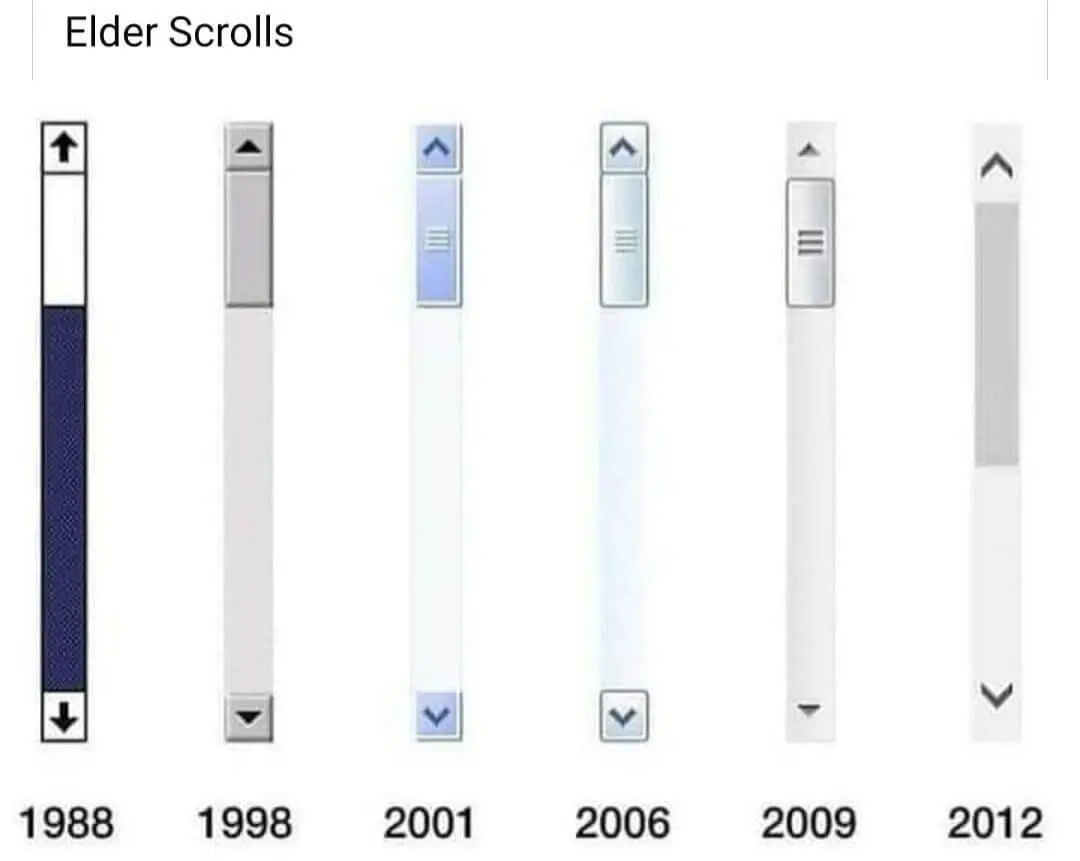
UIs get worse all the time, very frustrating. Who needs contrast, right? I have good eyes and know exactly where to look. My mother? Holy shit no chance.
Not necessarily for visibility but when i work I NEED FUCKING BORDERS FOR MY FUCKING BRAIN TO KEEP FUCKING STRUCTURE AND NOT EVERYTHING FADING OUT INTO ..yeah thanks i lost the thread again
Seriously fuck Wikipedia's desktop redesign, I regret that I donated before the change
In case you weren't aware, there are extensions that you can use to restore the older (better) UIs. Here are a couple:
There are probably some for other browsers as well. I don't use them though. I instead wrote myself a tampermonkey script to change it:
You can compare the available wikipedia styles on this page to see which one you like best: https://en.wikipedia.org/wiki/Wikipedia:Skin?useskin=monobook
Yeah, and I do that, I just don't think I should have to. I should be able to open the website on a fresh install and not get nauseous using it.
At least on the bright side, people are becoming much more aware of accessibility. I'd argue that old sites were accessible mainly on accident due to most being restricted to fairly straightforward CSS and HTML. The advent of Javascript was a dark time...
I don't think it was a pure accident as some non-accessible designs would still be possible with those limitations. IIRC scroll bars were taken from the OS back then, so if the OS didn't have accessible design, it wouldn't be a thing for the websites either.
It's really depressing how often I have to turn off CSS entirely just to view a webpage. I could of course always go into the inspector and turn off the bad CSS, but Gecko-based browsers fortunately have "View -> Page Style -> No Style" which is must easier and faster.
And seriously, whoever invented the
font-weightCSS property can burn in hell. Ditto for whoever decided that we should only be allowed to read light grey text on slightly lighter grey background.Browsers have an accessibility check for contrast for this reason. More devs / designers should use it.