this post was submitted on 03 Jan 2024
143 points (100.0% liked)
covid
683 readers
3 users here now
Try to include sources for posts No Covid misinformation, including anti-vaxx, anti-mask, anti-lockdown takes.
COVID MINIMIZATION = BAN
This community is a safe space for COVID-related discussion. People who minimize/deny COVID, are anti-mask, etc... will be banned.
Off-topic posts will be removed
Jessica Wildfire's COVID bookmark list
COVID-safe dentists: (thanks sovietknuckles)
- https://covidsafeproviders.com/category/covid-safe-dental-dentists/
- https://www.covidsafedentists.ca/
- https://www.covidmeetups.com/en/directory/dentists/US
founded 2 years ago
MODERATORS
you are viewing a single comment's thread
view the rest of the comments
view the rest of the comments


~~COVID is less deadly now, so we won't be seeing hospitals overwhelmed or anything like the first waves, thankfully. Excess mortality in the United States has stabilized since January 2023 to normal levels, and hasn't risen throughout last year, at most there were 3% more excess deaths than expected. For context, it peaked at 46% during January 2021.~~
~~However this latest COVID wave is really bad news if you are immunocompromised or old, and as we all know the US government does not care about that. And there's also the risk of chronic illness from a COVID infection for everyone. So still bad, just not 2020 and 2021 bad, though that should not be used as a comparison, that was a worst case scenario.~~
Please read my reply to @[email protected] the CDC seems to have fudged the data. This makes everything I said irrelevant and I apologise for the misinformation.
As a heads up, here's a chart that compares excess deaths to before 2020 without any assumptions: https://ourworldindata.org/grapher/excess-mortality-p-scores-average-baseline?country=~USA
It's never really gone below 10% more deaths. You can make your own judgement on which chart is more useful, but I think it's useful to understand the contexts of these calculations. The chart you shared (and the charts the CDC shares) are including pandemic years in their predictions for 2023, so of course excess deaths seem like they're back to "normal".
That's extremely sneaky by the CDC. Most of the other countries compare with deaths from previous years to make their projections on the original graph I shared, so it makes the USA look better by comparison. Compare this chart, with the projections, to this one, which just uses data from previous years. Suddenly the USA looks substantially worse versus South Africa...
There is something really wrong with the USA's projection if there's such a difference when compared to other countries projections. That is just data manipulation. That's honestly criminal by the CDC. Thank you for pointing this out and correcting my misinformation. Your contributions to this community in this regard are very valuable. Thank you for your patience when dealing with idiots like me.
I definitely don't think you're an idiot, it was very intentional on their part. I appreciate the reflection and willingness to dig into what was going on, though!
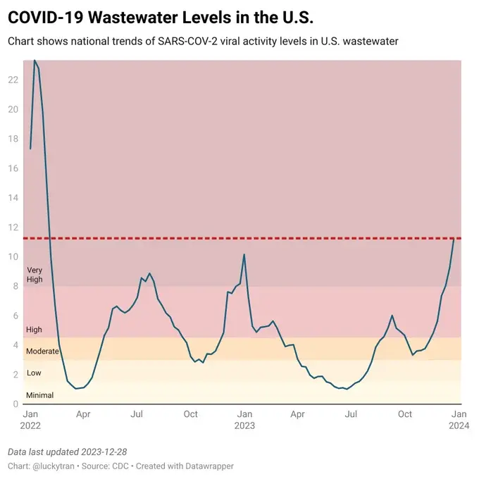
It's certainly less deadly, which is good but can change if a new crazy variant shows up, but I don't see why anyone is content with "Several times worse than a bad flu season, all the time". There's been 1000-2000 dieing of it a week since August, and the wave just starting to peak in most of the country, so we'll see how it goes. I think the first omicron wave was reported as mild, but it was still incredibly deadly.
Also worth noting that if we went back to "normal" we likely would also be seeing less deaths than pre-pandemic levels and negative excess deaths because the most vulnerable in society were killed off en masse the last few years.
Damn, I didn't even think of that. Just an extra layer of