The UAE doing the Russian approach: lie through your teeth and play dumb when called on it. No one will punish them for it, so be shitty, no one who can do anything cares.
Climate - truthful information about climate, related activism and politics.
Discussion of climate, how it is changing, activism around that, the politics, and the energy systems change we need in order to stabilize things.
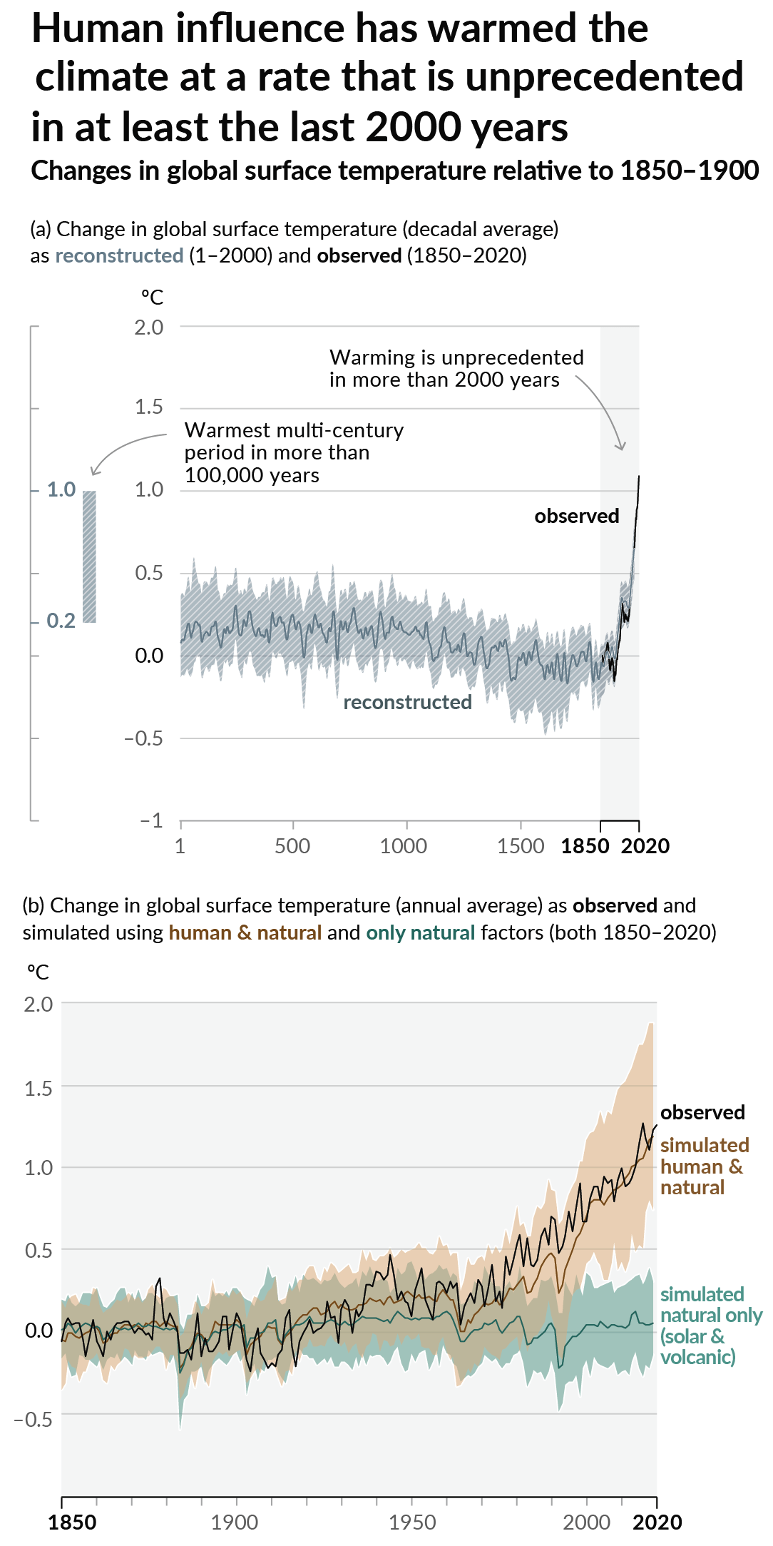
As a starting point, the burning of fossil fuels, and to a lesser extent deforestation and release of methane are responsible for the warming in recent decades:

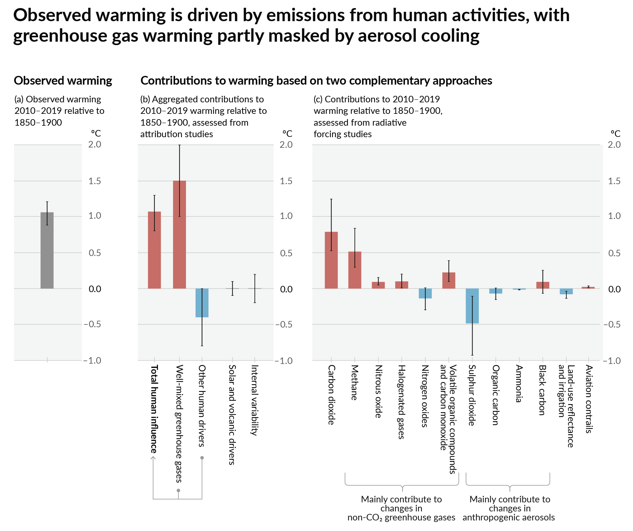
How much each change to the atmosphere has warmed the world:

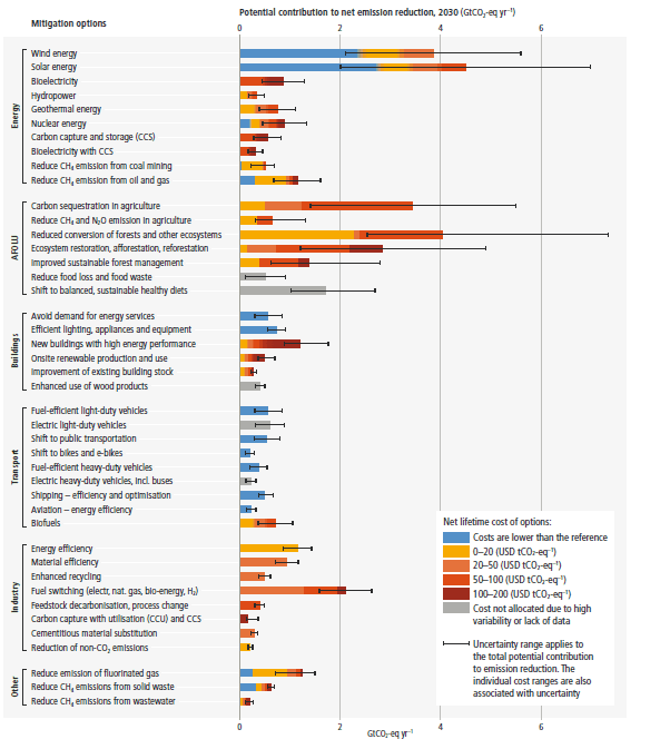
Recommended actions to cut greenhouse gas emissions in the near future:

Anti-science, inactivism, and unsupported conspiracy theories are not ok here.
The colors here are confusing because the color scale grades the temp gain, but that isn't the information that is claimed to be shown, which is whether or not they are meeting their goals.
I disagree because it portrays whether they are meeting their goals and a lot more information.
Compare the two columns and if they are the same color, they are meeting their goals.
Compare two countries to see which sets stricter goals compared to each other, or is achieving better results compared to each other.
You're right. However, I feel like the left and right columns could've been linked with a gradient to more clearly show their relationship.
I always struggle with colors because I'm colorblind, and grokking this chart at a glance is hard.
Even if we ignore the fact it is talking about emission goals, but the metrics are in celcius. A good graphic would include an indication that they're meeting their goals. Either having two groupings or an additional column to provide a quick way to see that information.
Why are any of these countries even allowed to set +2°C, +3°C, or even +4°C or higher as a goal in the first place?! That's not a fucking goal; that's a suicide pact!
suicide pacts can, in fact, be goals
Egypt and Morocco Ws.
It took way to long to see that only these two countries beat their target.
Good to see that Saudi Arabia and Indonesia are doing such a fantastic job meeting their target of unlimited planet melting!
Egypt and Morocco are a little under target though which is a shame.
The ClimateActionTracker website itself actually has a lot more details on individual countries, their targets and the policies they implemented. You can see by how much they miss their targrets as well. For example the US is pretty close to the 3C line.
