this post was submitted on 26 Aug 2024
8 points (100.0% liked)

Programmer Humor

19589 readers
710 users here now

Welcome to Programmer Humor!

This is a place where you can post jokes, memes, humor, etc. related to programming!

For sharing awful code theres also Programming Horror.

Rules

founded 1 year ago
MODERATORS
 

It used to be the Greatest advancement in Microsoft's purchased software ever! Plus teams...

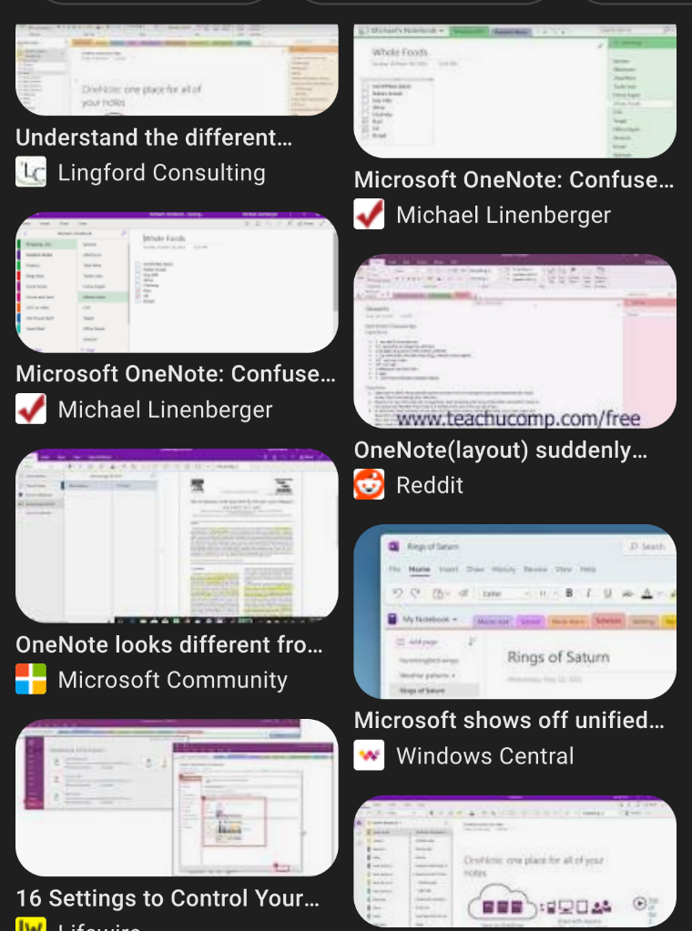
Now I got One Note which should be renamed "Several Notes"

There's the one from the browser, the one from One Note student version, the pro version, the purple tab version, the gray tab version etc. and you can make any of them look different. You can have vertical tabs or horizontal tabs. It's like Linux except there's no actual functionality difference, it's just so different that you can't fucking follow what anyone else did on the same exact page. In the browser it might be highlighted with Roman Times font, yours might look like Arial font with no highlight but the background is light blue.

Anyway the app is a total trainwreck. It's still very useful but it's less effective if the thing looks and behaves so different that I don't understand where we're at on the page each time a member of my team presents it via teams.....

and thanks Microsoft for not having a simple button to maximize the page being presented. 5 minutes off every meeting is spent figuring out how to maximize the God damn content followed by or preceding a good 10 minutes of figuring out which is the mic or sound card or monitor you're supposed to be presenting on, followed by ...can you see it yet? Can you hear me? Can I hear them, I'll just rejoin, can you make it bigger? You can make it bigger if you remove the waste of space that is the big ass blocks with everyone's name on them! Ok how? Click here! No, go to view. I swear I've noticed it under preferences! No this is the browser version! Why can't It just install it on everyone's computer and all presentation rooms? Blah blah...ok we're ready to present but we're 5 minutes over. Thanks everyone who came!

Thanks bye!...bye!, bye! Bye guys!..... Hold on. A sec I didn't even come! What kind of company is this? The slide wasn't even that sort of material that makes me come. Well fine bye! I'll just come later to the Sears catalog.....who was that guy? It will check!

All joiners leave the meeting, the stage closes it's curtains abruptly....a woman still crying in the back corner...mhaaa! It's so good because it's true!.

The END
top 17 comments
sorted by: hot top controversial new old
[–] [email protected] 4 points 2 months ago (2 children)

Yea... Microsoft has a history of doing this a lot... their "concession" to being a large software developer is that each version of an app seems to have an entirely different team that develops independently from the other platform versions (the best you can say is that they occasionally borrow good features from one another).

I recently got forcefully switched to "New Teams" at work which is a strict downgrade and doesn't support half the shit the browser app (which, as a reminder, is a weird Frankenstein of calendar and email) supports. It also absolutely bombards users with unnecessary notifications that need to be individually muted.

Never have I appreciated Google more than when I was forced from GSuite to SharePoint, Teams, Outlook, Visio, etc...

[–] [email protected] 2 points 2 months ago (1 children)

I love how new Teams doesn't even have a contacts list for chat anymore, it's just your most recent chats. And if you search for someone, any recent group chats with that person show up first so you may still have to scroll to find that person's chat. Oh, and we store documents on Teams so if I want to switch between looking through the document repository and chat I still have to do a whole bunch of clicks between the two.

I don't fault them for when my project manager tags @everyone on the group chat with an important message saying "good morning and happy Monday" though. I wish I were kidding.

[–] [email protected] 2 points 2 months ago

I like how the teams team wasted hours making a new notification popup system instead of using the default system on the user's os. They wasted time to just make a worse thing that's also buggy. If users send too many messages at once, you end up having notification popups stacking on top of each other until it completely fills your screen.

[–] [email protected] 3 points 2 months ago (1 children)

Software teams solved this a fucking eternity ago through shared component and design libraries. Meanwhile, all of these FAANG companies are out here pushing surveillance tools that are all clearly built by siloed teams with zero collaboration.

[–] [email protected] 1 points 2 months ago* (last edited 2 months ago) (1 children)

Even Microsoft did. Their Office Application libraries are phenomenal.

Scriptable object based libraries that work and do so cross platform. It’s a thing of beauty and I’ve never seen MS ever do anything even remotely like it again.

Asp MVC. Nope, different.

Windows code API’s. Nope, different.

But office… Excel.Sheets etc. [chef’s kiss]

[–] [email protected] 1 points 2 months ago (1 children)

I think it’s just part of this “move fast” mentality. We’re at a point where we’re forced to move so quickly that things get thrown out the window just to meet a deadline.

[–] [email protected] 1 points 2 months ago (1 children)

I think we're discovering where "move fast" plus "personal information" results in a penalty.

[–] [email protected] 1 points 2 months ago

Unfortunately, the current penalties are insufficient.

[–] [email protected] 2 points 2 months ago (1 children)

I remember liking it 10 years ago. Now, it's not only way worse: it simply got surpassed by all the markdown note-taking apps (Joplin, Logseq, ...) and xournalpp (or even rnote).

Moral of the story: try rnote. It's good.

[–] [email protected] 2 points 2 months ago

Rnote Looks really interesting. Was searching for that. Thanks.

[–] [email protected] 1 points 2 months ago

I feel ya. It feels like software designed by people who have never used OneNote.

[–] [email protected] 1 points 2 months ago (2 children)

They'll do an outlook: cut features from the desktop version until it's exactly the same as the web version, because every interface needs to be a facsimile of the web, right?

[–] [email protected] 1 points 2 months ago

It's a lot faster to stick an existing web ui into an electron app than make a true native app.

[–] [email protected] 1 points 2 months ago

but they will still push the desktop version hard in the most annoying way possible on the web version.

because reasons.

[–] [email protected] 1 points 2 months ago

It seems that they intend Microsoft Loop to be the collaborative notes app now.

It’s replaced OneNote as the meeting notes app and it has more flexible access control.

Currently they also only have one version as it’s a progressive web app (that might change with time though).

[–] [email protected] 1 points 2 months ago

Microsoft doesn't know how to make/manage/deploy software at all. They are clueless to their own products and the problems THEY cause, and their information the public is ALWAYS outdated and a convoluted mess of bullshit....but it's somehow out fault for not knowing