If you haven't already, I would consider cross-posting to the privacy community. I imagine you might get some useful critique from them. I'll definitely try it just for fun. I'm pretty sure I wouldn't replace my connect app, but I'd love to at least try it
Lemmy Apps
A home for discussion of Lemmy apps and tools for all platforms.
RULES:
- No spamming
- Be nice and have fun
- Follow the general lemmy.world rules
An extensive list of Lemmy apps is available here:
Visit our partner Communities!
Lemmy Plugins and Userscripts is a great place to enhance the Lemmy browsing experience. [email protected]
Lemmy Integrations is a community about all integrations with the lemmy API. Bots, Scripts, New Apps, etc. [email protected]
Lemmy Bots and Tools is a place to discuss and show off bots, tools, front ends, etc. you’re making that relate to lemmy. [email protected]
Lemmy App Development is a place for Lemmy builders to chat about building apps, clients, tools and bots for the Lemmy platform. [email protected]
Great idea! I'll cross-post over on Privacy.
And yes, let me know if you have any feedback!
The interface looks good. It looks like standard Material Device but put together beautifuly. Btw, is it open source?
Thanks! I took inspiration from a few different design styles to make something a bit more fun and novel. And It is closed right now. I work on Quiblr in as a side project and I've never managed an open source project lol but I'm talking with a friend who does have experience managing open source projects to see if they can assist
I hope you'll get to open it. Maybe you'll be surprised from the community you can form around it.
Agreed. Closed source and Lemmy users don't mix much. I'll be passing for now.
Just upload the source code to github, it's not difficult to make things open source, just often people don't want to.
I don’t think this is totally accurate. Open source management is very thank-less. If you just upload code, people expect to submit PRs, get updates, version control, etc. also you often need to do your diligence to ensure there aren’t any additional security considerations
You can definitely just upload the code (with some revision for security) but truly managing an open source project (which I’m guessing OP is referring to) is another beast all together
Wow, this seems like a cool project.
How do I... use it? Is Quiblr a separate instance? An app? A front end?
Quiblr is a frontend. You can choose any instance that you want to browse. Right now, it is just a web app. IOS and Android apps are in the works
This is a great idea! It feels very snappy and looks great, too!
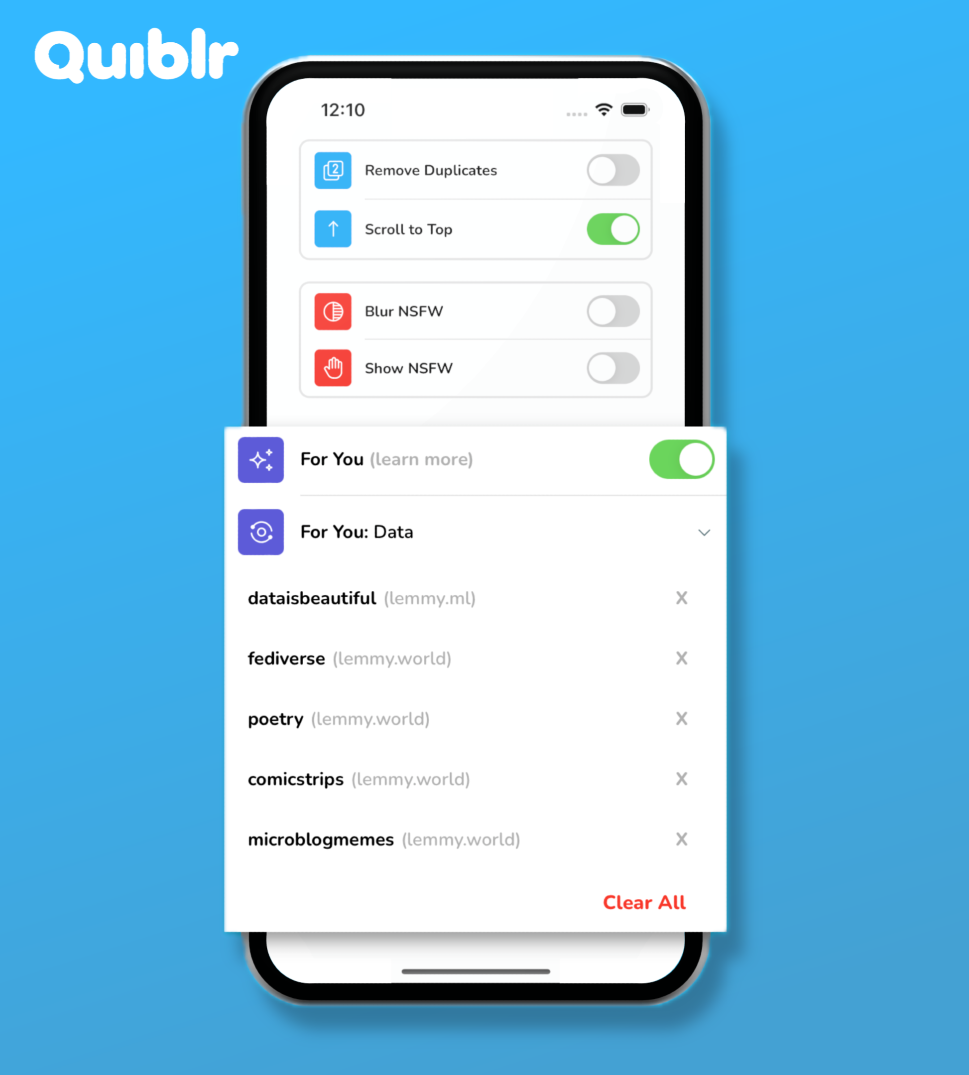
This feature seems really cool!
Any reason to have a button for "show me more" when there's also an upvote button? But good idea to separate "show me less" vs downvote
I guess another thing you could do is sort a list of communities by how many upvotes you've given to them, then you can easily subscribe to communities you didn't know you liked
I added a "show me more" button so that it can be an additional signal to differentiate content. Like I can upvote a post but ALSO I want to see more of this type of content.
Plus users don't have to log in to use the "show me more" button
The design looks quite Duolingo-y.
I see that. I like the Duolingo feel. It is a fresh take. I appreciate it. Props to OP
i mean yeah button design looks exactly the same, it's pretty iconic
I didn't see any links for version tracking, but if you have/make one, I'll be happy to add this to our megathread of Lemmy apps, you may also want to check the sidebar for other projects that help people explore the app options out there.
Always love seeing your updates to this.
I appreciate it! I try to update regularly when I’ve got time
This looks great. Can you add options to show community instance and user instance?
