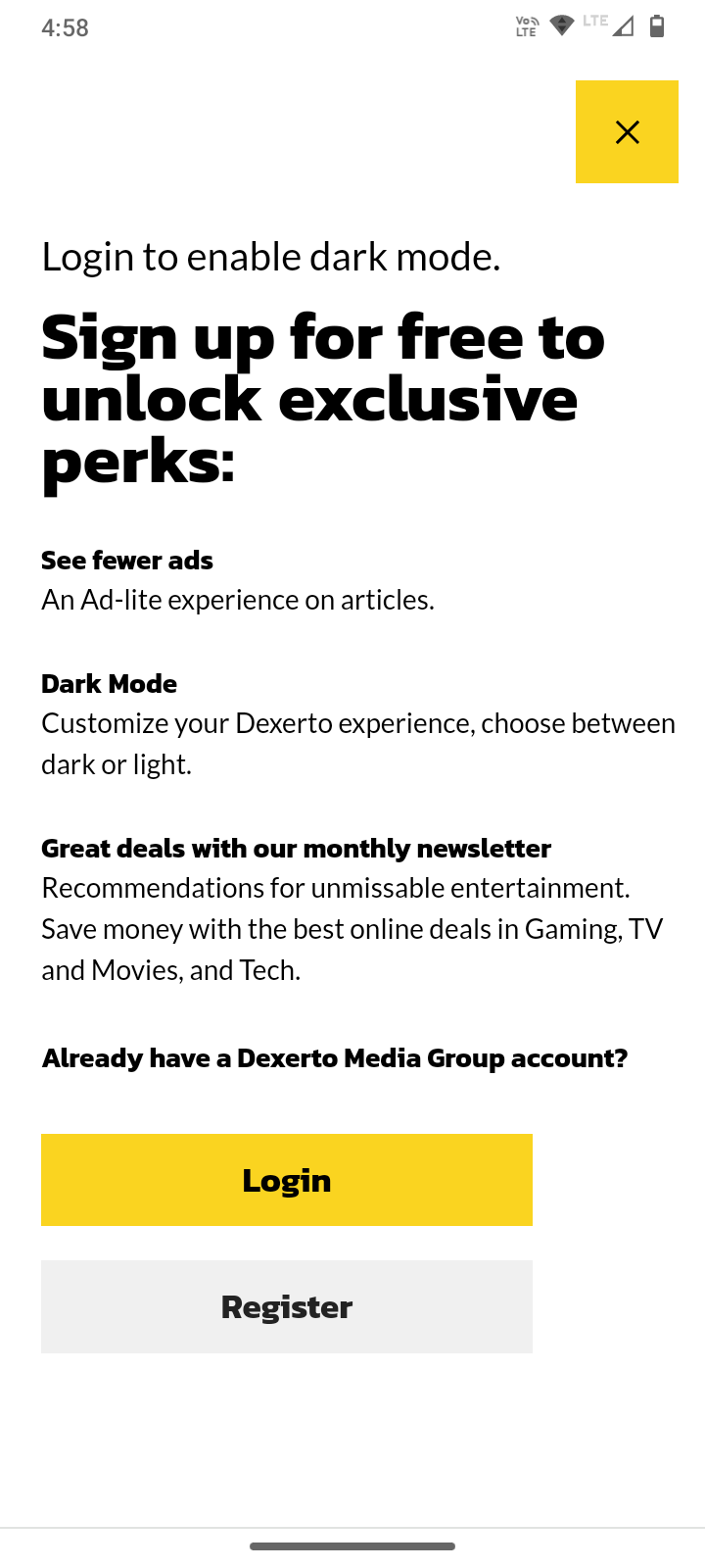
or... just use darkreader :D
AssholeDesign
This is a community for designs specifically crafted to make the experience worse for the user. This can be due to greed, apathy, laziness or just downright scumbaggery.
Seconding. Can't imagine not using darkreader in this day and age.
Yup yup. Darkreader has improved my entire internet experience, which is a huge accomplishment. Works flawlessly 99% of the time.
Dark reader is great. It can also be used to prevent fingerprinting based on your preference, as most are configured to light mode by default.
However it often makes the site nearly or completely unusable, as it isn't (and can't) always be 100% correct. Having dark mode configured by the site is often much more useful.
or... just lower your monitor brightness so you don't feel like you need dark mode, which is actually worse in every way than just using the correct monitor brightness.
CSS is so premium lol
same with news.google.com
Lots of websites do this the other way around, too. It's very annoying.
What, you have to enable dark mode to sign up?
No lol just you need to sign up to enable light mode
there was a android apk site that did that
