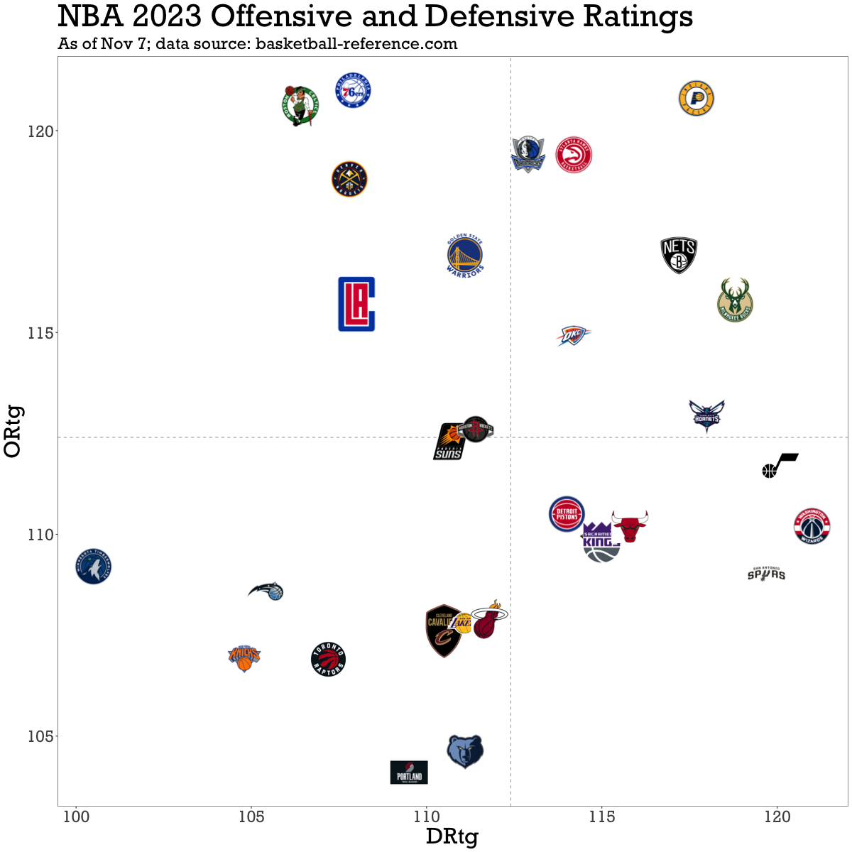
good work plotting the ratings, it is a very welcome addition to this community :)
some suggestions for the next version of the chart: (- inverting Drtg axis was already suggested before)
- same scaling of axes, so that 5 points of rating is visually the same length for Ortg and Drtg
- adding some diagonal lines to mark levels of the same net rating
- equalizing logo size, right now some are huge and some are tiny
- in some cases logo background could be transparent
