this post was submitted on 06 Mar 2024
156 points (94.8% liked)
Climate - truthful information about climate, related activism and politics.
5237 readers
712 users here now
Discussion of climate, how it is changing, activism around that, the politics, and the energy systems change we need in order to stabilize things.
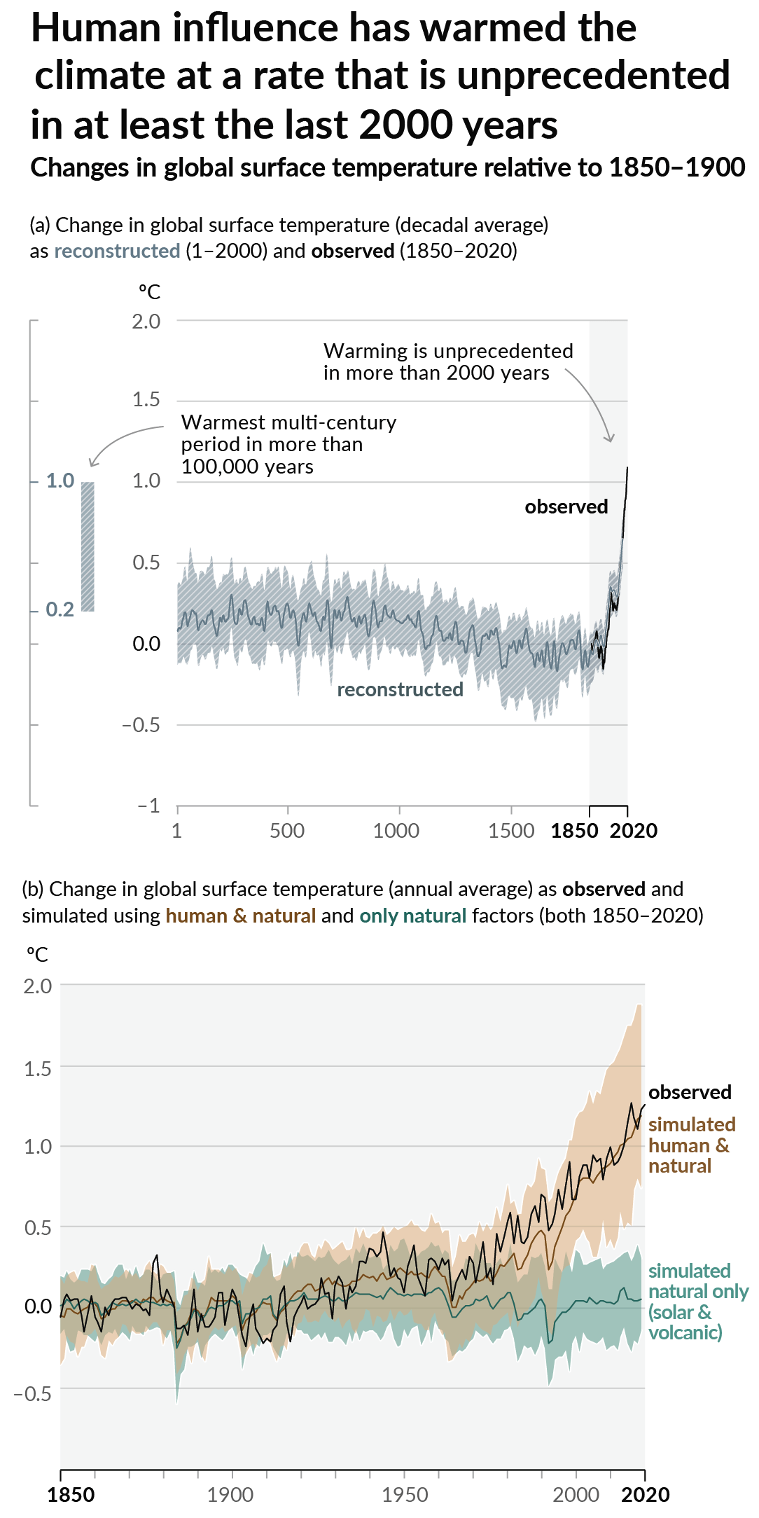
As a starting point, the burning of fossil fuels, and to a lesser extent deforestation and release of methane are responsible for the warming in recent decades:

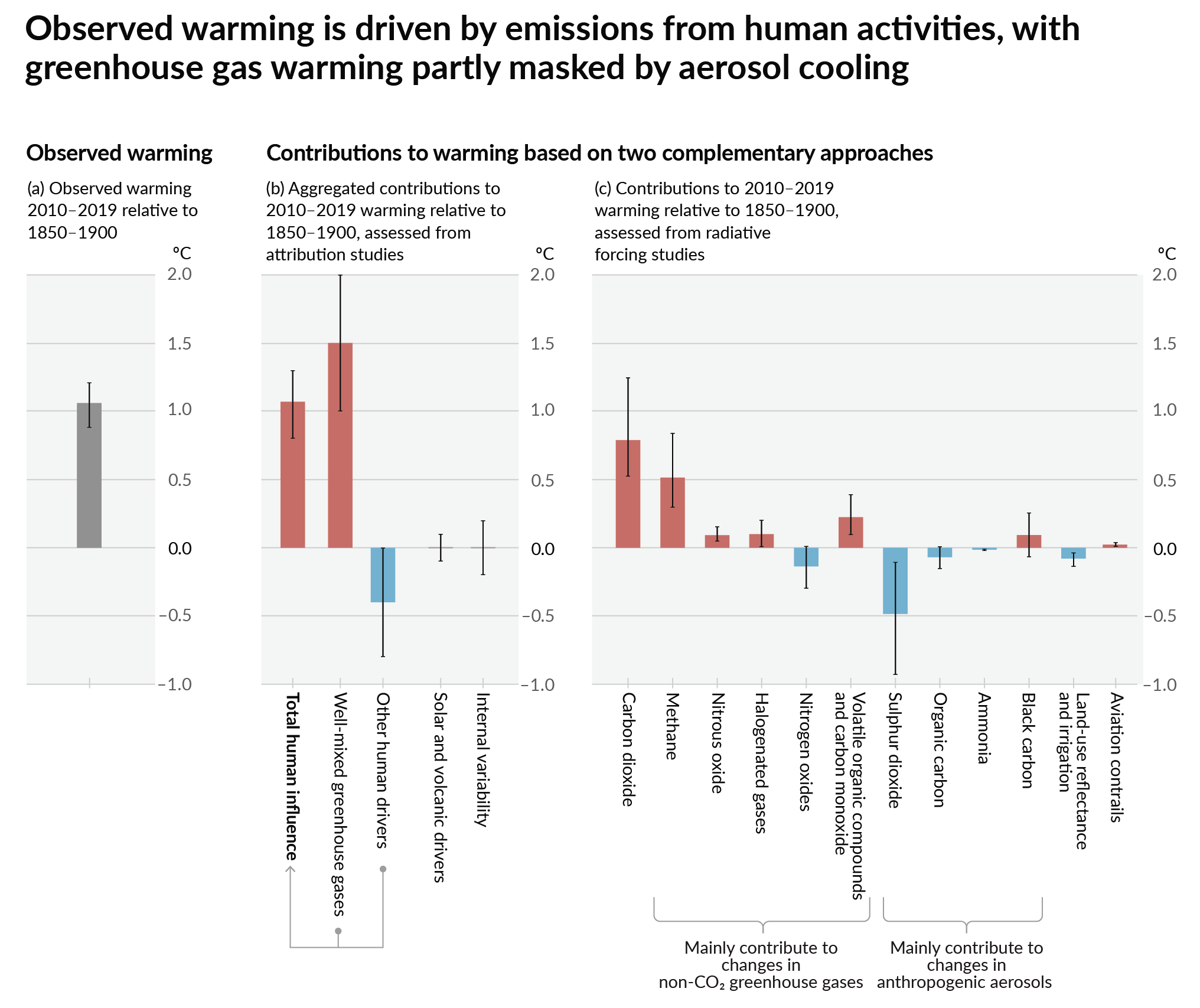
How much each change to the atmosphere has warmed the world:

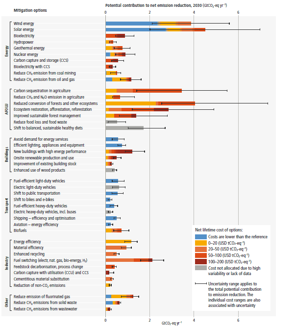
Recommended actions to cut greenhouse gas emissions in the near future:

Anti-science, inactivism, and unsupported conspiracy theories are not ok here.
founded 1 year ago
MODERATORS
you are viewing a single comment's thread
view the rest of the comments
view the rest of the comments

This looks cool but is meaningless. waste heat is a very, very small problem.
It's meaningful because charts showing "primary energy" include waste heat, so you only need to replace ~1/3 of primary energy with renewables to fully replace its use.
what charts are using primary energy? the only useful metric is energy we can actually use, and all statistics I know generally compare emissions per kWh of electricity, not primary energy.
We don't take inti account the energy of the sun for calculating solar energy either.
The ones I've seen people using in online discourse are these which mislead the heck out of people trying to figure out how much work is needed for displacing fossil fuels.
Oh wow, that is terrible and disapointing. Then again, when you think about it, it does mean the corrected graph gives us more hope.
huh, interesting!
If we did then solar energy would be the most ridiculously inefficient energy source on Earth. Only 0.000000045% of the Sun's energy even hits Earth at all.
Though now that I think of it, uranium comes from supernovae and neutron star mergers. So nuclear power might be even less efficient.
If you look around, there are tons of people who claim that all of the primary energy used today needs to be provided by renewables in the future (and that that's impossible).
It looks also like this graph is completely ignoring the fact that the excess heat is actually used to heat up homes (at least in Finland), making the process of burning coal way more efficient.
That said, renewables are obviously still better on the climate, and should be heavily invested to.
I can say that in the US, such use of waste heat is fairly uncommon