Terrible Estate Agent Photos
Terrible photos listed by estate agents/realtors that are so bad they’re funny.
Posting guidelines.
Posts in this community must be of property (inside or out) listed for sale which contains a terrible element. “Terrible” can refer to:
-
the photo itself (finger over the lens, too far away, people in the shot, bad Photoshop, etc.)
-
the property (weird layout, questionable plumbing, unsound structure, etc.)
-
the interior (carpeted bathrooms, awful taste interiors, weird mannequins/taxidermies/art, inflatable pools indoors, etc.)
-
the actual listing itself including unusual descriptions and unrealistic pricing. However, this isn’t a community to discuss the housing market in general. This is a comedic community - let’s keep it light.
-
Photos can be sourced from anywhere and be any age, but please check they haven’t already been posted.
-
Censor any names/contact details of private individuals.
-
Mark the post NSFW if it includes nudity or sensitive content
Rules.
This community follows the rules of the feddit.uk instance and the lemmy.org code of conduct. I’ve summarised them here:
- Be civil, remember the human.
- No insulting or harassing other members. That includes name-calling.
- Respect differences of opinion. Civil discussion/debate is fine, arguing is not. Criticise ideas, not people.
- Keep unrequested/unstructured critique to a minimum.
- Remember we have all chosen to be here voluntarily. Respect the spent time and effort people have spent creating posts in order to share something they find amusing with you.
- Swearing in general is fine, swearing to insult another commenter isn’t.
- No racism, sexism, homophobia, transphobia, xenophobia or any other type of bigotry.
- No incitement of violence or promotion of violent ideologies.
view the rest of the comments

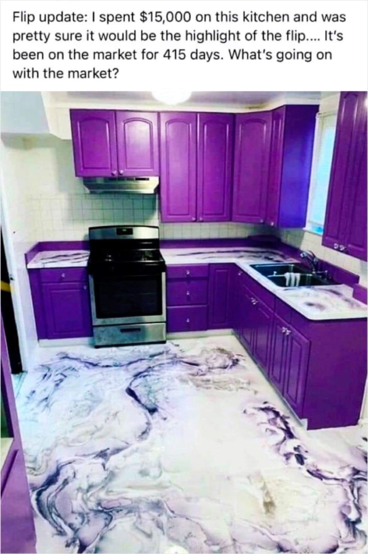
I love purple and I even love cabinets with some color in it. But this ain't it, chief. It's like they deliberately chose the most vibrant and gaudy color imaginable.
I cannot even believe this is the actual color. It looks so bad plus there's just something off about the color of light coming through the window. Imagine if the saturation was less and it was a little more red. It'd be a perfectly normal color choice in that case. Hard to say if it's just the photo or not, or if it was photoshopped to exaggerate a slightly-off color.
Might be a weirdly overly saturated photo. Sometimes I feel like real estate agents go a bit wild with the color alterations they do in photos.
This is why you have accent pieces or walls and not an accent room.