2905
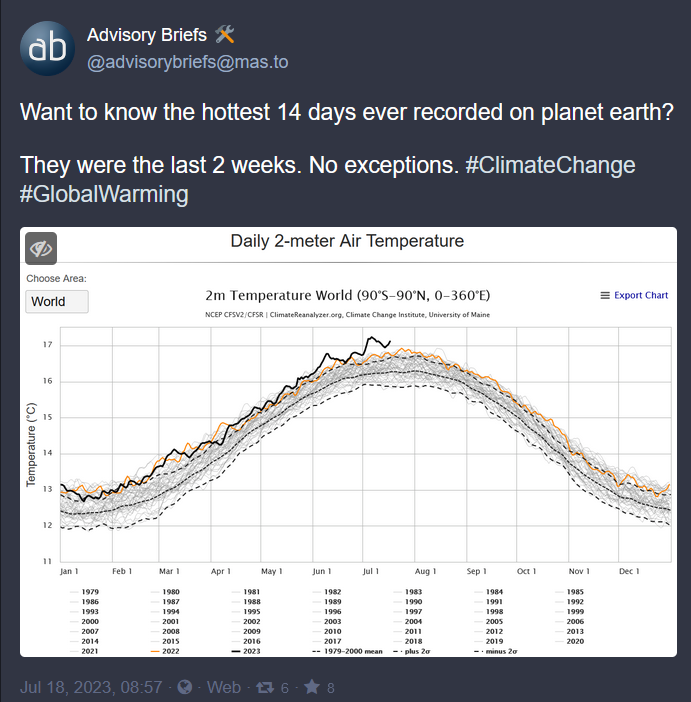
The hottest 14 days ever recorded are the last 2 weeks
(lemmy.world)
A community for discussing events around the World
Rule 1: posts have the following requirements:
Rule 2: Do not copy the entire article into your post. The key points in 1-2 paragraphs is allowed (even encouraged!), but large segments of articles posted in the body will result in the post being removed. If you have to stop and think "Is this fair use?", it probably isn't. Archive links, especially the ones created on link submission, are absolutely allowed but those that avoid paywalls are not.
Rule 3: Opinions articles, or Articles based on misinformation/propaganda may be removed. Sources that have a Low or Very Low factual reporting rating or MBFC Credibility Rating may be removed.
Rule 4: Posts or comments that are homophobic, transphobic, racist, sexist, anti-religious, or ableist will be removed. “Ironic” prejudice is just prejudiced.
Posts and comments must abide by the lemmy.world terms of service UPDATED AS OF 10/19
Rule 5: Keep it civil. It's OK to say the subject of an article is behaving like a (pejorative, pejorative). It's NOT OK to say another USER is (pejorative). Strong language is fine, just not directed at other members. Engage in good-faith and with respect! This includes accusing another user of being a bot or paid actor. Trolling is uncivil and is grounds for removal and/or a community ban.
Rule 6: Memes, spam, other low effort posting, reposts, misinformation, advocating violence, off-topic, trolling, offensive, regarding the moderators or meta in content may be removed at any time.
Rule 7: We didn't USED to need a rule about how many posts one could make in a day, then someone posted NINETEEN articles in a single day. Not comments, FULL ARTICLES. If you're posting more than say, 10 or so, consider going outside and touching grass. We reserve the right to limit over-posting so a single user does not dominate the front page.
We ask that the users report any comment or post that violate the rules, to use critical thinking when reading, posting or commenting. Users that post off-topic spam, advocate violence, have multiple comments or posts removed, weaponize reports or violate the code of conduct will be banned.
All posts and comments will be reviewed on a case-by-case basis. This means that some content that violates the rules may be allowed, while other content that does not violate the rules may be removed. The moderators retain the right to remove any content and ban users.
News [email protected]
Politics [email protected]
World Politics [email protected]
For Firefox users, there is media bias / propaganda / fact check plugin.
https://addons.mozilla.org/en-US/firefox/addon/media-bias-fact-check/
Here is a graphic to help visualize the unprecedented rate of temp change. Data source for temperature is cited and likely errors are explained. https://xkcd.com/1732/
It's actually worse than that. We are not in the predicted path, we are in one of the worst estimated predicted paths. Understandable as that comic was made in 2012.
Yeah, you're right. It would be even more obvious now if it were redone. I specifically like that one because it invites people to scroll through the time axis slowly and on a linear scale. It makes the recent changes more real than the same graph fitted to a screen and seen all at once.
Can't stand those comics. Thanks but no thanks.
They cite their sources. I got paywalled by the Marcott paper, but that seems like it has data you're looking for. I think most of the referenced links are as follows:
Shakun https://www.nature.com/articles/nature10915
Marcott https://www.science.org/doi/10.1126/science.1228026
Annan and Hargreaves https://cp.copernicus.org/articles/9/367/2013/cp-9-367-2013.html
Hadcrut4 https://psl.noaa.gov/data/gridded/data.hadcru4.html
Dang climate change denial is one thing but speaking ill of xkcd on the internet are you a fucking madman?