this post was submitted on 05 Jul 2023
0 points (NaN% liked)
Thunder App
2814 readers
27 users here now
An open-source, cross-platform Lemmy client for iOS and Android.
This community is intended to discuss features and feature suggestions for Thunder; as well as friendly, respectful talks about Lemmy in general.
Please use the GitHub repository linked below to submit bug reports, so keeping track of them is easier, and make sure to search first if you already can find an issue for your report.
If there are any developers who would like to contribute, feel free to reach out on GitHub!
General Links
Website: Link
GitHub Repository: Link
Matrix Space: Link
Android Releases
IzzyOnDroid: Link
Google Play: Link
iOS Releases
Apple App Store: Link
TestFlight Beta: Link
Related Communities
Nightly Community: Link
founded 1 year ago
MODERATORS
you are viewing a single comment's thread
view the rest of the comments
view the rest of the comments


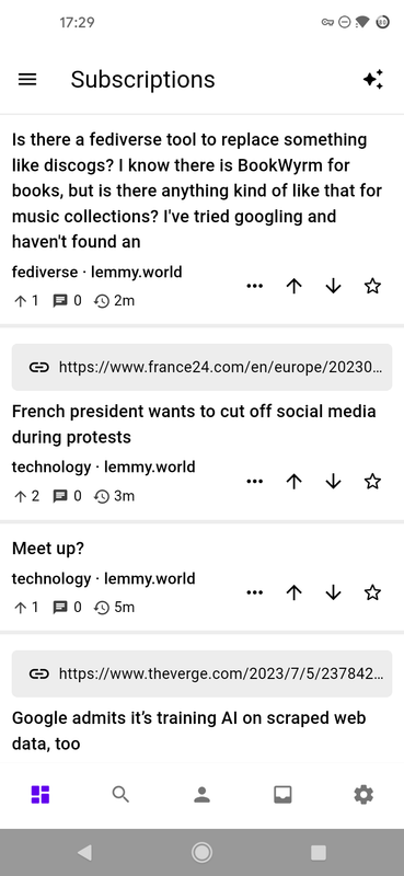
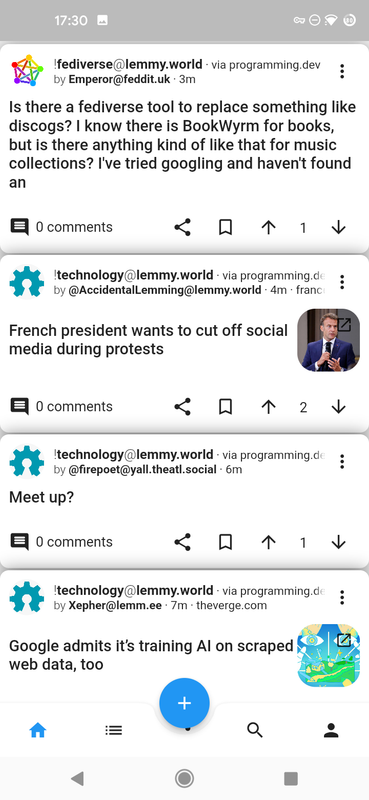
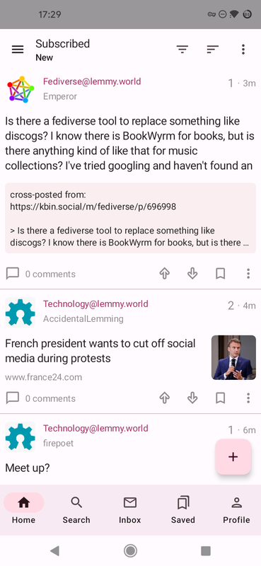
Hmm, okay! That's a valid point you brought up. I'll keep the settings enabled for now rather than disabling them, and see what can be done to help with the divider situation