this post was submitted on 14 Nov 2024
23 points (73.5% liked)
Data is Beautiful
4875 readers
10 users here now
A place to share and discuss visual representations of data: Graphs, charts, maps, etc.
DataIsBeautiful is for visualizations that effectively convey information. Aesthetics are an important part of information visualization, but pretty pictures are not the sole aim of this subreddit.
A place to share and discuss visual representations of data: Graphs, charts, maps, etc.
  A post must be (or contain) a qualifying data visualization.

  Directly link to the original source article of the visualization
    Original source article doesn't mean the original source image. Link to the full page of the source article as a link-type submission.
    If you made the visualization yourself, tag it as [OC]

  [OC] posts must state the data source(s) and tool(s) used in the first top-level comment on their submission.

  DO NOT claim "[OC]" for diagrams that are not yours.

  All diagrams must have at least one computer generated element.

  No reposts of popular posts within 1 month.

  Post titles must describe the data plainly without using sensationalized headlines. Clickbait posts will be removed.

  Posts involving American Politics, or contentious topics in American media, are permissible only on Thursdays (ET).

  Posts involving Personal Data are permissible only on Mondays (ET).
Please read through our FAQ if you are new to posting on DataIsBeautiful. Commenting Rules
Don't be intentionally rude, ever.

Comments should be constructive and related to the visual presented. Special attention is given to root-level comments.

Short comments and low effort replies are automatically removed.

Hate Speech and dogwhistling are not tolerated and will result in an immediate ban.

Personal attacks and rabble-rousing will be removed.

Moderators reserve discretion when issuing bans for inappropriate comments. Bans are also subject to you forfeiting all of your comments in this community.
Originally r/DataisBeautiful
founded 1 year ago
MODERATORS
you are viewing a single comment's thread
view the rest of the comments
view the rest of the comments

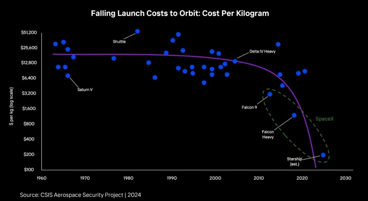
An important detail is missing: whose estimate?
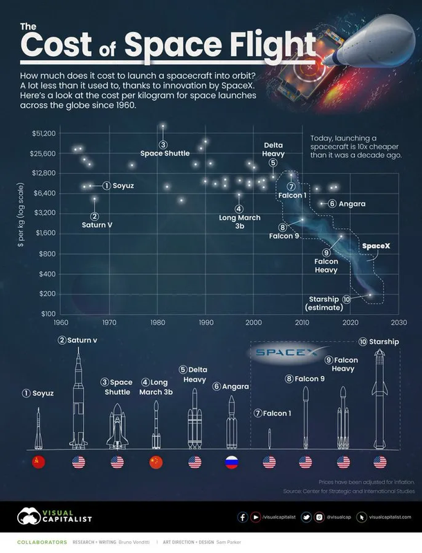
The chart seems to have emerged from an apparently famous report(, p.13, discussed there), whose taking its source from the Center for Strategic and International Studies, an american think tank.

As for the estimated cost of Starship, a cost inferior to $300/kg(, sometimes below $100/kg) seems confirmed all over the internet after a quick research, although the prices are varying, with many articles(, e.g.,) speaking about an aim below 10$/kg.
However, interestingly enough, the only contradiction i found came from wikipedia, since a capacity of 100.000-150.000kg for a current launch cost of $100.000.000 would imply a cost of 666-1000$ per kg.
I've probably made mistakes while checking all of this, so feel free to dive deeper in order to explain the differences between SpaceX's estimates and the wikipedia page.
I love such curve-fitting techniques. By 2025 we can launch 1t into space for a few cents, if we follow the purple line.
It's also absurd that the fit line dives down to be cheaper and earlier than an optimistic projection that will likely move further to the top right as time progresses. That's a chart with an agenda, not an analytical regression.
The curve would be even worse if the y-axis was linear b.t.w. 🤷
I think this actually is a linear regression plotted on a log y graph.
Which a linear regression is a bad choice for something that must be asymptotic at best.