Pixel Dungeon
This community is a place to talk strategies, tell stories, or discuss anything related to Pixel Dungeon or its many versions.

Rules:
-
1. No hate or adult themes of any kind: NSFW or illegal material, hate speech, personal attacks, harassment, doxxing, bullying, etc. are all strictly forbidden. Crude or offensive language should be kept to a minimum or avoided entirely.
-
2. Posts must directly relate to Pixel Dungeon: All content posted must directly reference Pixel Dungeon or one of its variants in some form. Loose connections or similar nomenclature from irrelevant works do not count.
-
3. Do not use other's work without giving credit: You may post things that were created by other people, but you must link to the original and credit the author. AI generated content is prohibited, as crediting the original authors is impossible.
-
4. Follow site-wide rules: https://legal.lemmy.world/fair-use/
We have a few title tags for standout posts:
- [MOD] - Posts by moderators about the community
- [DEV] - Announcements from a developer of a PD version
- [OC] - Self-made original content
Sister Communities:
view the rest of the comments

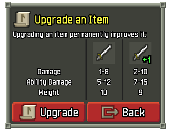
Ooh this looks great! Small request though, can the "upgrade" and "back" buttons be swapped? In most other UIs (both in the game and elsewhere) the confirm/primary function is on the right, with the cancel option on the left. Either way, this seems like a great QoL change!
That actually varies by device. Shattered usually puts confirm on the left (or above) and cancel on the right.
Oh ok. Thank you.
On Android and iOS, primary actions are on the right.
Windows is left:
Sometimes this changes based on RTL languages, but this is the case for English as least. I sometimes don't bother flipping it for Windows and instead focus more on making sure the keyboard works as expected (Enter, Escape, Tab)