this post was submitted on 25 Apr 2024
1133 points (97.6% liked)
People Twitter
5466 readers
1465 users here now
People tweeting stuff. We allow tweets from anyone.
RULES:
- Mark NSFW content.
- No doxxing people.
- Must be a pic of the tweet or similar. No direct links to the tweet.
- No bullying or international politcs
- Be excellent to each other.
- Provide an archived link to the tweet (or similar) being shown if it's a major figure or a politician.
founded 2 years ago
MODERATORS
you are viewing a single comment's thread
view the rest of the comments
view the rest of the comments

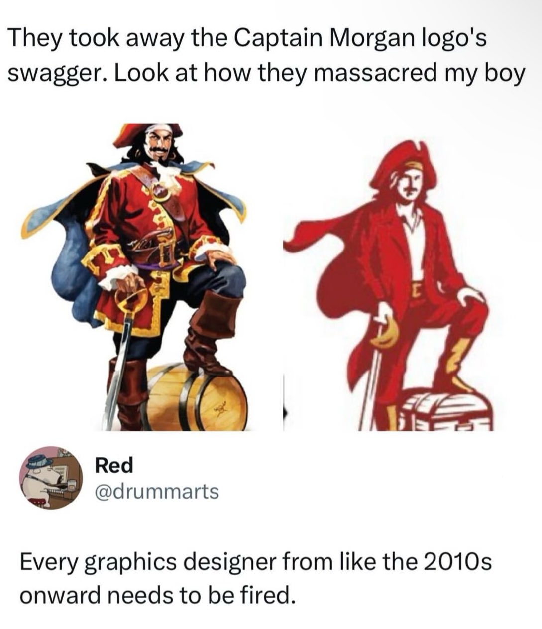
i have no idea what this brand is supposed to be but... tbh i don't see anything wrong with the right one
logos are supposed to be simple-ish, use minimal amount of colors and be scalable and it sure does a better job with it's reduced color palette and vector shapes
the one on the left should be reserved for e.g. illustrations
I kinda agree with it from an ease of printing perspective and easy perception from a distance, but they completely changed the proportions and got rid of the contrasting dark blue/red color-scheme that would catch people's eyes. Looking at them side by side I'm still not convinced they're even the same company, and that's a failure for brand recognition in my mind which is the only reason logos even exist.