this post was submitted on 27 Jul 2023
66 points (100.0% liked)
TechTakes
1432 readers
130 users here now
Big brain tech dude got yet another clueless take over at HackerNews etc? Here's the place to vent. Orange site, VC foolishness, all welcome.
This is not debate club. Unless it’s amusing debate.
For actually-good tech, you want our NotAwfulTech community
founded 1 year ago
MODERATORS
you are viewing a single comment's thread
view the rest of the comments
view the rest of the comments

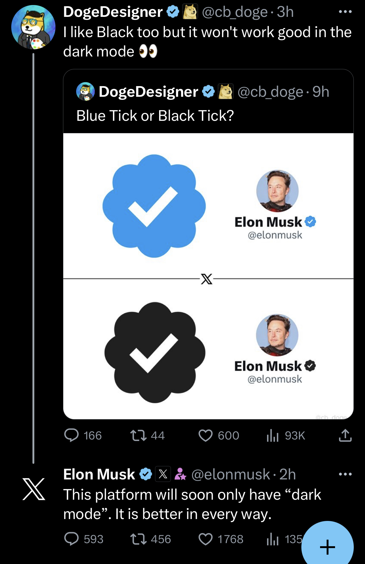
For some it's just personal preference, for some with vision issues it's unreadable
What's the benefit to removing one and forcing everyone to use the other?
If "X" can't handle a light mode and a dark mode, then that's not a very good sign...
You're acting like they need to code a whole new app rather than a single if/then statements with different color values.
Do you have any idea what you're talking about?
don't underestimate the work that goes into maintaining two UI themes on that level. Every new thing has to cater for both themes by the designers. Those colour values are easy for devs IF the css is built to accommodate. It very rarely is... and by rarely I mean never, but say rarely to appease the devs seeing this who think they've built something that accommodates it.
For the love of... they are freaking twitter! It is one of the most used user interfaces in the world! I think they can spring for the necessary dev resources to maintain a UI that can support multiple modes.
maybe this… thrilling??? discussion of who’s 10x enough to maintain the site theme is better suited to the orange site @[email protected] @[email protected] @[email protected]
I was looking for the mute button a long time ago
Thanks for @ing me!
I wouldn't know to block you otherwise, makes it super convenient.
ahahaha, off you fuck
I'm guessing they are using a client that tags people automatically. Mastodon client does this. I have no idea what the posts are saying though.
What are you trying to say? That twitter doesn't have enough money to develop in a modern design system? It's not a matter of BS mythical 10x developers. Although according to elon all the non 10xers were fired I guess.
You set up a table for each.
If you're adding one thing that needs a color value, you just add a color to each table rather than a single color...
It's honestly not complicated or time consuming. Especially when two versions already exist...
ok, tables and colour values. Sounds good.
I'm not the one saying ridiculous things like taking away "light mode" would free up resources...
So comparitively speaking, yeah, I'm practically an expert.
Compared to the backend development, sure.
It's also not like they're creating it from scratch, it already exists. The muskrat is literally just saying he's going to get rid of it, not just not develop it.
It's not exactly the hardest part of the job... It's a CSS file with altered colours.
Ah, well, if it's less work for the tech team, excluding disabled users is a reasonable compromise!!!
/s
If he didn't fire everyone except his H1B slaves this wouldn't be an issue.
nothing wrong with not having one. Having one and removing it because you like the dark mode better, on the other hand? He's been told that every design decision has to consider light and dark. Just like he's going to be told that the web app requires more dev resources for browser compatibility testing, accessibility, performance etc and more design resources for responsiveness and stuff like mouse vs touch.
If he drops light mode he can cut more staff for sure. If he drops web, he can cut even more. He will do it.
but anyway, light mode/dark mode are a great example of corps doing something good in the bare minimum way. Before apple or whoever branded black backgrounds and white text as "dark mode" implementing an alternative UI theme based on accessibility concerns on a major web app would have been impossible to get approved.
I'm speaking in the sense that he's a desperate idiot trying to make twitter cost him as little as possible. He's walking around that hell hole asking for ideas on cutting costs.
Except if you cut development costs your app will suffer, and thus be less profitable. If people don't want to use your app because it's a pain to use, then you're cutting out a part of your userbase... and thus a source of profit.
but fascism is a core functionality!
I personally prefer it. I'd be surprised and annoyed if it went away.
That said, I don't get too het up if an existing site/service only has dark mode.
I clicked the button that deshittfied the thread but since that deleted the warning I posted too:
reconsider before having a 10xer slapfight here