1
5
submitted 1 week ago by [email protected] to c/[email protected]
2
18
submitted 1 month ago by [email protected] to c/[email protected]
3
35
submitted 1 month ago* (last edited 1 month ago) by [email protected] to c/[email protected]

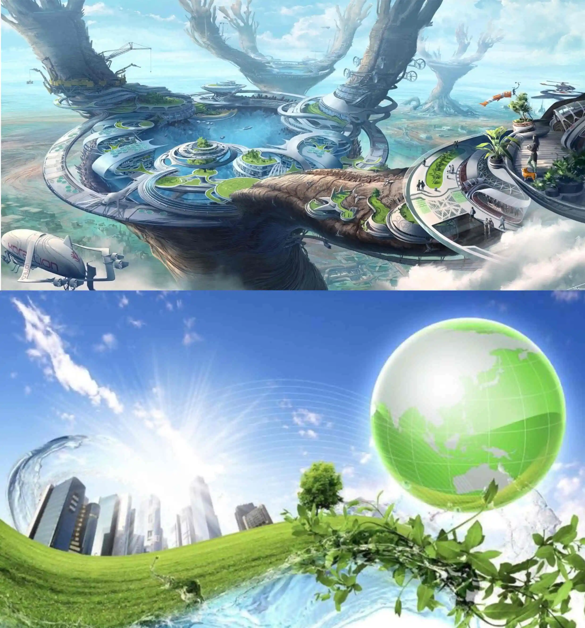
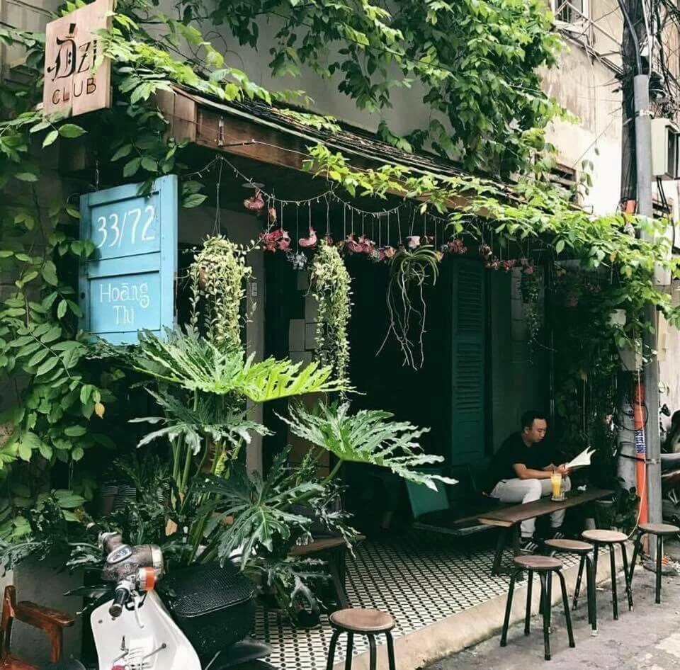
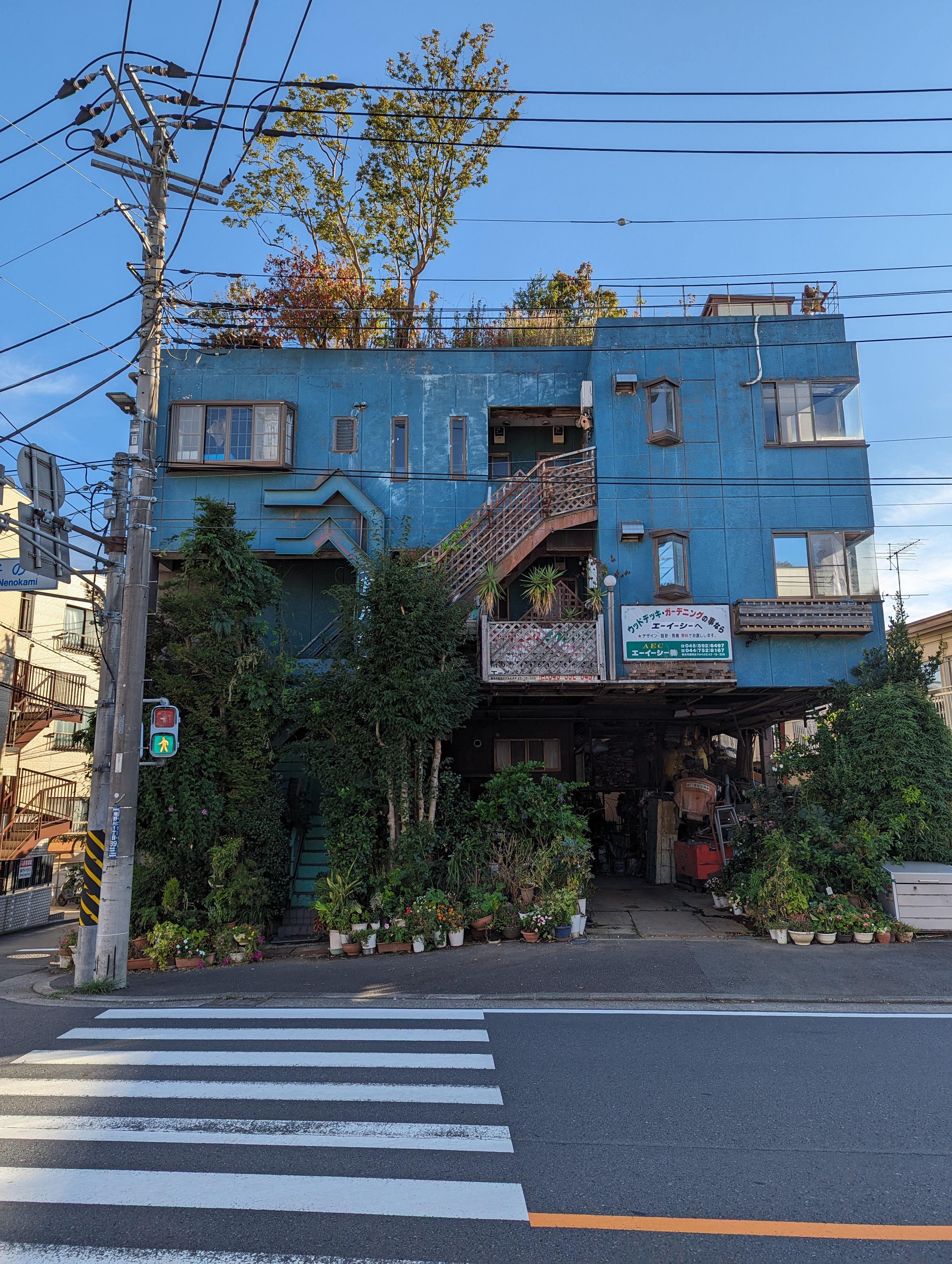
For me, it's hard to describe what an solarpunk building looks like, but this post has some extreme examples. Basically, for me I tend to look for:

  • Designs inspired by nature
  • Lots of color (instead of the grey cities tend to be now)
  • Greenery
  • Designs focused on human happiness, instead of prioritizing what looks most modern
  • Designs that promote a sense of community
  • Eco-friendly focus

Those below don't all hit all of those points, but something about these just seem like they would fit in a Solarpunk story world.

I would love to see what everyone else things of when someone says "solarpunk building." Please show me!

Friedensreich Hundertwasser

Friedensreich Hundertwasser was an Austrian artist, architect, and supporter of protecting the environment. Even his grass-roofed home(not pictured) in 1970 was self-sufficient; running off solar panels and a water wheel. As a blend of both his artistic side and his love for nature, his designs often look like something out of a fairytale, while often having greenery worked in.

“For Hundertwasser, human misery was a result of the rational, sterile, monotonous architecture, built following the tradition of the Austrian architect Adolf Loos, author of the modernist manifesto Ornament and crime (1908). He called for a boycott of this type of architecture, and demanded instead creative freedom of building, and the right to create individual structures.” Wikipedia

Image Source 1 | Image Source 2 | Image Source 3 | Image Source 4 | Image Source 5

“Satellite Set” by architect Javier Senosiain

Image sources (and more info)

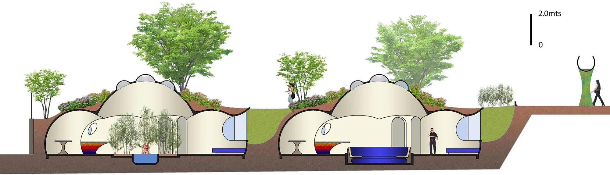
Architect Peter Vetsch

Images and More Info

The Termite Inspired Building

https://youtu.be/620omdSZzBs

How do you cool a building without air conditioning? Using an approach called biomimicry, see how architect Mick Pearce harnessed the ingenuity of termites to design a natural cooling system for the largest commercial building in Zimbabwe.”

Using the technology inspired by a termite mound, The Eastgate Centre in central Harare, Zimbabwe uses up to 35% less energy than other buildings.

4
6
ULTROS game (www.ultrosgame.com)
submitted 3 months ago* (last edited 3 months ago) by [email protected] to c/[email protected]

ULTROS is set in a multifaceted realm – a vast alien landscape teeming with life. Grounded in science fiction, ULTROS comes wrapped in both an eccentric art style from the visionary El Huervo, renowned for his work on Hotline Miami, and a mystical soundtrack composed and performed by Ratvader - Oscar Rydelius. ULTROS explores meta-themes of mental health, life, death, and karmic cycles through deep lore and environmental storytelling.

5
474
submitted 3 months ago by [email protected] to c/[email protected]
6
16
submitted 6 months ago by [email protected] to c/[email protected]
7
21
submitted 6 months ago* (last edited 6 months ago) by [email protected] to c/[email protected]
8
32
submitted 6 months ago* (last edited 6 months ago) by [email protected] to c/[email protected]

I feel like it's wrong to associate Solarpunk and Frutiger Aero aesthetics. I know that Frutiger Aero is a huge thing for a lot of us, i do feel appeal as well. And many time when i see solarpunk image i do see resemblances with some images of back then. But i feel that there is something bad about this. Wasn't it just a commercial hook to make us feel like capitalism is good and green ? i mean it principally exist as design for products or images campaign, it is a pure northern capitalistic aesthetic (the worst are the white hands handing the world or the new nokia https://aesthetics.fandom.com/wiki/Frutiger_Aero)
I'm confuse when i see it infuse in solarpunk...

btw i'm french so here is my original thought :

J'ai l'impression qu'il y a un problème à associer les esthétiques Solarpunk et FrutigerAero. Je sais que ce courant est assez important parmi nous, et en premiére ligne, j'avoue j'aime regarder ces images. Plusieurs fois en consultant ce qui est proposé pour le Solarpunk ca m'a fortement rappelé frutigeraero. Pourtant je sens que quelque chose ne va pas la dedans. Est ce que cette esthetique n'a pas toujours été qu'un pantin pour rendre le capitalisme attrayant, en nous faisant penser qu'il était écologique ? Ca n'a jamais existé que pour vendre des trucs, et pour moi c'est l'essence même du capitalisme occidental. (les mains blanches qui tiennent le monde ou le nouveau nokia sont vraiment cringe https://aesthetics.fandom.com/wiki/Frutiger_Aero) Je suis vraiment confuse quand a son mélange avec le solarpunk...

9
7
submitted 6 months ago by [email protected] to c/[email protected]

10
5
submitted 6 months ago by [email protected] to c/[email protected]
11
96
submitted 7 months ago by [email protected] to c/[email protected]
12
190
submitted 7 months ago by [email protected] to c/[email protected]
13
10
submitted 7 months ago by [email protected] to c/[email protected]
14
168
submitted 8 months ago* (last edited 8 months ago) by [email protected] to c/[email protected]

Cross-posted from [email protected] source

15
9
submitted 8 months ago* (last edited 8 months ago) by [email protected] to c/[email protected]

The DamiLee video that's been making the rounds generated some interesting conversation around the rather muddled aesthetics of solarpunk. It suggested that the lack of a coherent single aesthetic is a weakness for the genre, and I wonder about that.

I'd agree it's a genre with fewer big visual examples to point to, and which is being pulled in many different directions.

At the same time, I wonder if it's possible or even worth doing. I think it might be hard to get a good universal aesthetic going, especially in architecture, as solarpunk buildings should be built to fit their environment - what's practical, energy efficient, and even what materials are locally available will depend on where the scene is set. Our current society, with its wealth of fuel and concrete, tends to drop the same cookie-cutter building into every climate and just burn more fuel to heat or cool it rather than adapt the design. As cyberpunk isn't aspirational, the societies it depicts can do the same. But solarpunk would have to look very different in the desert than in a temperate rainforest, or a prairie. Similarly, clothing would have to vary as widely as there's cultures and climates.

The only universal solarpunk aesthetics I can think of are the ones I'm trying to compete with with my own art (generally the impractical utopian megacities with touches of green). I'd wanted to pull people's first impressions of solarpunk away from thinking it was an empty eco-utopian aesthetic, easy to dismiss like art of moon colonies or flying cities. I wanted to see if and think "hey why aren't we doing this?" I try to cover locations, industries, and seasons we don't otherwise see to show the genre has answers for that stuff.

Maybe that's why I'm asking this - because if the lack of a cohesive aesthetic is a problem at this early stage, then I'm deliberately contributing to it.

Despite my own art goals, I'd actually love to have a visual shorthand to make my art more recognizably solarpunk. I sometimes reference some of the AI art people post to find bits and pieces of aesthetics that don't change the message but hopefully pull it closer to what people expect (the solarpunk kitchen's dark wood-paneled interior and red accent wall came from that kind of search).

Over on reddit, someone suggested that architecturally we could try to work out a specific style for each biome, and some elements of design that could be universal to tie them all together somehow.

So what do you think? Can it be done? And does this matter? Is a cohesive overall theme necessary to build the genre and reach people or just a way for marketers and Hollywood to repackage the genre, make it safe, and sell it back to us, the way they did with cyberpunk back in the 90s when they picked it too early? They defanged it by utterly absorbing it, using it to sell everything they could, making it this joke aesthetic with no deeper message. Cyberpunk won in the end, infecting science fiction with its themes and eventually aesthetics, until now it's kind of the primary voice in the genre. But they pretty much killed it for a solid decade at the least.

16
27
submitted 8 months ago* (last edited 8 months ago) by [email protected] to c/[email protected]

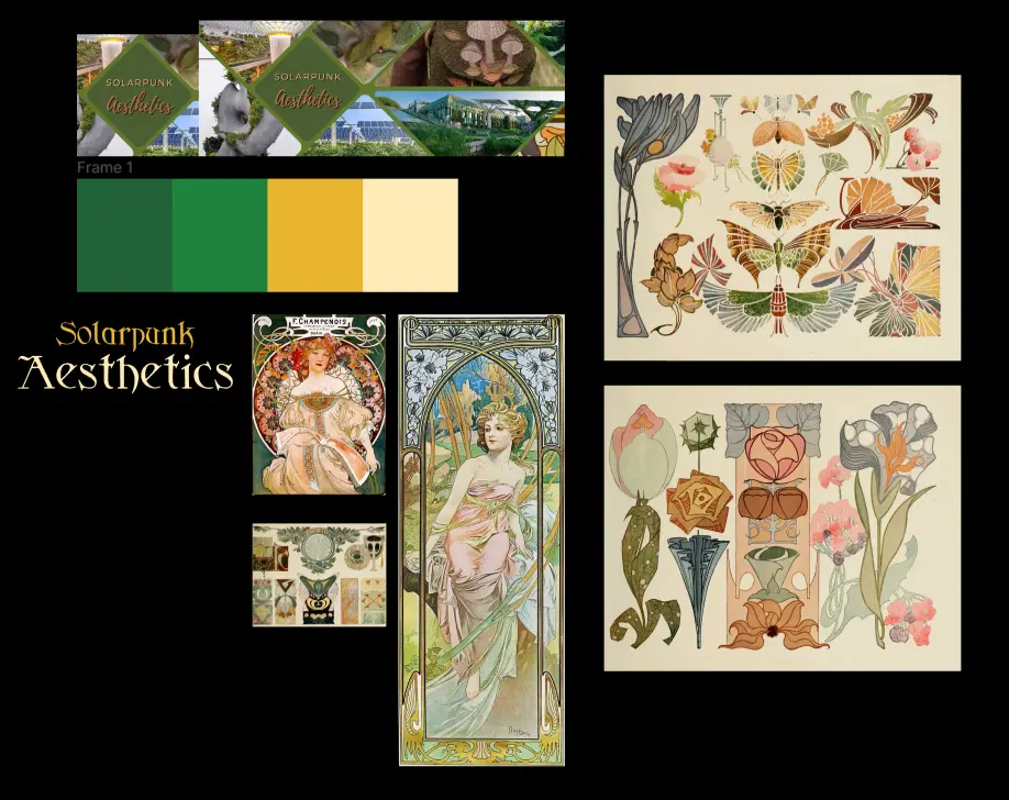
If you recall, @[email protected] offered in their last post to make a new banner and icon for the community, and I'm very happy to update them today!

They are currently taking graphic design commissions (icons, banners, posters, adds, flyers…), so if you want to commission a cool new icon, you can do so here. You should also definitely check their webpage, it's very cool.

Lastly, they did this for free, but if you happened to have some money to spare, you can donate some to them if you feel like it (you might have to get in touch with them). No need to feel obliged to do this, the banner will be ok to use regardless.

17
29
submitted 8 months ago by [email protected] to c/[email protected]

The font I used is https://www.fontspace.com/sidhe-font-f3649 (license should be fine for this use case)

18
12
submitted 10 months ago by [email protected] to c/[email protected]
19
14
submitted 10 months ago by [email protected] to c/[email protected]

Hi All!

I was recently traveling this weekend and happened to pass through the LaGuardia airport. The terminal I was in had a really pretty floor to ceiling fountain that was used as projection screen creating the illusion of a 3D hologram.

While I'm not a digital artist, I think including "holograms" like this would be a great way to meld futuristic technology into a green focused cityscape.

what do you think?

Brighter Futures Ahead, houston

20
8
submitted 10 months ago by [email protected] to c/[email protected]
21
9
submitted 11 months ago* (last edited 11 months ago) by [email protected] to c/[email protected]

Can y'all link me to some images for inspiration on how people of solarpunk would dress. I am considering collecting an outfit just to look good. I am a man, but female clothing also includes some nice pieces.
P.S. of course, the clothes will be second hand and mended when necessary.

22
10
submitted 11 months ago by [email protected] to c/[email protected]
23
14
Reclaimed Car Park (i.imgur.com)
submitted 1 year ago by [email protected] to c/[email protected]
24
4
submitted 1 year ago by [email protected] to c/[email protected]
25
3
submitted 1 year ago by [email protected] to c/[email protected]
view more: next ›

aesthetic

487 readers
2 users here now

Wecome to the aesthetic community of solarpunk, where everything that reminds you of it has a place, be it visual, audible, fashion or anything else!

Remember to follow the instance rules when interacting, and also:

-Cite the author whenever possible, or state it as unknown when unsure.

-We have a sister community where solarpunk artwork is posted, /c/art, so even though art is also welcome here, keep it in mind when posting.

-Keep it SFW.

Hope you enjoy your time here! :D

As a last thing, kindly reminder that solarpunk is not just a form of artwork/aesthetic, but also a mindset and a movemet. For more on this, you can check our community /c/solarpunk.

Banner and icon courtesy of solinus.

founded 2 years ago
MODERATORS