Fuck drunk drivers
Mrjelly13
joined 1 year ago
Card 3 is called card 2
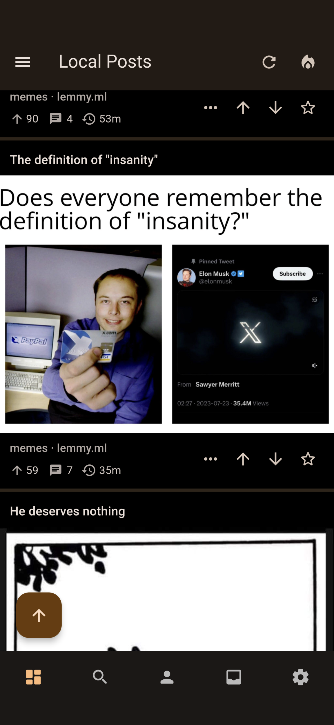
It might look better with square cards? Idk if that's something you're thinking about implementing at some point as an option.
Here's an example from the thunder Lemmy app.

Would it be possible to have something like a card 3 option where the title is above the image, but everything else is under it?
I also found a bug. If you use card 2 any of the image settings crash the app when toggled on or off.
If you have blur nsfw posts set to show they are still blurred in the saved section. Same with user profiles.
You do, but that's in the constitution.