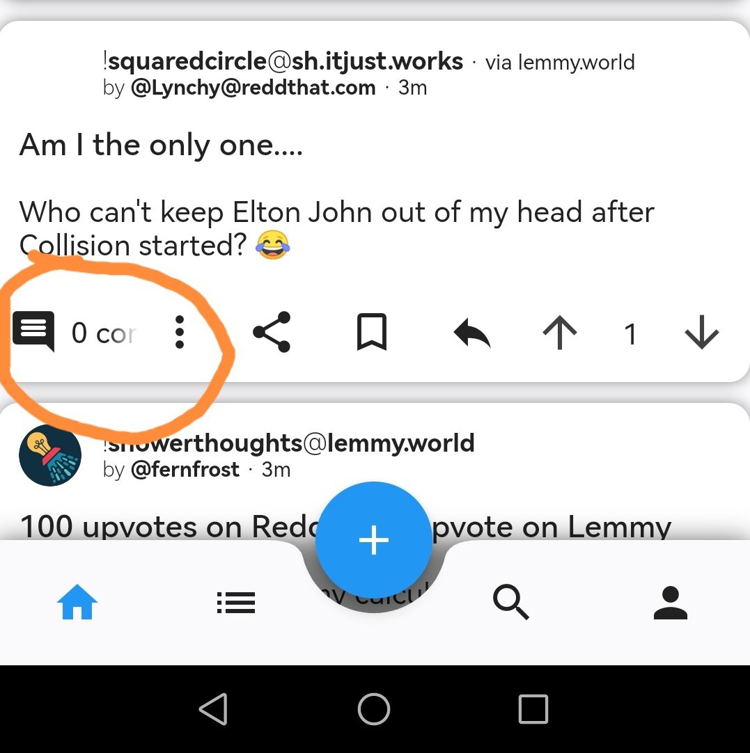
Same
this post was submitted on 18 Jul 2023
19 points (95.2% liked)
Liftoff!
4352 readers
1 users here now
A mobile client for Lemmy running on iOS and Android
founded 1 year ago
MODERATORS
Interestingly, I'm missing 2 of the buttons you have. Perhaps it's a setting?


Non issue here. Galaxy S10+ I do have some scaling settings customised in my phone to for more content on screen.
That's a good tip, if I change the scaling from default to small it all fits. I'd rather not do that though, especially considering it looked fine on default yesterday :)
I have a S22 and it's set to whatever the default is for screen scaling and I have no issue. It looks just like yours.
