17
Pangora-UI Day 4 Progress (programming.dev)
submitted 1 year ago by [email protected] to c/[email protected]

Back with another update on programming.dev's new frontend thats being built

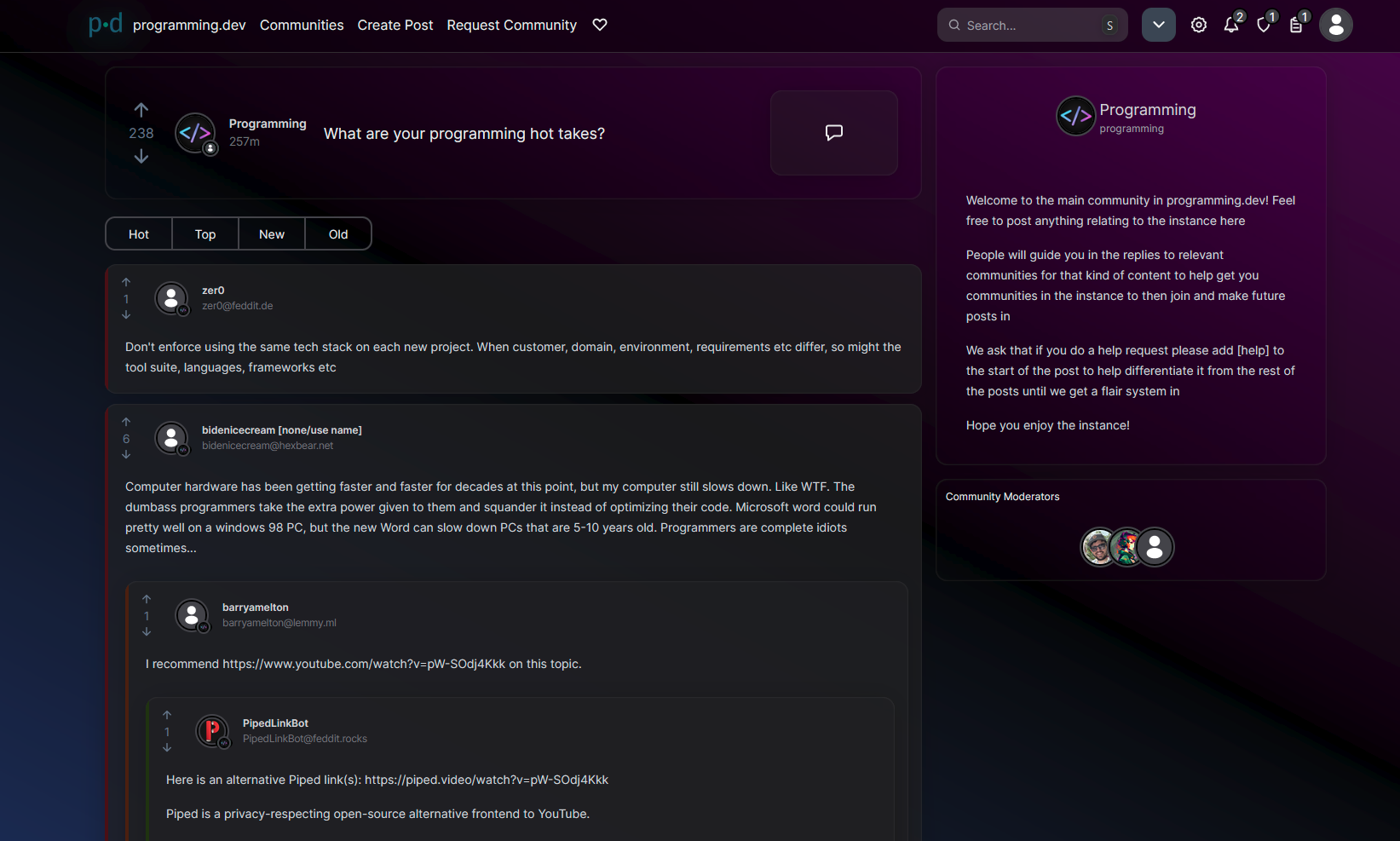
Have a lot more progress done in terms of post content. Post views are almost done, just need to finish up some more aspects of the comments + add in mod options

New features since my last post

  • Posts can now be viewed
  • Comments are shown when looking at posts

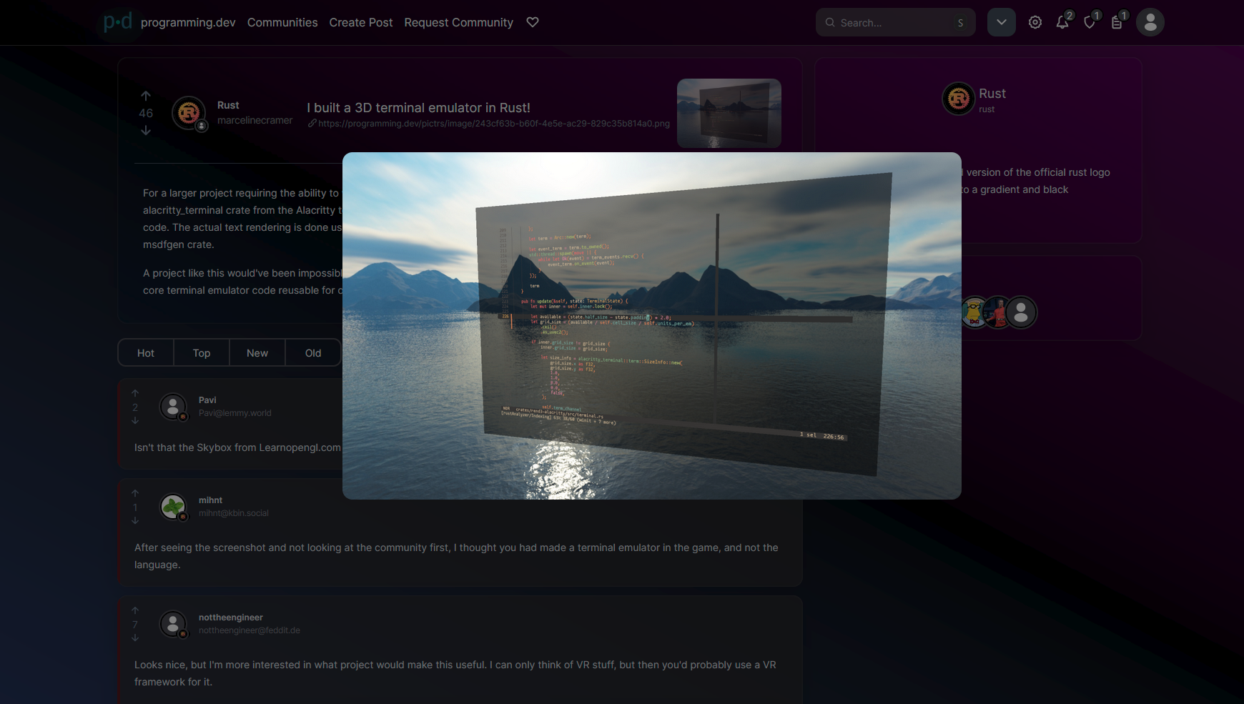
  • If a post has an image, you can click on the thumbnail to get a larger image popup

  • Comments can be collapsed/expanded by clicking on the colored bar on the side (and are automatically collapsed if they have a score of 0 or below). Collapsed comments show the upvotes, the creator, and up to 100 characters of the content

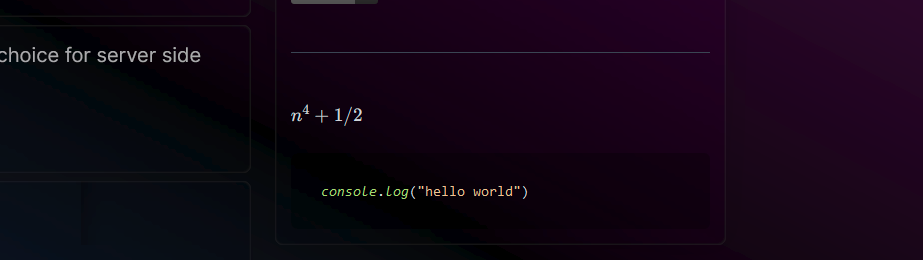
  • Markdown is supported in the sidebar and in messages. This has all of the markdown in lemmy-ui + some extra ones. The extra markdown is: code blocks, latex, table of contents, task lists, and anchors

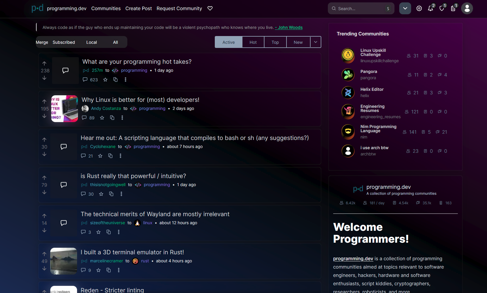
  • The home page was improved a bit in terms of design and has had trending communities and the sidebar added to it. (The post sorts are still a work in progress hence why they look unfinished + are two different designs)


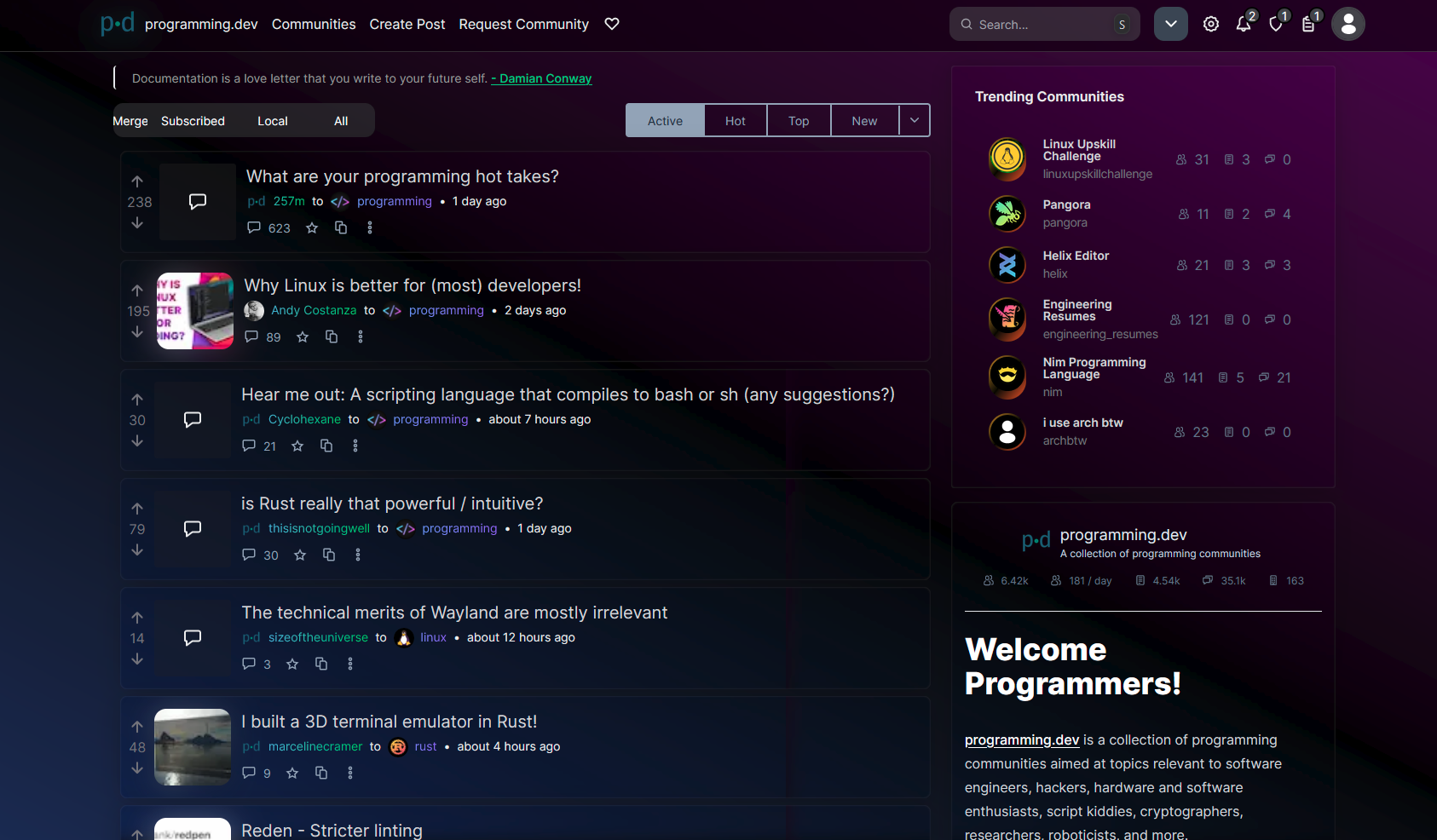
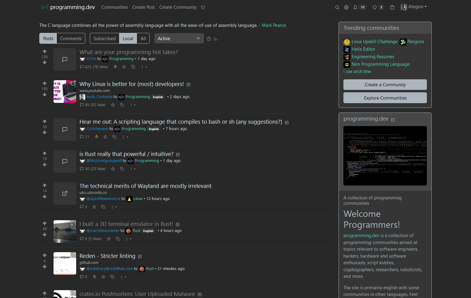
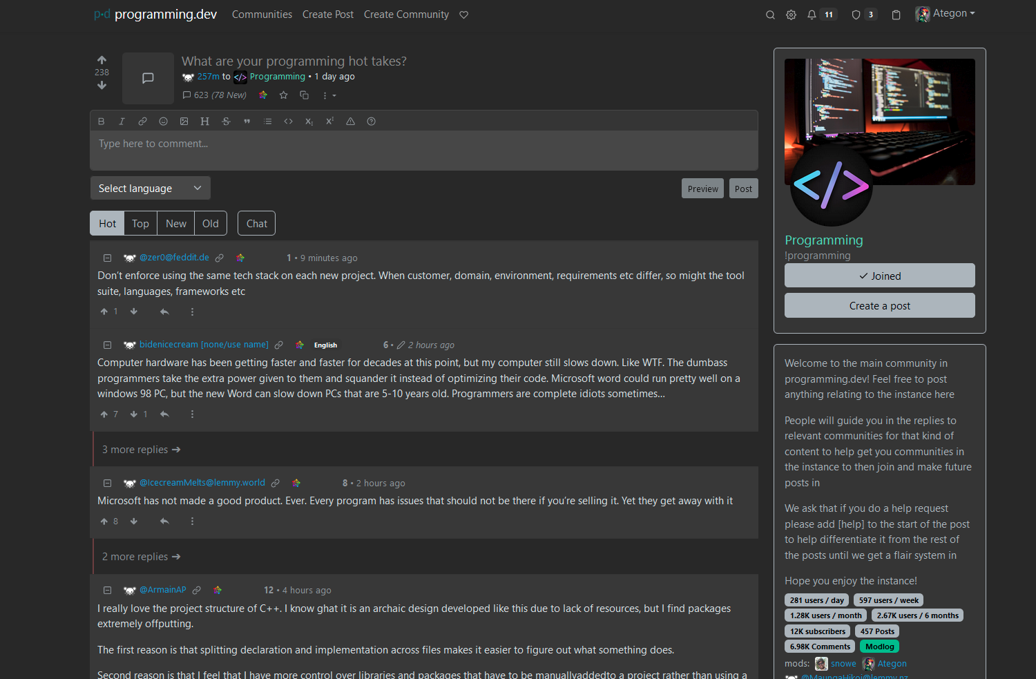
Here are some comparisons between Pangora-UI and Lemmy-UI!

top 10 comments
sorted by: hot top controversial new old
[-] [email protected] 4 points 1 year ago

Can we have a little less whitespace? We should definitely keep the larger images and icons though.

It looks slick, but I love me some information density

[-] [email protected] 1 points 1 year ago

Whitespace in terms of the bars on the side, the sidebar, padding between elements, or all of the above

[-] [email protected] 1 points 1 year ago

There's lots of whitespace on the right side of the username and details The padding could be more judicious instead of applying it nearly uniformly everywhere, specially in the comment area. Eg: we don't need the cascaded buffering on the right hand side. A tiny padding there would serve try same purpose as a wide one

Sidebar looks nice and wide in new design

On a horizontal display, it'd save space if the elements are arranged horizontally like the original design. On a vertical display, it makes sense to limit information in horizontal to NY make it feel cramped

[-] [email protected] 1 points 1 year ago

Ah yeah the area to the right of the username is going to get filled up, just havent added the timestamp and post options yet. (and there will be more in that area as well once flairs get added). Ill edit the padding values

[-] [email protected] 3 points 1 year ago

That new UI looks really slick ๐Ÿ‘Œ

[-] [email protected] 1 points 1 year ago

Holy shit, that looks great!

[-] [email protected] 1 points 1 year ago

now that's beautiful

[-] [email protected] 1 points 1 year ago

Looks nice, dark enough to not Dark Reader enabled too, great work.

Got a question/request though, when clicking on the comments will it take it to the post page, or will it show up as an overlay without redirecting? Would be a nice QoL if it just popped up a window showing the post with comments while still staying on your page.

[-] [email protected] 1 points 1 year ago

Clicking on the comments as in clicking on the comment button on a post in the post feed? Currently has no behaviour but was just going to make it redirect to the post

I was thinking of having a little popup showing info on hover but if I add comments into that it could turn into a lot of http requests if someones just dragging their mouse over all of them really quickly. Could try adding it in with a 4 second delay before it shows or something

[-] [email protected] 1 points 1 year ago

How you would like to implement, whether by hover with a delay or by clicking on a "preview" wouldn't really make a difference, though I think a button would be better for allowing actions such as scrolling and replying to comments. The idea is to essentially show the same thing as if you were to open up the post on a new page, just that you would still technically stay where you are so that you can continue scrolling. The alternative is to open up a new tab for every post you want to read.

this post was submitted on 02 Sep 2023
17 points (100.0% liked)

Pangora

129 readers
1 users here now

๐Ÿ An activitypub compatible forum and link aggregator. Downstream from Lemmy.

https://github.com/PangoraWeb

Kanban board


Info

Info

Pangora is the name of the lemmy soft fork thats being primarily worked on by members of programming.dev. Its aimed so that we can add features on top of lemmy and prioritize them based on what the instance needs while still being able to push changes upstream to lemmy if they accept them.

This also makes us more decoupled from lemmy so that if anything major happens to lemmy we can keep going with maintaining the site without any issues.


Credits

Credits

Icon base by Lorc under CC BY 3.0 with modifications to add a gradient


Pangora

Pangora-UI


founded 1 year ago
MODERATORS