9
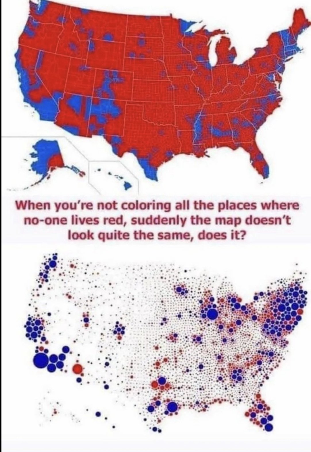
See This Red Area? This Is Sand
(lemmy.world)
cross-posted from: https://lemmy.world/post/17777580
cross-posted from: https://lemmy.world/post/17777580
the only reason republicans win is because you allow your land to vote. it's unbelievable.
Frankly both of these maps are deceptive (though the top one is albeit more so). The dot gets colored the primary color in that region, and visually makes the Democrats seem way more dominant when it's much more bipartisan. A gradient would make this map better
Yes, all it takes is small critical details to influence the desired reception of a presentation of data. A goal of a good map or any statistical based representation is not to operate as means of propaganda, but rather by letting the viewer decide the correlation based on making the actual data easy to understand without deceiving in an appealing way.
Yep, each area needs two dots, one red, one blue, sized proportional to their votes.
Florida will get quite a bit bluer, but California and the northeast will get much redder.
I like to point out that cows don’t vote.
[Grerrymandering intensifies]
Counterpoint: the vote is near to 50/50 and neither of those maps look anywhere close to 50/50. Come back when you've got an alternative that looks proportional, not equally bad just the other way.
For the map enthused!
Rules:
post relevant content: interesting, informative, and/or pretty maps
be nice