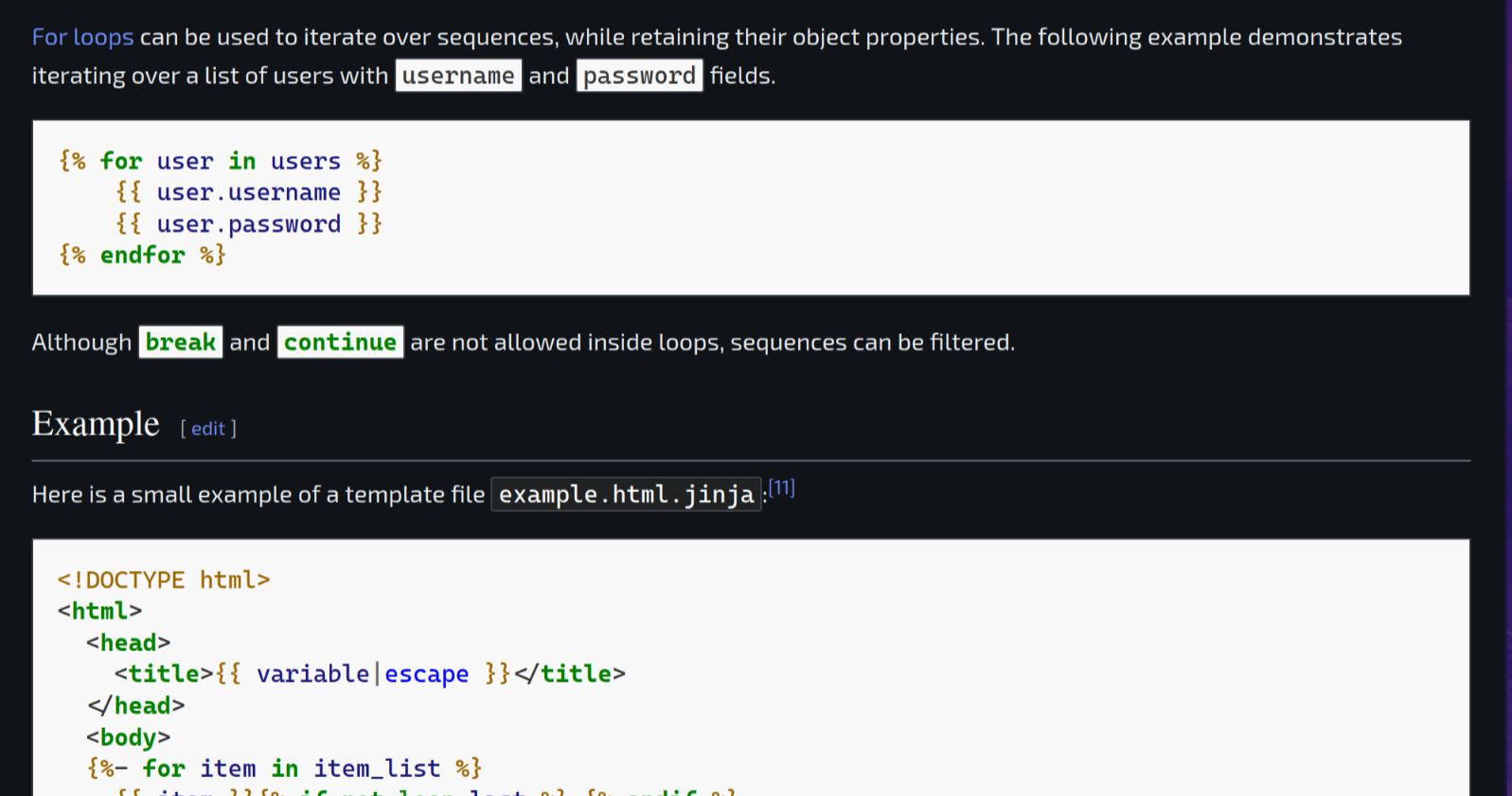
Dark Reader Plugin already solved that issue.
Technology
This is a most excellent place for technology news and articles.
Our Rules
- Follow the lemmy.world rules.
- Only tech related content.
- Be excellent to each another!
- Mod approved content bots can post up to 10 articles per day.
- Threads asking for personal tech support may be deleted.
- Politics threads may be removed.
- No memes allowed as posts, OK to post as comments.
- Only approved bots from the list below, to ask if your bot can be added please contact us.
- Check for duplicates before posting, duplicates may be removed
Approved Bots
Native dark modes are better and have much less of a performance impact. It’s good as a stop gap though.
Native dark modes are better
Agreed. Well, I don't know if it'd deal with random images as well, as users can upload those.
and have much less of a performance impact.
For a number of sites, you can just get away with running Dark Reader in static mode and it works well enough. Considerably faster.
EDIT: Actually, thanks for reminding me. I've never donated to Dark Reader, and it looks like they ask for a $10 donation if you use it regularly, and that plugin has dramatically improved my Web-browsing experience. Going to do that now.
Also just donated
Dark reader team be like "Guys! We're eating pizza tonight!"
Maybe. Does it make a big performance difference which css (dark reader or delivered by wiki) is used?
Is it known how the default to dark mode setting is persisted if let's say a plugin removed all the Wikipedia cookies on window close? A get or post parameter?
Either way it's a good thing that wiki offers a dark mode.
Dark reader is one of the heaviest extensions you use, lots of dom modifications. It also passes around far too much data between processes.
lots of dom modifications
That's good to know. These modifications are needed to replace the style sheet details, I guess?
passes around far too much data between processes.
What does this mean? Do you have a link where I could read up on the details? Thanks.
Yeah, Dark Reader is a godsend. I just got tired of all the light mode webpages and took matters into my own hands.
Not a fan of dark reader. It has a weird blue tint to things. I much prefer Dark Background and Light Text. That extensions has a true black background.
Is ot jyst me or does dark reader do formulas wrong on wikepedia for u as well?
All I want is “follow system theme” for us light mode at day, dark at night fellows.
They added that too!

Cool
So, if I'm reading this right it's basically just a 17 paragraph essay that boils down to, "Sorry we suck at CSS and it took us a decade to finally get around to rooting out all the random shit from 2014 that was hard-coded to display as rgb(0,0,0) or whatever, which was a capability that in retrospect we really shouldn't have handed out like candy?"
The TV Tropes wiki has managed to have a built in dark mode for at least the last 7 years. TV Tropes. Come on, guys.
I'm baffled by the section about "making a shortcut that darkens all the colors on the page." I'm positive that's the intent of that entire blurb, to dazzle people with bullshit in the hopes that they won't ask Hard Questions, because no competent designer would ever try such a thing. It is a self-evidently moronic idea. You don't fuck with elements you didn't create and don't control, like images and color swatches.
There are only really two viable possibilities, here:
- If arbitrary user definable, hard-coded colors in content are permissible, you'll have to accept the fact that the cards will fall where they may and some instances will inherently be suboptimal in either light or dark modes, or...
- Accept that you won't allow users to hard-code colors into anything outside of specific elements where that usage is valid, so users will just have to suck it up and pick from a list of preapproved color combinations with light and dark mode renditions.
The TV Tropes wiki has managed to have a built in dark mode for at least the last 7 years. TV Tropes. Come on, guys.
It'd be kind of interesting to have a "dark mode spider" that crawls the Web and checks to see what percentage of websites support the browser-requested dark mode. I'd be kind of curious to see how far along we are.
I mean, people have done it for stuff like IPv6 support for a while.
Didn't Google's lighthouse have a metric for that? "Colour Contrast ratio" or something?
Not familiar with it.
goes looking
Oh, it's a tool that you run on one page, rather than a spider to try to gather statistics on the Web as a whole. But, yeah, that run en masse could maybe gather that kind of information.
Isn't #2 the only option?
Websites specifying color for foreground (or background) and assuming browsers will use whatever color they're expecting for the other has always existed, and still exists
If you're getting fancy and specifying colors, you can't cheap out and not specify all colors
If the browser ignores all your colors at that point, then it's displaying as the user intended
If you only specified some of the colors, it's a bug of the website
But why the buttons? Just use
media (prefers-color-scheme: dark) {}
done. The js-solution doesn't seem to auto-adapt for me.
Come to the Dark Mode: we have more accessible comprehension
I hate the pop up about it though. If I care that much, I’ll find it. Don’t use advertising tactics.
I'd rather be informed with a popup than have to remember to periodically check the settings in case they've maybe added dark mode. Tying this to "advertising tactics" is, well, ridiculous – they're informing users about a new feature they might not otherwise learn about, not selling literally anything
Surely there’s a better way than creating a floating modal dialogue in front of the content I came there to read.
I use FF Focus (new private mode always) so EVERY TIME I GO THERE the popup is there. A bit annoying.
I don’t mind the pop up as much as I mind it being a pop up that tells you to go to another menu to change the setting. Why not just put the setting in the pop up?
i think the pop up is necessary as long as the button to open the appearance menu is still the incognito icon for whatever reason
Oh wow, finally!
💀 mfw I'm waiting for the mozilla team to do the same with their help forum.
It does look like you currently need to be logged in to set the setting or set it each time (or, I assume, have your browser retain persistent cookies); the default is light. It'd be kind of nice if it just used the browser "light" or "dark" preference.
Maybe this is just temporary; they do say that the dark mode is "beta".
Can't imagine a scenario in which a person avoided using Wikipedia all their life till now just because things looked a bit brighter on screen.
Dark mode makes things easier for its existing userbase (practically anyone with an internet wanting to learn) but that's that
Maybe not avoid using entirely, but I can easily imagine someone that can't use it for more that 10 minutes or so because the brightness causes them headaches.
Ah, well, if you can't imagine it, then all those people with visual impairments who haven't been able to read the content previously simply must not exist! 🙄🤦♀️
I guess I'll stick with dark reader for now

Only skimmed the article: why did their initial theme color solution affect the media contents like international orange? Feels like that would be a non-starter…
I've always been kind of curious: am I weird because I prefer light mode for web pages with a lot of text to read? Or is it more of an age-gated thing, like older people who grew up reading printed texts only prefer what's familiar to them? I'm fine with YouTube (for example) having a black background and dark theme, but I even browse Lemmy via old.lemmy.world in light mode!
The irony of me opening the article and being immediately blinded by the eyesore white page.
If by trying to change just the color of text and its background, images and other containers would change color too that mean it is a css tagging issue. It is really trivial to correctly color just text and its container with dark theme leaving "custom" things hacked in html inside the page with light theme, people will contribute to make them darkable afterward.