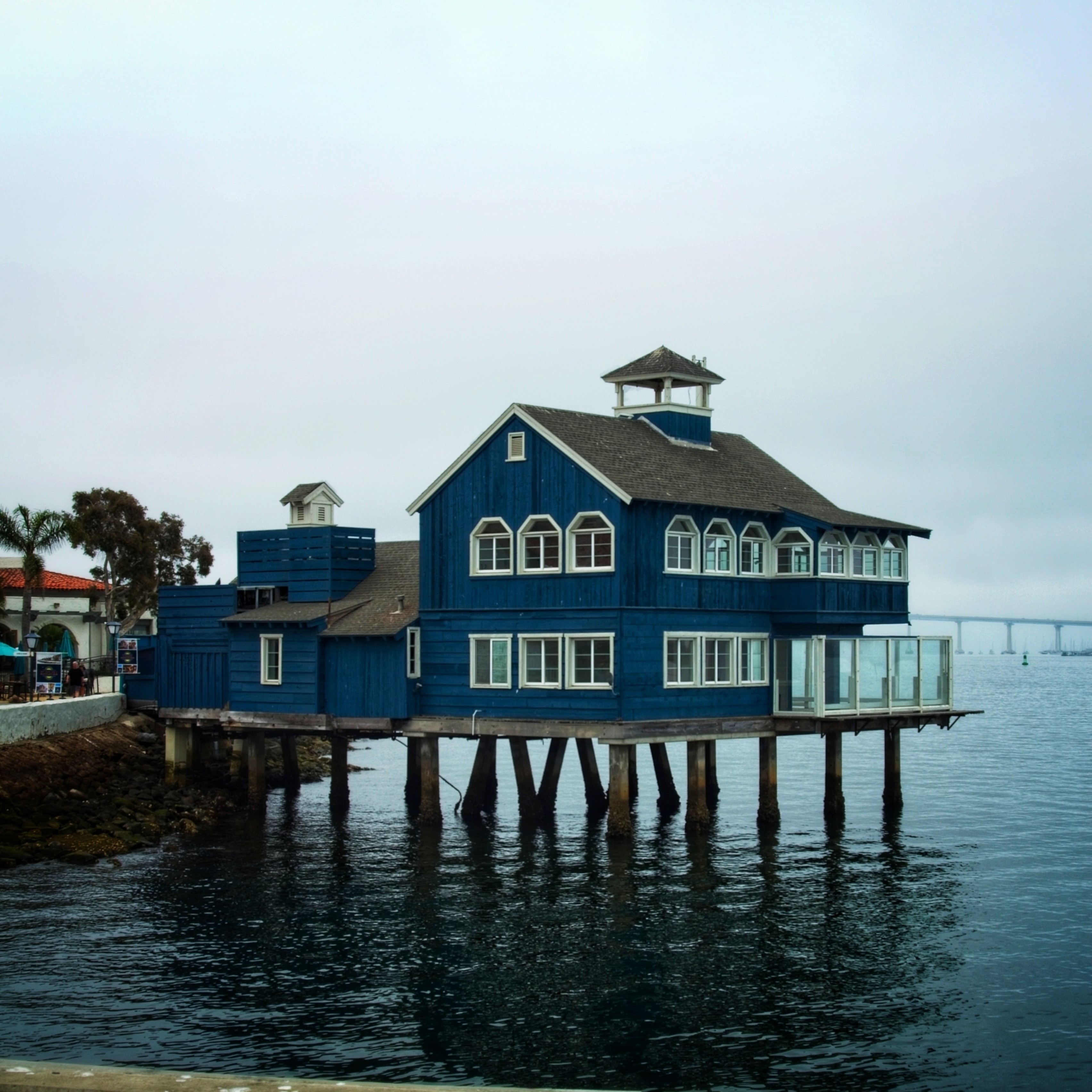
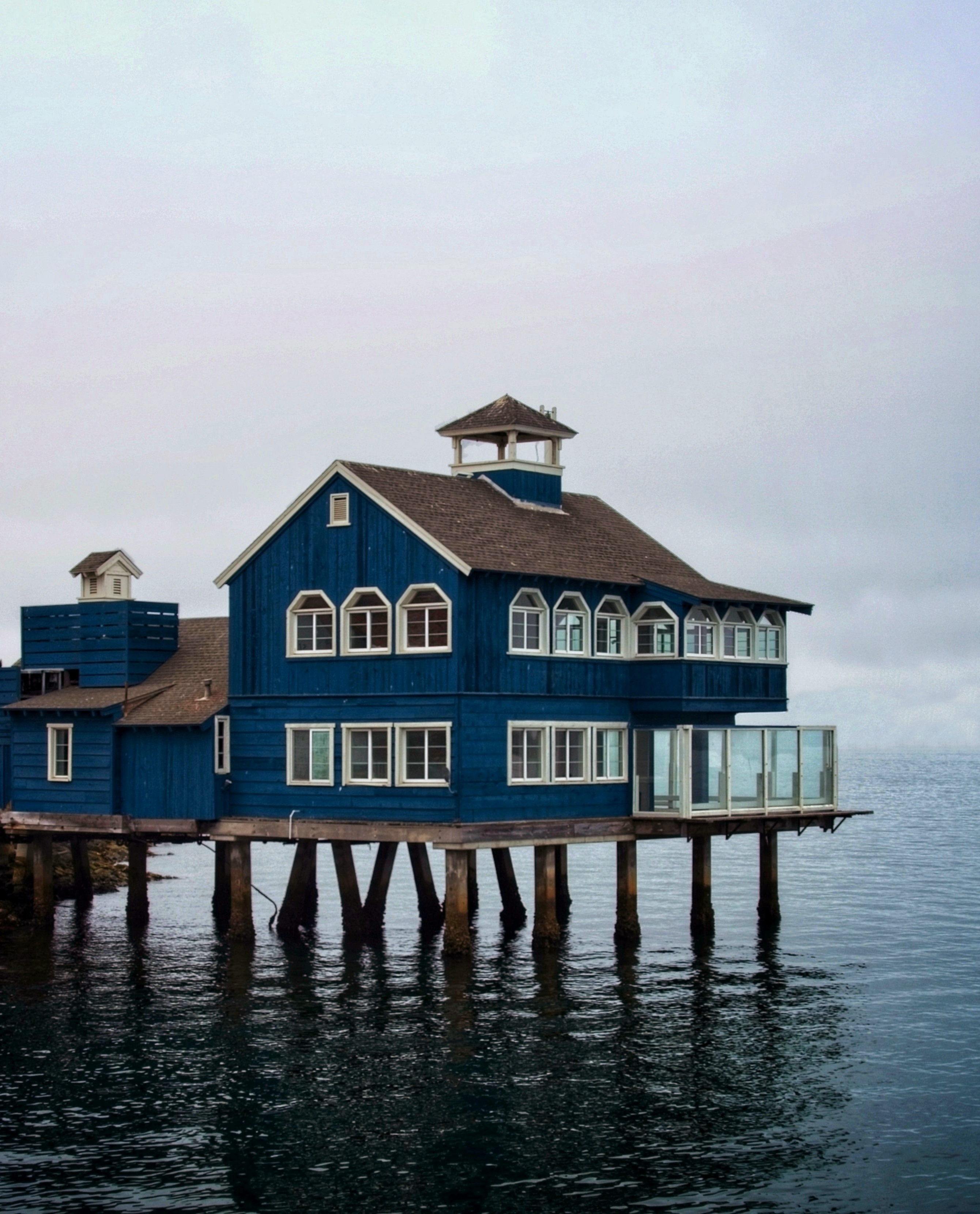
I assume you mean critique on the picture itself and not the house? In that case, these are my pointers:
I would have cropped out the railing on the bottom. There's also a lot of sky in the picture, which is a little over exposed. This leaves the house itself muted and flat. Maybe playing with the levels can fix this and bring out more details.
The angles and location are limited in a case like this. But I feel this isn't the best angle. The shore side on the left is distracting, especially with the orange roof there. It would be better if it showed more of the water, to give the impression the house is actually on the water.
Otherwise, neat picture! Good find and excellent subject for photography.


