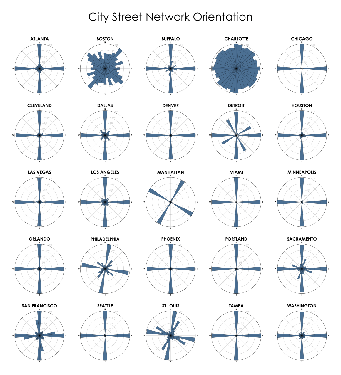
24
City Street Orientation Visualization
(lemmy.cringecollective.io)
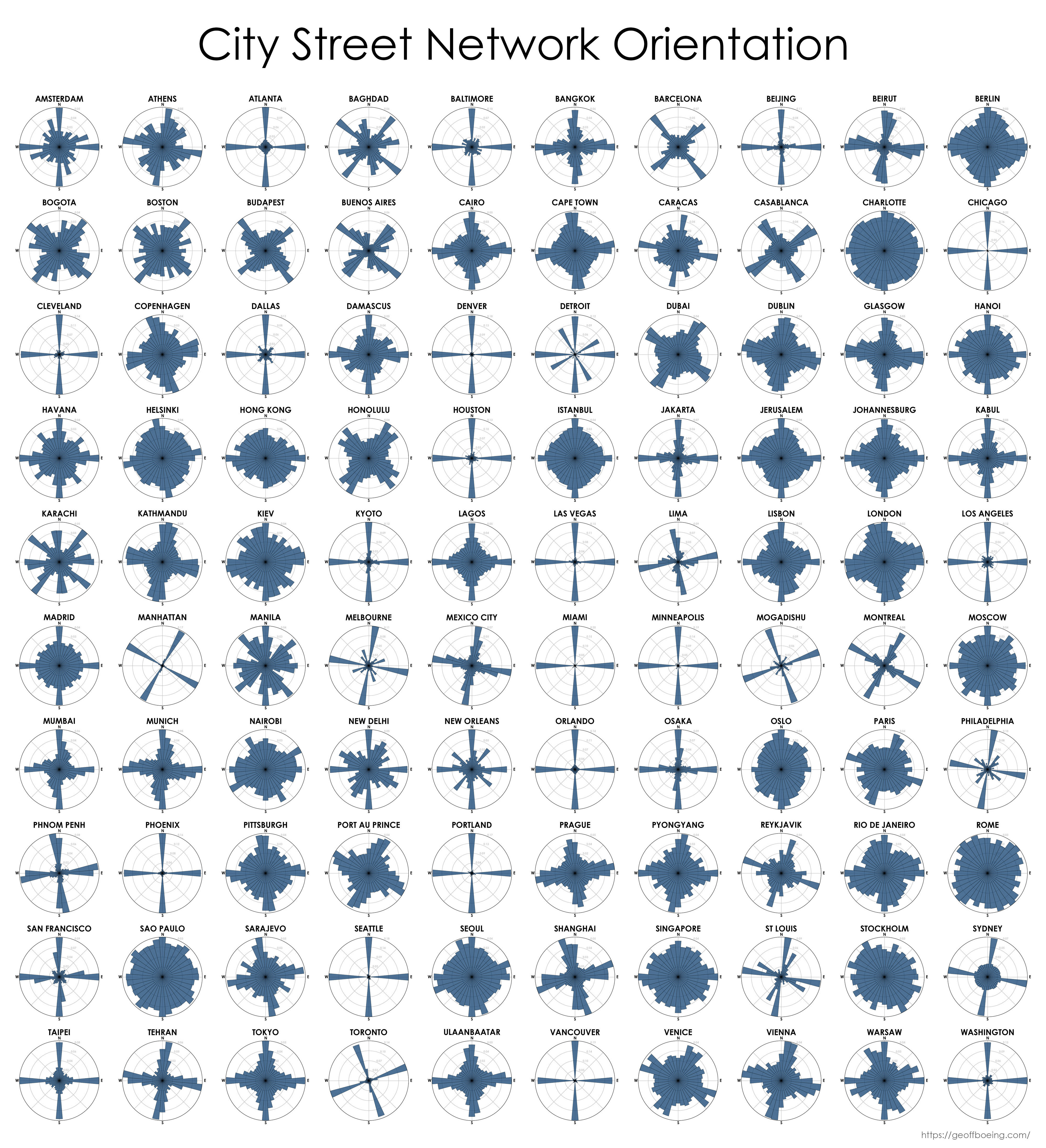
Here's one that includes more cities around the world
God dammit, Rio 💀
Probably correlates fairly tightly to the age of the city.
More like how organically (or slowly, if you will) it grew and how walkable it is. I suspect the ones that looks like crosses are made mostly for car traffic.
I'm pretty sure that the blobby ones are more than 1500 years old while the ones that look like crosses are just a few hundred years old.
*looks at orlando*
Yeah this data is bullshit lol. Or it’s looking exclusively at the city center and not the city as a whole
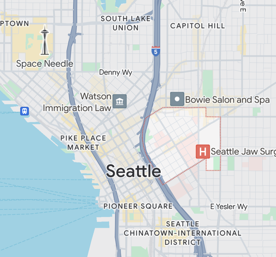
Even that doesn't hold up. See Seattle's city center.
Showing Atlanta the same as Denver means the level of abstraction is so high as to make this meaningless.
East coast cities are more chaotic than this implies, because of time and growth patterns.
Denver was first aligned along the river, then a NS grid later, which this graphic doesn't show at all. So while it's primarily a grid, it's 2 grids, one that's rotated about 45°.
I've driven in a number of these cities, and this graphic really doesn't reflect the on-the-ground experience.
Make fun of Charlotte all you want. It's the only one here that passed its standardized Scantron tests, since it's the only one that colored that circle fully in.
I wish this map weighted streets for density. Seattle is mostly NSEW as portrayed in the plot, but the downtown core famously has two competing grid systems.
Yeah, I think it's something you see in any city built in the last several hundred years that's near water and engaged it maritime transport. Recent enough that we discovered that the grid system makes sense and simplifies things, and near water which gives one rational orientation for the grid, coast aligned centered around the port, ripe to conflict with the other "north south" sensible alignment.
If you look at Detroits roads, it's got three grids, one north-south, one aligned to one part of the coast, and another smaller one aligned to a different part of the coast. It's also fun because you can still see the faint remnants of when the roads were a radial spoke system built around the original french fort that caused the city.
Manhattan never gets far enough from the coast to switch.
It makes me wonder about cities with notable rivers built after the grid system. Do they align to the river, or just build bridges and pretend it's not there?
Having driven in a handful of these cities, I would say that Charlotte's is grossly inadequate at describing the sheer chaos that city is.
My cousin lives there, and he's a cousin I enjoy very much. It's a running joke that I must love him a lot if I'm willing to get within fifty miles of those roads. I swear by all that's holy, if he ever moves, I will never enter that city again.
DC, Pittsburgh, Philly, Atlanta, Savannah, Baltimore, Cleveland, Asheville, Nashville, Knoxville, I've driven in all of those anything from a week to a year+, and none of them match the sheer psychotic horror that is Charlotte's roads (and drivers).
Any of the cities I've spent a day or two in are the same.
If the graphs here are indicative of anything other than road orientation, I will never go to Boston without a tank and plenty of ammunition for it. No way would I deal with Charlotte level fuckery and a bunch of damn yankees honking in their strange language through their nose as well.
Boston is just the worst to drive in.
At least the drivers don't just sit at lights when they turn green. Your ass is getting honked at in under half a second.
A whole half second?
In this day in age when MFers are on their phone and will sit out a whole ass green light watching some fucking Mojo top ten you bet your ass I’m honking when it goes green
Just don't be the mofo watching the cross lights and honking as it turns green, give them at least a half second.
Brother I’m ready to stomp on that loud pedal AWROOOO
My current car hauls so much ass that I sometimes enjoy waiting a second to annoy someone and then hit the next light before they cross the line.
Ah, that explains Boston.
That’s what happens when a city never gets a chance to burn to the ground and start over.
A place to share and discuss visual representations of data: Graphs, charts, maps, etc.
DataIsBeautiful is for visualizations that effectively convey information. Aesthetics are an important part of information visualization, but pretty pictures are not the sole aim of this subreddit.
A place to share and discuss visual representations of data: Graphs, charts, maps, etc.
  A post must be (or contain) a qualifying data visualization.

  Directly link to the original source article of the visualization
    Original source article doesn't mean the original source image. Link to the full page of the source article as a link-type submission.
    If you made the visualization yourself, tag it as [OC]

  [OC] posts must state the data source(s) and tool(s) used in the first top-level comment on their submission.

  DO NOT claim "[OC]" for diagrams that are not yours.

  All diagrams must have at least one computer generated element.

  No reposts of popular posts within 1 month.

  Post titles must describe the data plainly without using sensationalized headlines. Clickbait posts will be removed.

  Posts involving American Politics, or contentious topics in American media, are permissible only on Thursdays (ET).

  Posts involving Personal Data are permissible only on Mondays (ET).
Please read through our FAQ if you are new to posting on DataIsBeautiful. Commenting Rules
Don't be intentionally rude, ever.

Comments should be constructive and related to the visual presented. Special attention is given to root-level comments.

Short comments and low effort replies are automatically removed.

Hate Speech and dogwhistling are not tolerated and will result in an immediate ban.

Personal attacks and rabble-rousing will be removed.

Moderators reserve discretion when issuing bans for inappropriate comments. Bans are also subject to you forfeiting all of your comments in this community.
Originally r/DataisBeautiful