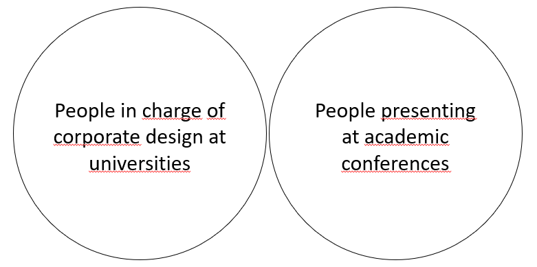
Universities have 2 templates. One was designed by a contracted designer. It features the company logo, and only works in recent versions of PowerPoint. Everyone struggles adapt the template to anything useful. The other was designed by a math professor, it uses the school colors, but is otherwise pretty much default. He receives emails periodically with people asking to update the template, which he promptly deletes. Neither of these templates is aware the other exists, they are simply never in the same room.
Science Memes
Welcome to c/science_memes @ Mander.xyz!
A place for majestic STEMLORD peacocking, as well as memes about the realities of working in a lab.

Rules
- Don't throw mud. Behave like an intellectual and remember the human.
- Keep it rooted (on topic).
- No spam.
- Infographics welcome, get schooled.
This is a science community. We use the Dawkins definition of meme.
Research Committee
Other Mander Communities
Science and Research
Biology and Life Sciences
- [email protected]
- [email protected]
- [email protected]
- [email protected]
- [email protected]
- [email protected]
- [email protected]
- [email protected]
- [email protected]
- [email protected]
- [email protected]
- [email protected]
- [email protected]
- [email protected]
- [email protected]
- [email protected]
- [email protected]
- [email protected]
- [email protected]
- [email protected]
- [email protected]
- [email protected]
- [email protected]
- [email protected]
- !reptiles and [email protected]
Physical Sciences
- [email protected]
- [email protected]
- [email protected]
- [email protected]
- [email protected]
- [email protected]
- [email protected]
- [email protected]
- [email protected]
Humanities and Social Sciences
Practical and Applied Sciences
- !exercise-and [email protected]
- [email protected]
- !self [email protected]
- [email protected]
- [email protected]
- [email protected]
Memes
Miscellaneous
The Marcom dept takes calls from these two populations daily. They have an official template used for dean presentations.
They are not sharing it for many, many good reasons. And a few hilariously shitty ones.
What's with your spell check?
It must be set to a language that isn't English.
low-key might use this for future memes - there's an uncanny quirkiness that draws the attention hahaha
don't - it just looks ugly

all memes are beautiful.
People use power point for academic presentations? I thought it was either beamer or, if you are a hipster scientist, reveal.
Never heard of any of those
OK, beamer
Beamer is for Latex to crate presentations
Every presentation I have ever seen at university was a PowerPoint, never seen beamer or reveal
Beamer popular with people that need to add lots of equations. It's easier/quicker if you know your greek alphabet and have several equations.
Beamer is the slide equivalent of latex. Even among latex users, PowerPoint seems more popular. If you've written the paper and are going to present it, you can just take the equations from the paper as screenshots so the big advantage of beamer is nulled.
I think reveals target market seems to be web developers. It's html slides so might be easier if you want that workflow.
Thanks for the explanation, I probably would never have looked it up lol
I actually do use beamer for most presentations, but all universities I've worked at only ever provided templates for PowerPoint. My solution to this has been to just write a .sty file that makes it look similar (and leaves out the over-designed garbage that the templates tend to contain).
Edit: I've tried reveal, too. Didn't hate it, but it makes some things ridiculously difficult (e.g., handouts or "overlay-style" animations).
In germany many technical universities offer .sty packages in the corporate design. Really cool!
Ipe gang
(am I doxxing myself as being one of the like ten people that do presentations in Ipe?)
What's lpe?
This. It's a LaTeX-based image editor, basically
Sounds nice. What's the benefit compared to inkscape's pdf/TeX export?
I have no idea actually, never used inkscape
I think it's funny that beamer always looks so bad but everyone accepts it because it's the standard
We have some pretty good styles at our company and we also had some at my university. It's not beamer that looks bad, it's just the default styles that suck. Use the metropolis styles, they're decent.
Why would these roles overlap at all? I'm so confused.
Just one of many cases of the designer having not a single clue what is valuable to an end user
This is brilliant! Thanks OP
