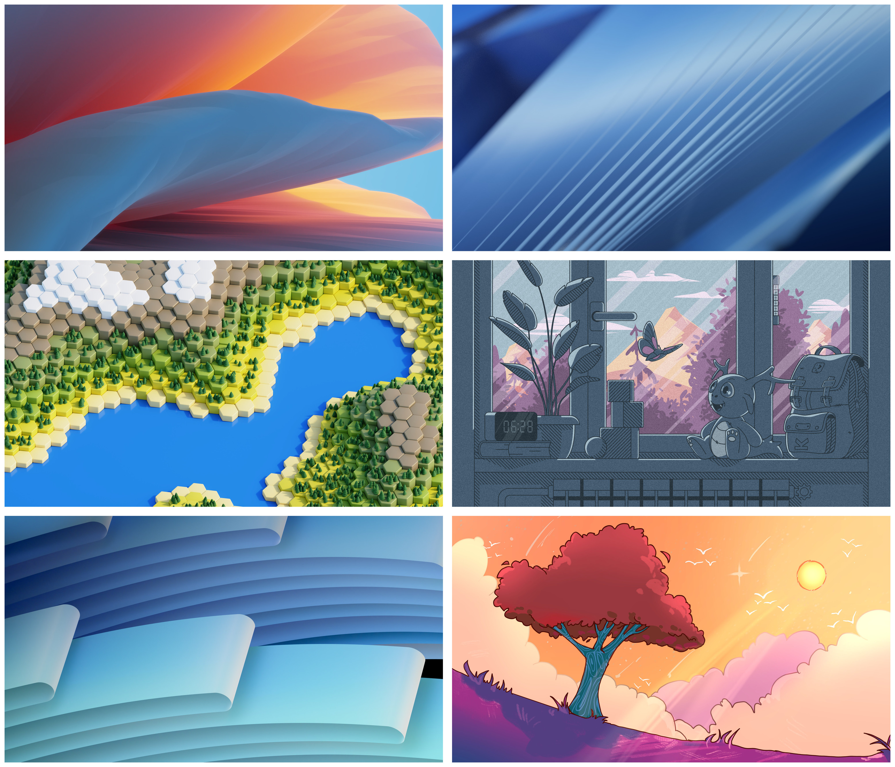
Bottom left or top left scream sleek desktop background
KDE
KDE is an international technology team creating user-friendly free and open source software for desktop and portable computing. KDE’s software runs on GNU/Linux, BSD and other operating systems, including Windows.
Plasma 6 Bugs
If you encounter a bug, proceed to https://bugs.kde.org, check whether it has been reported.
If it hasn't, report it yourself.
PLEASE THINK CAREFULLY BEFORE POSTING HERE.
Developers do not look for reports on social media, so they will not see it and all it does is clutter up the feed.
Bottom left
Middle Right has a lot going on, you can look at it for a long time and not get bored.
Remove the playful dragon entirely and you got a spot on metapher: A personalized view onto the landscape chosen on its own (housing).
It also implies maturity by two things:
-
The plants are already grown, like KDE.
-
One (Unix) is at the root of image generation.
@[email protected] @[email protected] Middle ones and bottom right. Especially the ones on the right are great!
Feeling middle left. Bottom right is a very close second.
The top two and bottom left are too generic for my tastes.
@[email protected] @[email protected] how could you possibly ask me to pick between these 😭 all of them of course!
@[email protected] @[email protected] I like the Maxfield Parrish riff on the one looking out a window
I love the top left flying pillow wallpaper. 😜
If there wasn’t a weird monster, backpack, or out of place alarm clock in the middle right one, that would’ve been my favorite. The alarm clock isn’t even within reach of a bed to snooze it or turn it off. The backpack makes it too cluttered. The view through the window and the colors are my favorite, however.
As-is, the bottom two are the ones I like most. I love the color of the bottom left and I like the nature of the bottom right though I am not a fan of so much orange.
