this post was submitted on 28 Jan 2024
28 points (78.0% liked)
Pixel Art - pushing pretty pixels around
2237 readers
2 users here now
This shall be the community where we discuss, share, make and learn from each other how to draw the little pictures and game assets we all love.
Rules
-
To make it easy to identify original content, mark original content with [OC] in the post title.
-
If it is not your art, please credit the creator out of respect for their efforts.
-
Critizise art in a constructive manner and only when asked for.
-
Consider adding a copyright license hint to your post, if you are fine with people sharing your work.
-
This community is about enjoying art and appreciating artists, please do not post generated images here
Resources
founded 4 years ago
MODERATORS
you are viewing a single comment's thread
view the rest of the comments
view the rest of the comments

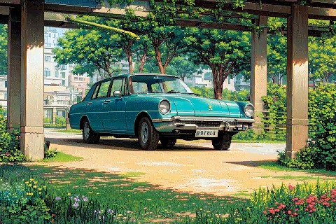
There's a few other artistic choices that would be an odd choice for a human artist to make:
The bumper is wonky and non symmetrical.
The side windows are mirror reflective and aren't transparent when the windscreen is.
There's a bit of tree trunk? inside the car on the camera left side of the windscreen.
The style of the shading is very inconsistent, with some parts using dithering, and other parts using smooth gradients, sometimes on the same surface.
The concrete structure above is weird, looks a bit like a concrete monorail or something on the left side of the image, then morphs into the trees and then comes out of them looking more like a normal steel overhead railway. Also the size and spacing of the columns is weird and inconsistent.