this post was submitted on 27 Jan 2024
513 points (85.0% liked)
Data Is Beautiful
6990 readers
2 users here now
A place to share and discuss data visualizations. #dataviz
(under new moderation as of 2024-01, please let me know if there are any changes you want to see!)
founded 3 years ago
MODERATORS
you are viewing a single comment's thread
view the rest of the comments
view the rest of the comments

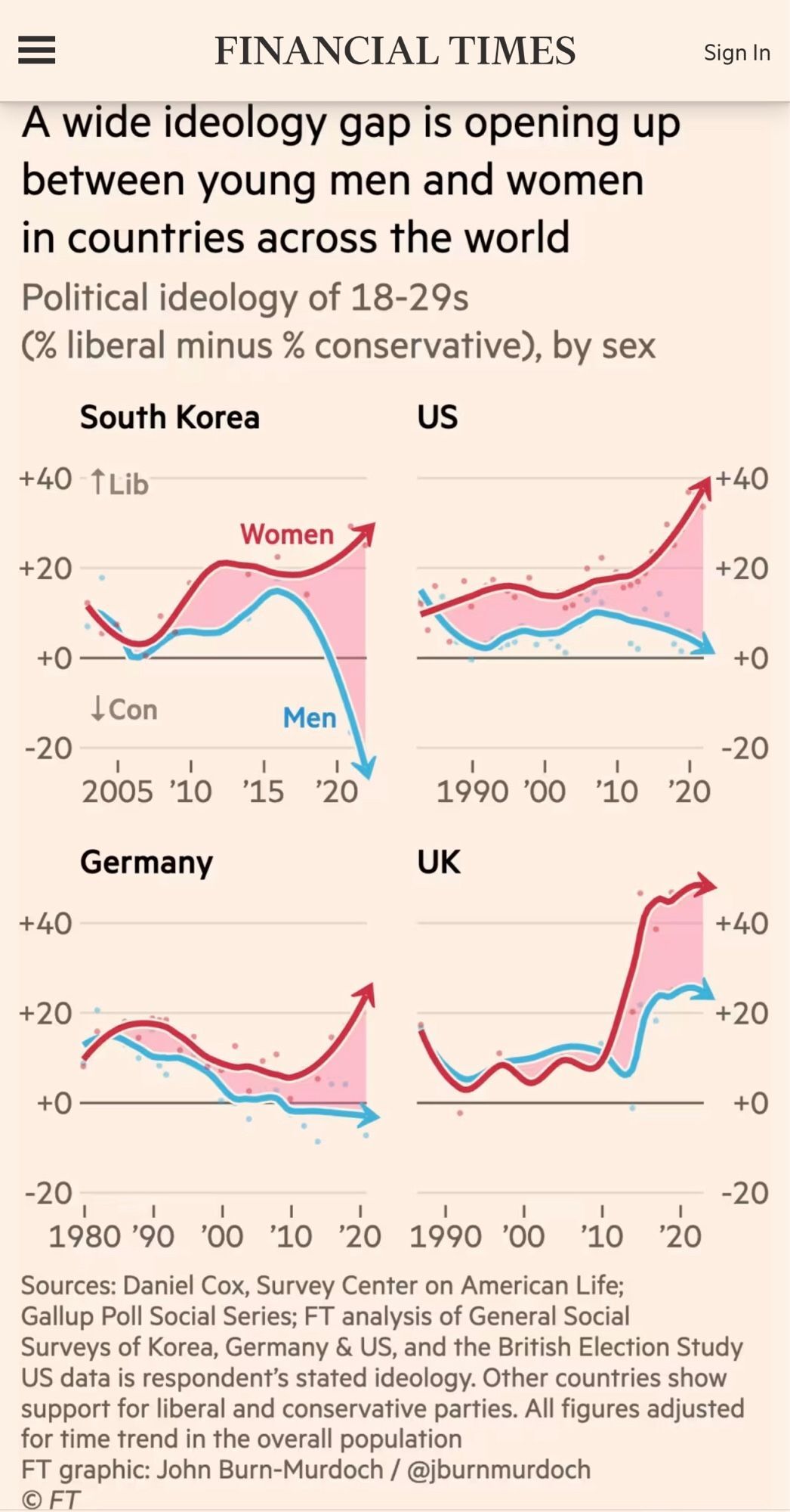
Perpetuates the false dichotomy of a linear political spectrum of either liberal or conservative and that in and of itself is one of the reasons for these trends. Liberalism has nothing to offer men. Leftism does.
You might as well be asking men how much they are willing to sacrifice for others vs. look after their own interests. When the inequality gap widens and the majority live below average economically, don't you think people will tend to become more selfish? That's all these charts show.
Conservatism is essentially synonymous with patriarchy and on a very shallow level, it's easy to see how men would choose that over the status quo. That will surely be better for men than this slow attrition of status that comes with ever increasing wealth concentration. This isn't true but it is an obvious conclusion.
The real question, which this survey completely ignores, conveniently, is what we should all be doing together to better the status quo for all. Because I believe almost everyone except a small and shrinking fraction agrees that current trends are not working for anyone.
the graph explicitly takes 1 dimension of the spectrum to look at it in isolation. This is exactly what single graphs do best.
have you looked at the source of the graph?
Why would you intentionally look at this complex situation in 1 dimension. That dimension being the most overplayed talked about dimension because it creates conflict between groups based on identities. Instead of looking at the actual problem that the dimension completely ignores.