this post was submitted on 16 Jan 2024
9 points (100.0% liked)
Spoilers
646 readers
1 users here now
MTG Spoilers!
All card and set spoilers, including official spoilers and unofficial leaks.
Please try to preface spoiler posts with the set code in brackets, like this:
[CMM] Pearl Medallion
Please try to keep all spoilers and spoiler discussion here instead of the other communities to help subscriptions and during spoiler season.
founded 1 year ago
MODERATORS
you are viewing a single comment's thread
view the rest of the comments
view the rest of the comments

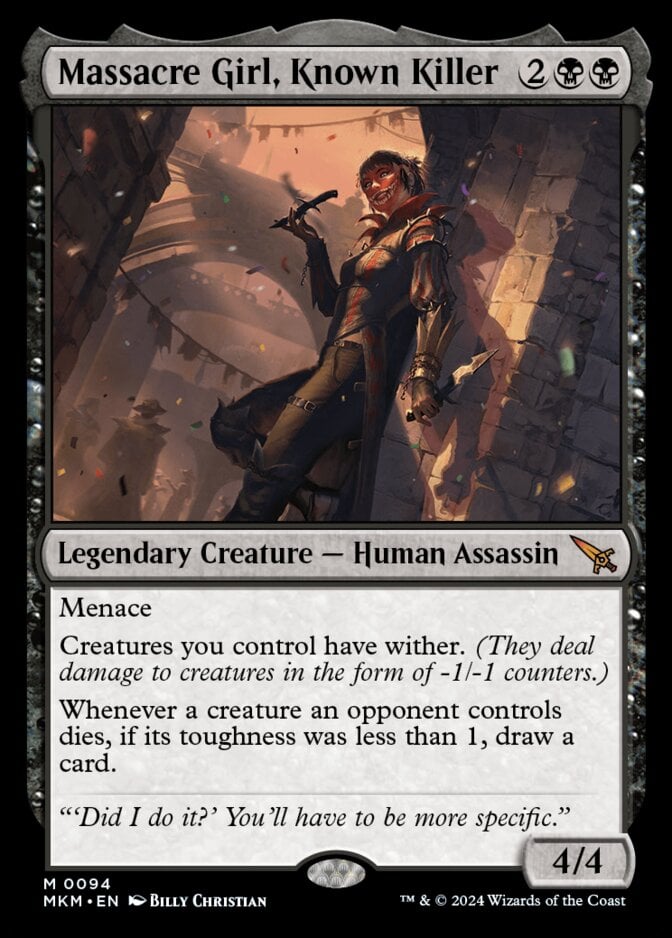
I really hate being negative towards artists, but does anyone else feel like a lot of the recent card art looks rushed? I don’t know what it is, but it’s like the faces look too smooth and 3D. Not like actual pictures. Just compare this to the original [[Massacre Girl]] and it feels rushed (although different artists, so styles can certainly vary).
I got similar vibes from [[Gimli, Counter of Kills]] and [[Rankle and Torbrand]] recently, just to name two cards off hand.
It's not the artists, because the same artists who I see cards that I think look bad have old card art that looks fantastic. I get the feeling that Wizards is asking artists to produce so much work that we aren’t getting the time put into a single card’s art that we used to and getting more rushed art.
Maybe it’s just me. I’m curious what others think.
Not sure what you mean about this art, maybe it's the low resolution? The full art seems pretty finished to me
UB always seems a little uncanny to me because of how often they try to go for hyper-realism, especially with cards of real life actors. I find the in-universe Magic cards (or stylistic ones like Warhammer 40k) to have less of this problem