this post was submitted on 14 Jan 2024
1420 points (97.3% liked)
Greentext
4346 readers
1597 users here now
This is a place to share greentexts and witness the confounding life of Anon. If you're new to the Greentext community, think of it as a sort of zoo with Anon as the main attraction.
Be warned:
- Anon is often crazy.
- Anon is often depressed.
- Anon frequently shares thoughts that are immature, offensive, or incomprehensible.
If you find yourself getting angry (or god forbid, agreeing) with something Anon has said, you might be doing it wrong.
founded 1 year ago
MODERATORS
you are viewing a single comment's thread
view the rest of the comments
view the rest of the comments

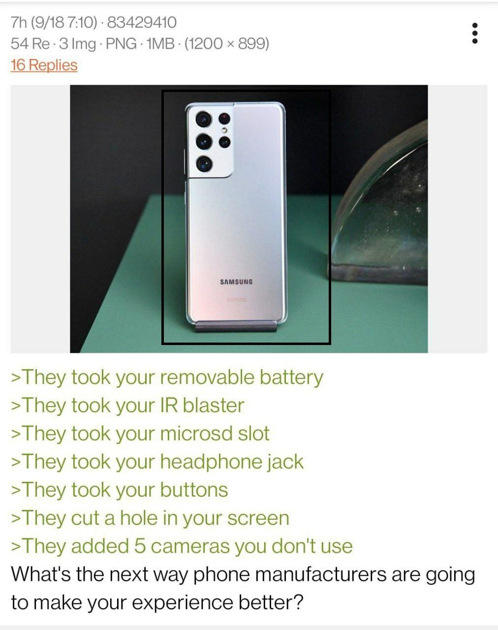
Hey man, I know this is a rant, but in case you didn't know there should be a setting to resize things to make a black bar at the top. Google it for your phone, but for samsung it's something like "full sceeen apps".
Just looked. Not a thing for pixel 6A :(
Googled it, try this
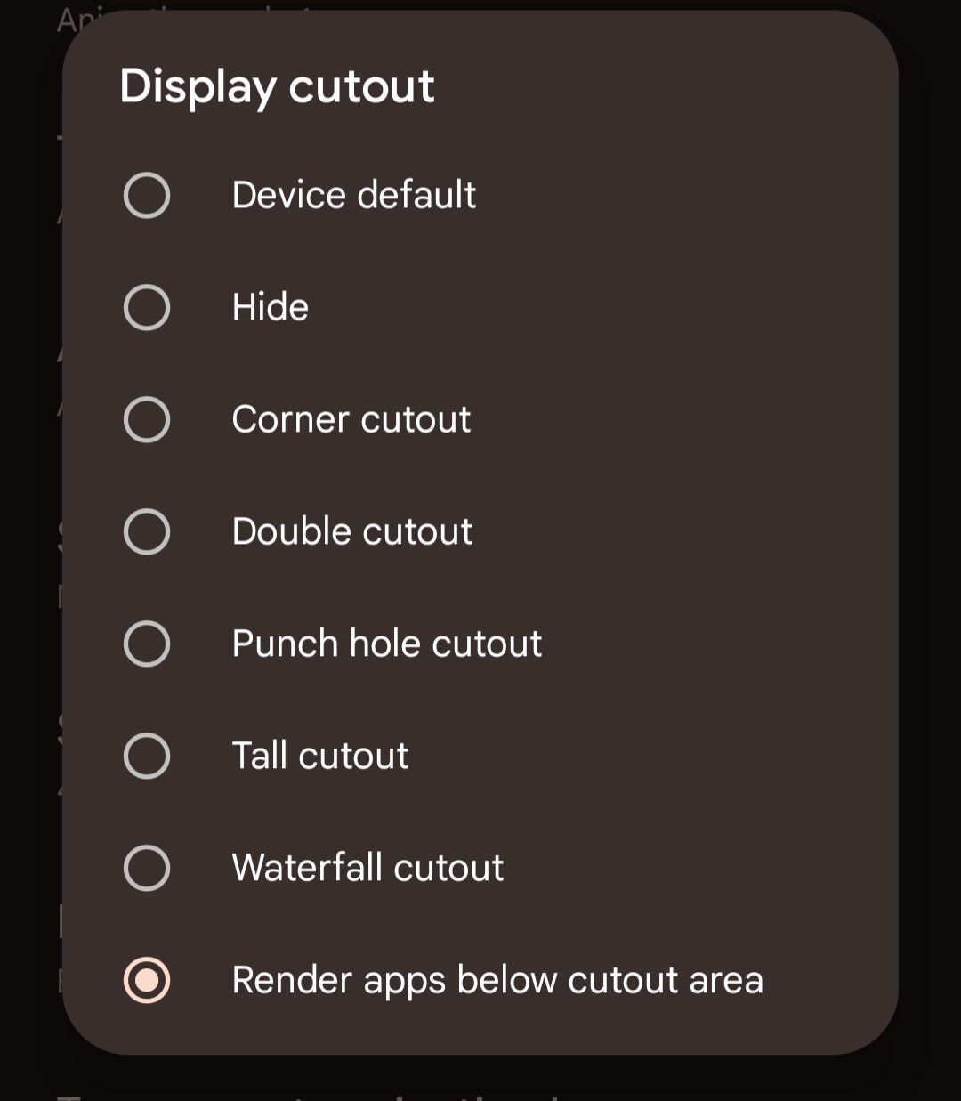
https://mashtips.com/hide-display-notch-and-cutouts-on-pixel/
Holy crap that did it! Thank you!!
That seems like a weird thing to want. You'll have less screen space because the notification area is now using your useable screen area instead of being up in the unusable dead space.
MY. MEMES.
Not actually how it works. There's two options. One of them has the notifications in the "dead space", but the content never gets eaten up.
(Pinging @[email protected] , just in case you didn't know about this!)
I wouldn't use this myself. Most apps are designed so content fits underneath the camera hole so nothing gets eaten, and even if it does get eaten, the camera is so small that it's not an issue for me
Edit: this is what you have to enable, by the way.
