850
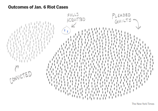
Outcomes of Jan. 6 Riot Cases
(lemmy.ml)
New York Times managed this with eloquence.
A place to share and discuss data visualizations. #dataviz
(under new moderation as of 2024-01, please let me know if there are any changes you want to see!)
Assuming they had a proper criteria/methodology rather than just anecdotes and the like, it's data. It's a weird visualization of that data, but it's still data.
Phrased another way, using only the data provided by the drawing, you could turn this into more common presentations. This includes a spreadsheet, pie chart, or a bar graph.