60
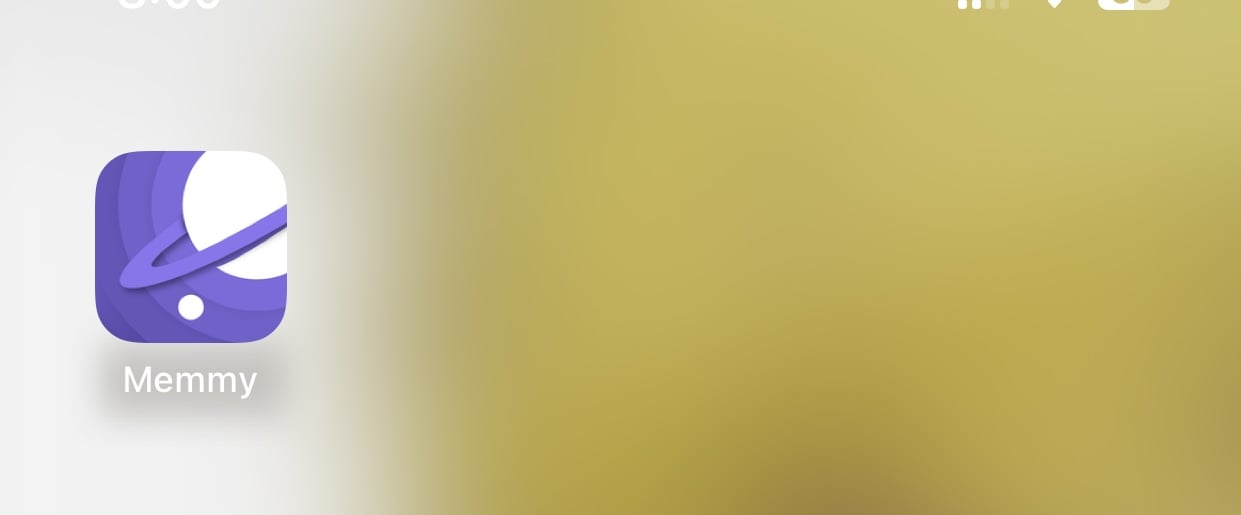
Has Memmy changed its icon? [App Store]
(lemmy.world)
I recall it had the mouse on it. Now I have the purple world.
I recall it had the mouse on it. Now I have the purple world.

While the previous icon wasn’t the best, it had more character imo. This one feels generic and looks too much like the Samsung internet icon.
Ahh now that you mentioned it, now I know why it feels like it doesn’t stand out much. It feels too much like a browser icon. Thanks. This has been nagging at me since I first saw it.