this post was submitted on 08 Nov 2023
310 points (97.8% liked)
Don't Dead - Open Inside
1122 readers
93 users here now
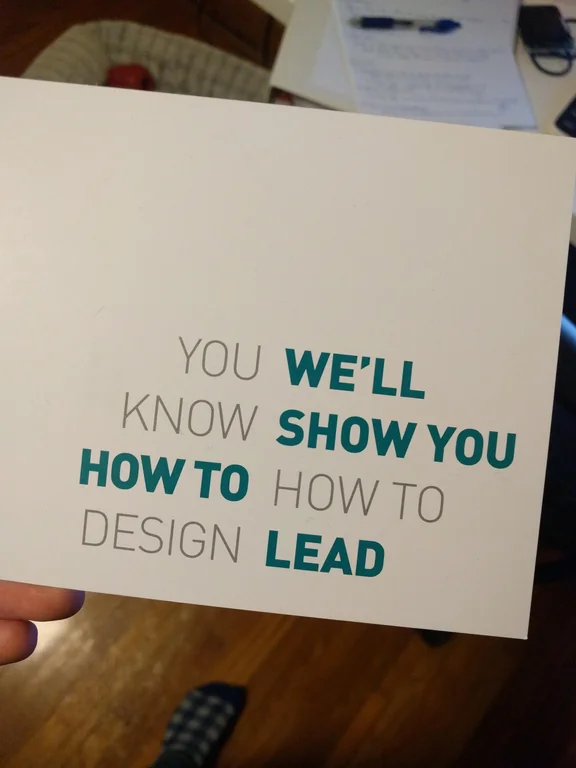
Images of text-designs, that are barely readable due to the placement of the words or letters
Please indicate which post is original by writing "OC" and properly credit stolen posts.
Please mark NSFW posts properly, don't spam, yadadadada
founded 1 year ago
MODERATORS
you are viewing a single comment's thread
view the rest of the comments
view the rest of the comments

It often doesn't have to be fancy. Boring is good. It's tried and tested to work.
Sometimes it's about getting the message across as coherently and quickly as possible.
Modern day humans have very low attention spans (think about the frustration you get after a website hasn't loaded after 5 seconds!). If I have to try and figure out something and it takes me longer than a second to do so, I'm gone.
But if it's an ad for an agency that provides a service I'm looking for, and they have a banner that looks simple and clear like this, I'm liable to notice and give them a call.