Cool Guides
Rules for Posting Guides on Our Community
1. Defining a Guide Guides are comprehensive reference materials, how-tos, or comparison tables. A guide must be well-organized both in content and layout. Information should be easily accessible without unnecessary navigation. Guides can include flowcharts, step-by-step instructions, or visual references that compare different elements side by side.
2. Infographic Guidelines Infographics are permitted if they are educational and informative. They should aim to convey complex information visually and clearly. However, infographics that primarily serve as visual essays without structured guidance will be subject to removal.
3. Grey Area Moderators may use discretion when deciding to remove posts. If in doubt, message us or use downvotes for content you find inappropriate.
4. Source Attribution If you know the original source of a guide, share it in the comments to credit the creators.
5. Diverse Content To keep our community engaging, avoid saturating the feed with similar topics. Excessive posts on a single topic may be moderated to maintain diversity.
6. Verify in Comments Always check the comments for additional insights or corrections. Moderators rely on community expertise for accuracy.
Community Guidelines
-
Direct Image Links Only Only direct links to .png, .jpg, and .jpeg image formats are permitted.
-
Educational Infographics Only Infographics must aim to educate and inform with structured content. Purely narrative or non-informative infographics may be removed.
-
Serious Guides Only Nonserious or comedy-based guides will be removed.
-
No Harmful Content Guides promoting dangerous or harmful activities/materials will be removed. This includes content intended to cause harm to others.
By following these rules, we can maintain a diverse and informative community. If you have any questions or concerns, feel free to reach out to the moderators. Thank you for contributing responsibly!
view the rest of the comments

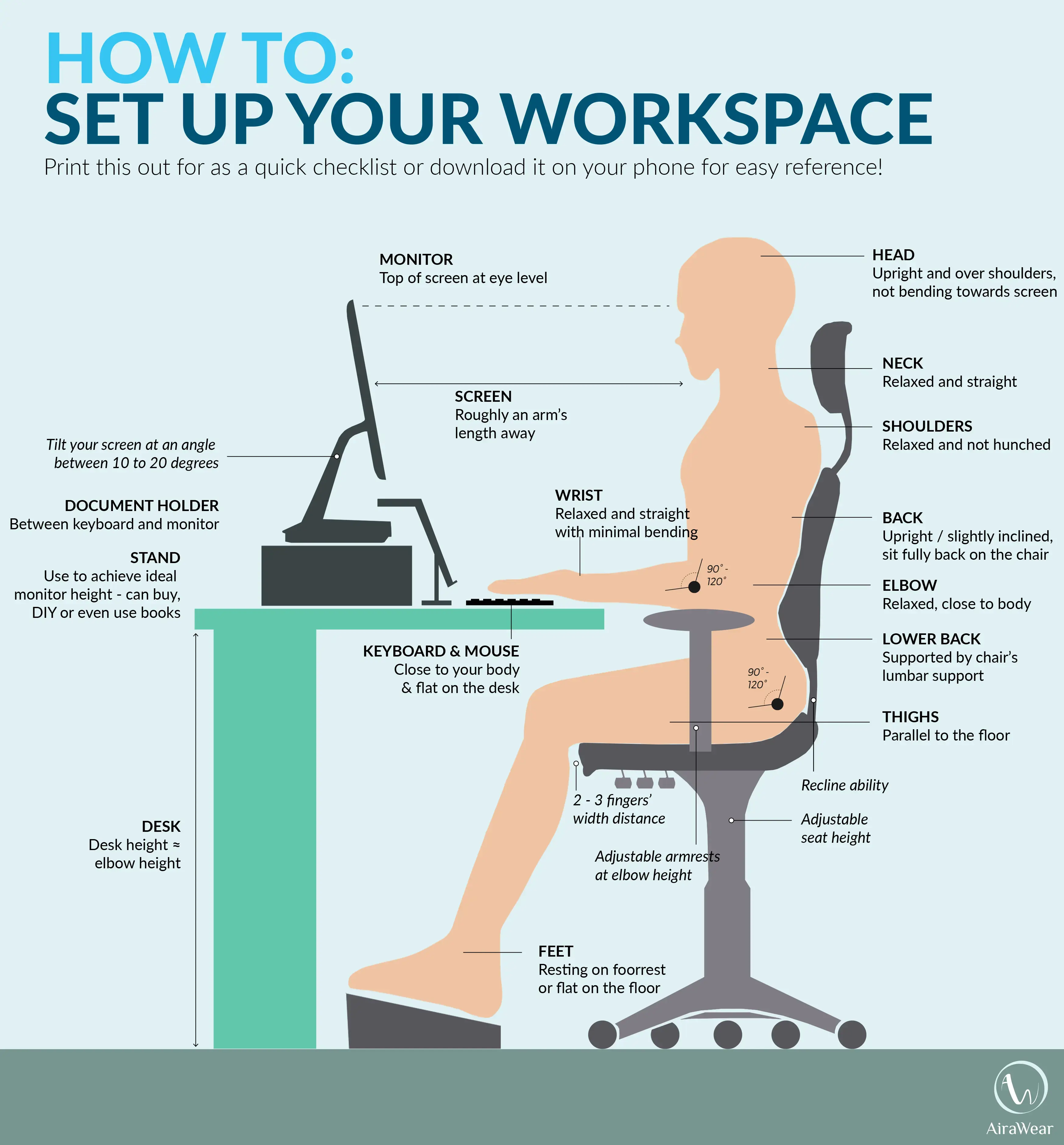
That doesn’t make sense. First you say to look down then say looking down is too much strain. I think it would make more sense to position the center of your monitor at eye level so you don’t need to always look down or always up. Plus the content is viewed in the center of the screen, not at the top.
Looing down with eyes is a natural movement when head is straight, but looking down far with neck tilted (for a low laptop screen) is neck strain. So ergonomics suggest straight ahead vision at top of monitor so heads stays directly above spine. Having vision at center of monitor causes upward glancing or backward neck tilt. you can test yourself. stare straight ahead and lower your gaze, it is easy. Now stare straight ahead and lookup, you will feel musxlcles in your eyes and forehead adjust. with high monitors people tend to tilt head back instead. if you really want to test you can get a head strap and weight system from your kinesthesiologist. when your neck and head is vertical you don't feel the 2lbs of added weight, when you tilt your neck down or back the leverage is instantly felt as it exaggerates the effort to hold your head in place. I was a CADadmin ergo person before, so I have done all these computer peripheral trials, especially for eliminating RSI
Personally, years ago when I was coding I would get neck strain from having the monitor below my eye level because I found my head movement always followed my eyes. So when my eyes were always looking slightly down, I would always start to tilt my head down to compensate. It wasn’t until I raised my monitor much higher that my headaches went away. Even now when I hold my phone, I naturally hold it to the middle of my eye level, not below.
Yeah, guidlines be guidelines. What also makes a difference is screen angle. as we like to position our head tilt to match equal distance to screen corners. phones gives everone bad posture unless you at least hold top of phone parallel to eye level. But then you get tired arms.