this post was submitted on 09 Aug 2023
11 points (100.0% liked)
Sim Racing
885 readers
8 users here now
Discussing all things Sim Racing
founded 1 year ago
MODERATORS
you are viewing a single comment's thread
view the rest of the comments
view the rest of the comments


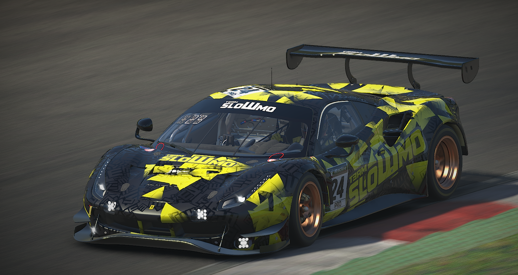
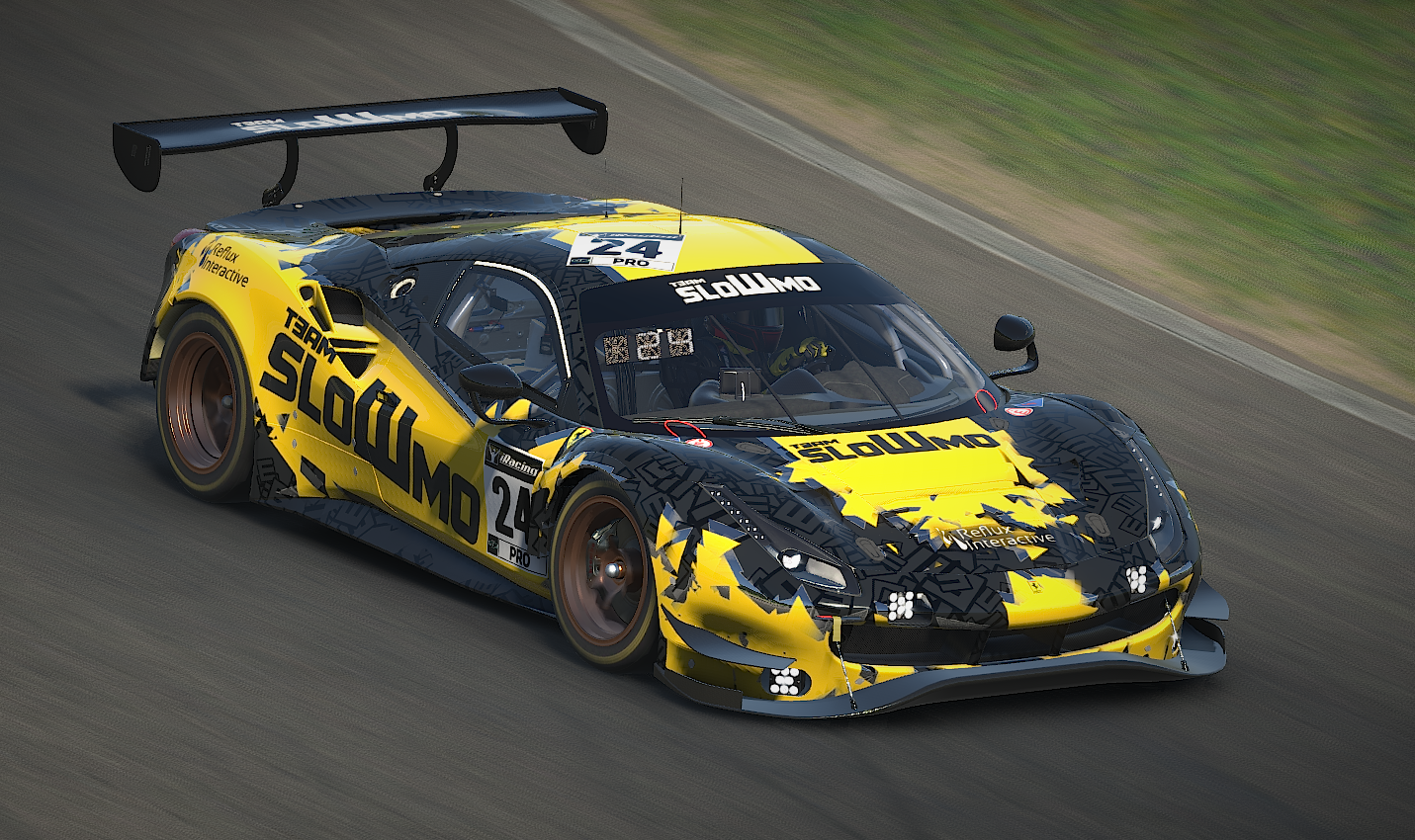
Nice! Love the black/grey pattern of the bottom layer especially
Thanks! That detail is only in the specmap (the texture controlling shinyness/metallic effects). Coming up with it is was quite the revelation back when I first made the previous livery.
Yep I picked that for sure, it's such a great effect. We use it for my team paints also, we have a pattern that fades from being a different colour from the base to the same colour but different spec