this post was submitted on 17 Jan 2025
219 points (97.8% liked)
Map Enthusiasts
3657 readers
1 users here now
For the map enthused!
Rules:
-
post relevant content: interesting, informative, and/or pretty maps
-
be nice
founded 2 years ago
MODERATORS
you are viewing a single comment's thread
view the rest of the comments
view the rest of the comments

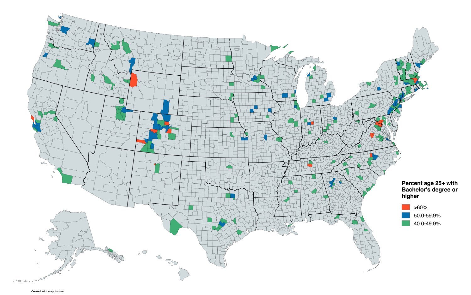
Neat data, but it seems like starting the coloring at 40% is really high.
I'm curious what this would look like if they counted counties with 25% and above degree requirements.
not really, that's roughly the percentage for the entire population of the country.
Exactly. The less educated population matters just as much as the more educated. Those people are not represented in this map.
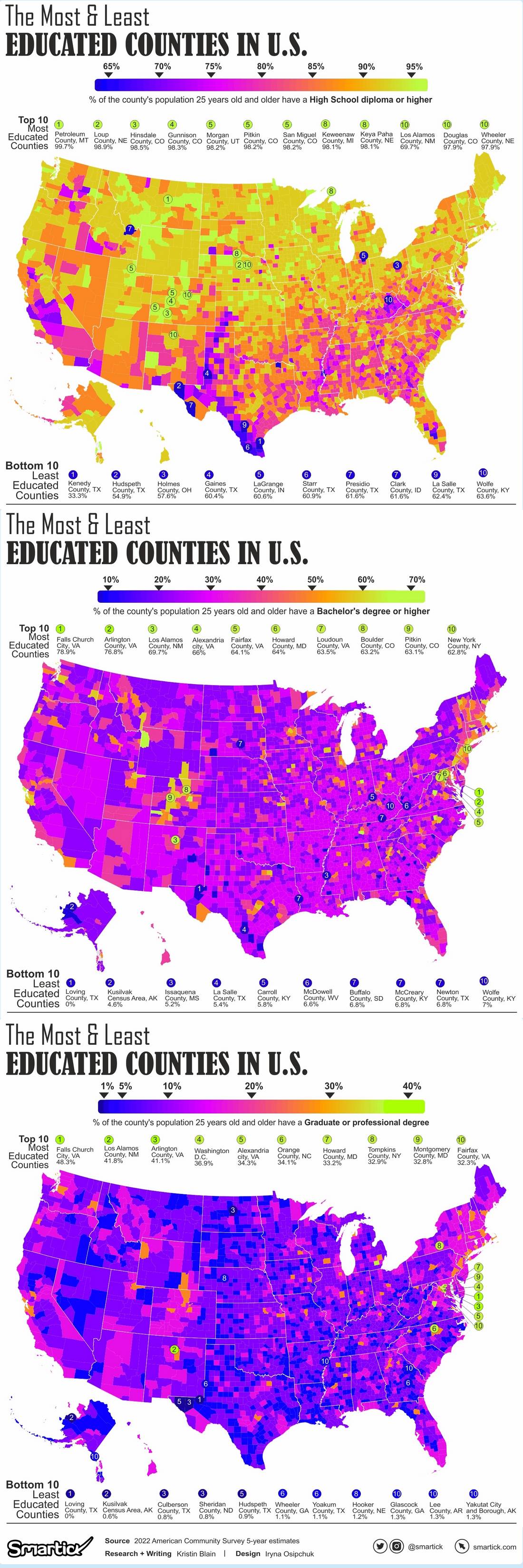
here's all the counties by education attainment. high school, 4-year college, graduate/professional degree.
source of the visuals:
www.smartick.com/data/visualizing-the-most-and-least-educated-counties-in-america/
using data from the census:
https://www.census.gov/data/developers/data-sets/acs-5year.html
Other than the obvious typo on the top chart, this is really interesting information.
Why would they be? The map is clearly not about that information. That would be a map titled “percent people 25+ WITHOUT a bachelor’s degree.”
And those are the people that the democrats ignored.