this post was submitted on 08 Aug 2023
9 points (100.0% liked)
Alexandrite
349 readers
1 users here now
Alexandrite is a desktop-first alternative Lemmy client.
Find a bug or have a feature request? Create an issue on Github, or post here.
founded 1 year ago
MODERATORS
you are viewing a single comment's thread
view the rest of the comments
view the rest of the comments


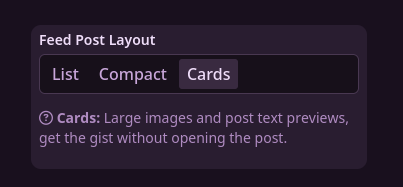
With cards, it reminds me of when I had the Voyager PWA on my desktop. One difference (apart from the colour) is that Voyager has the title above the image, rather than below. As for which way around works best, it unfortunately depends on the post.
I moved from Voyager to Alexandrite because I didn't like all the blank space on either side of posts. I can see how this works much better for mobile though, so it makes sense if you're targeting those platforms next.