this post was submitted on 01 Nov 2024
517 points (97.6% liked)
Data is Beautiful
4875 readers
13 users here now
A place to share and discuss visual representations of data: Graphs, charts, maps, etc.
DataIsBeautiful is for visualizations that effectively convey information. Aesthetics are an important part of information visualization, but pretty pictures are not the sole aim of this subreddit.
A place to share and discuss visual representations of data: Graphs, charts, maps, etc.
  A post must be (or contain) a qualifying data visualization.

  Directly link to the original source article of the visualization
    Original source article doesn't mean the original source image. Link to the full page of the source article as a link-type submission.
    If you made the visualization yourself, tag it as [OC]

  [OC] posts must state the data source(s) and tool(s) used in the first top-level comment on their submission.

  DO NOT claim "[OC]" for diagrams that are not yours.

  All diagrams must have at least one computer generated element.

  No reposts of popular posts within 1 month.

  Post titles must describe the data plainly without using sensationalized headlines. Clickbait posts will be removed.

  Posts involving American Politics, or contentious topics in American media, are permissible only on Thursdays (ET).

  Posts involving Personal Data are permissible only on Mondays (ET).
Please read through our FAQ if you are new to posting on DataIsBeautiful. Commenting Rules
Don't be intentionally rude, ever.

Comments should be constructive and related to the visual presented. Special attention is given to root-level comments.

Short comments and low effort replies are automatically removed.

Hate Speech and dogwhistling are not tolerated and will result in an immediate ban.

Personal attacks and rabble-rousing will be removed.

Moderators reserve discretion when issuing bans for inappropriate comments. Bans are also subject to you forfeiting all of your comments in this community.
Originally r/DataisBeautiful
founded 1 year ago
MODERATORS
you are viewing a single comment's thread
view the rest of the comments
view the rest of the comments

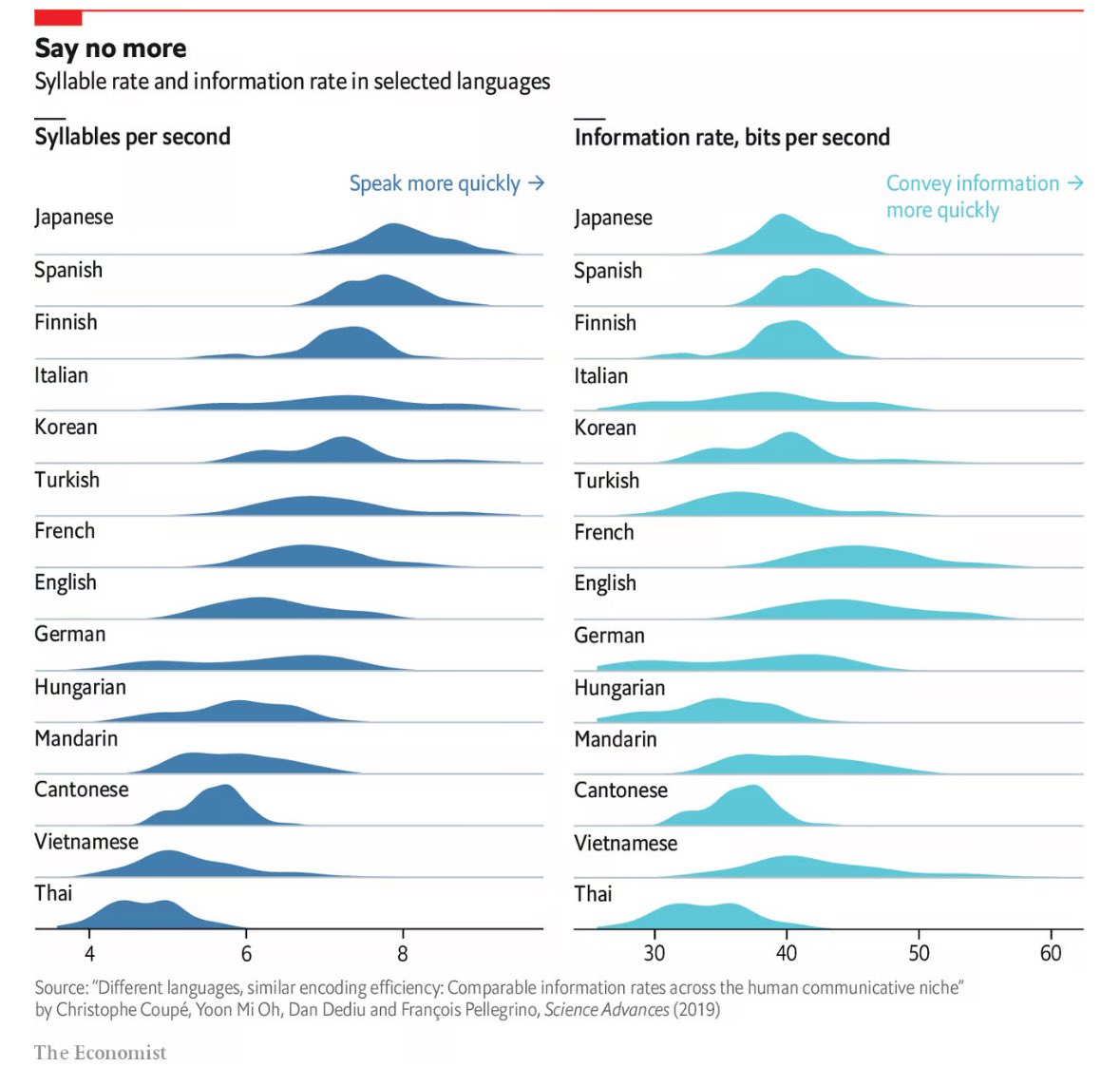
Alright, but dismissing the study as “pretty much bullshit" based on a quick read-through seems like a huge oversimplification. Using canonical syllables as a measure is actually a widely accepted linguistic standard, designed precisely to make fair comparisons across languages with different structures, including languages like Japanese. It’s not about unfairly favoring any language but creating a consistent baseline, especially when looking at large, cross-linguistic patterns.
And on the syllable omission point, like “probably” vs. “prolly," I mean, sure, informal speech varies, but the study is looking at overall trends in speech rate and information density, not individual shortcuts in casual conversation. Those small variations certainly don’t turn the broader findings into bullshit.
As for the bigram approach, it’s a reasonable proxy to capture information density. They’re not trying to recreate every phonological or grammatical nuance; that would be way beyond the scope and would lose sight of the larger picture. Bigrams offer a practical, statistically valid method for comparing across languages without having to delve into the specifics of every syllable sequence in each language.
This isn’t about counting every syllable perfectly but showing that despite vast linguistic diversity, there’s an overarching efficiency in how languages encode information. The study reflects that and uses perfectly acceptable methods to do so.
Well I did clarify I agree that the overarching point of this paper is probably fine...
I am not a linguist so apologise for my ignorance about how things are usually done. (Also, thanks for educating me.) But on the other hand just because it is the accepted way doesn't mean it is right in this case. Especially when you consider the information rate is also calculated from syllables.
Ultimately this just measures how quickly the speaker can produce different combinations of sounds, which is definitely not what most people would envision when they hear "information in language". For linguists who are familiar with the methodology, this might be useful data. But the general public will just get the wrong idea and make baseless generalisations - as evidenced by comments under this post. All in all, this is bad science communication.
Perhaps, but to be clear, that's on The Economist, not the researchers or scholarship. Your criticisms are valid to point out, but they aren't likely to be significant enough to change anything meaningful in the final analysis. As far as the broad conclusions of the paper, I think the visualization works fine.
What you're asking for in terms of methods that will capture some of the granularity you reference would need to be a separate study. And that study would probably not be a corrective to this paper. Rather, it would serve to "color between the lines" that this study establishes.