Feedback types: Is this a thing? / challenging perspectives / general opinions
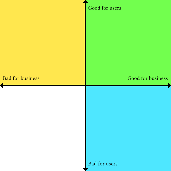
Here's an outline which I originally posted as a tweet thread but would like to flesh out into a fill article with images like the attached one to illustrate the "zones" that people may/may not realise they are acting in when they say stuff like "what's good for the user is good for the business"
I am writing this because I've published a few things now which say that empathy and "human centeredness" in commercial design, particularly UX design/research, are theatrical and not compatible with capitalism if done deliberately. That means they can be true as a side-effect, or by individuals acting under the radar of their employers. It has become common to hear the good for the user = good for the business response - and I want to write something that demonstrates how it is an incomplete sentence, and any way to add the necessary information to make it true results in the speaker admitting they are not acting in the interests of users or humans.
Here's the basic outline so far:
What’s good for the User
"What's good for the user is good for the business" is a common response I get to my UX critique. When I try to understand the thinking behind that response I come up with two possible conclusions:
Conclusion 1: They are ignoring the underlying product and speaking exclusively about the things between the product and a person. They are saying that making anything easy to use, intuitive, pleasant, makes a happy user and a happy user is good for business.
This type of "good for the user" is a business interest that values engagement over ethics. It justifies one-click purchases of crypto shitcoins, free drinks at a casino, and self-lighting cigarettes. https://patents.google.com/patent/US1327139
Conclusion 2: They are speaking exclusively about the underlying product and the purposes it was created to serve. They say a good product will benefit the business. But this means they are making a judgement call on what makes a product “good”.
This type of “good for the user” is complicated because it is a combination of objective and subjective consideration of each product individually. It is design in its least reductive form because the creation of something good is the same with or without business interests. A designer shouldn’t use blanket statements agnostic to the design subject. “what is good for the user…” ignores cigarette packet health warnings and poker machine helpline stickers there because of enforced regulation, not because of a business paying designers to create them.
It’s about being aware of the context, intent, and whose interests are being served. It means cutting implied empathy for people if it is bullshit.
If we look at this cartesian plane diagram we can see the blue and green quadrants that corporate product design operates in. The green being where the "good for user, good for business" idea exists, and the yellow representing the area that the idea ignores, dismisses, etc

your observation about services-subscriptions as renting strikes a chord with me - I've been referring to a lot of it as rentware for a couple months now (and am sure that my friends tire of me ranting about rentware in DMs)
sometime I'll find the spoons to write up my rant about it. one aspect of the rant is a critique of how many things have become rentware simply because it's an easier cashflow model for the vendor, along with the negative effects of it. and specifically "easier" not "simpler" - allows engaging more cashflow while not necessarily increasing product function (and in many cases worsening products)
it will also include a big bit of screaming about apple - whose push in the app store (scrubbing old free apps, pushing new apps to include paid offerings) have, imo, been a significant contributor to this worsening state of affairs