this post was submitted on 26 Jun 2024
790 points (94.7% liked)
linuxmemes
21281 readers
1076 users here now
Hint: :q!
Sister communities:
- LemmyMemes: Memes
- LemmyShitpost: Anything and everything goes.
- RISA: Star Trek memes and shitposts
Community rules (click to expand)
1. Follow the site-wide rules
- Instance-wide TOS: https://legal.lemmy.world/tos/
- Lemmy code of conduct: https://join-lemmy.org/docs/code_of_conduct.html
2. Be civil
- Understand the difference between a joke and an insult.
- Do not harrass or attack members of the community for any reason.
- Leave remarks of "peasantry" to the PCMR community. If you dislike an OS/service/application, attack the thing you dislike, not the individuals who use it. Some people may not have a choice.
- Bigotry will not be tolerated.
- These rules are somewhat loosened when the subject is a public figure. Still, do not attack their person or incite harrassment.
3. Post Linux-related content
- Including Unix and BSD.
- Non-Linux content is acceptable as long as it makes a reference to Linux. For example, the poorly made mockery of
sudoin Windows. - No porn. Even if you watch it on a Linux machine.
4. No recent reposts
- Everybody uses Arch btw, can't quit Vim, and wants to interject for a moment. You can stop now.
Please report posts and comments that break these rules!
Important: never execute code or follow advice that you don't understand or can't verify, especially here. The word of the day is credibility. This is a meme community -- even the most helpful comments might just be shitposts that can damage your system. Be aware, be smart, don't fork-bomb your computer.
founded 1 year ago
MODERATORS
you are viewing a single comment's thread
view the rest of the comments
view the rest of the comments

Swear I'm neither of those things, but you're talking about the system tray as in that little bucket of icons that sits in the lower-right of a taskbar usually?
This seems like it'd fall pretty neatly in the "you use it, so you think it's required basic functionally; other people don't, so they don't care about it" realm. I do not miss the bucket. It doesn't seem like awesome functionality (to me) to have to access application features through a bucket of tiny icons instead of the application itself and to be unable to access those features in the application.
I can see how frustrating it'd be if there's something you like to use or have to use that only works if it can be in a system tray, but it's not a ubiquitous feature requirement across all applications, so maybe GNOME is for people that don't care for apps that require this and all the other mainstream OS options are for folks that do? Man that's an annoying sentence to read; no wonder people get so angry about what seems like pointless minutiae.
I assume I dislike it because my work machine (windows, no choice there) always has about 30 things in its pointless icon bucket that can't be closed by a basic user and do nothing beyond cluttering the taskbar and getting in the way. I get nothing out of a bucket of icons that exist only to silently scream "I'm running in the background still! Just in case anyone cares!" Not having to see that crap on my personal machine is a relief rather than a frustration for me.
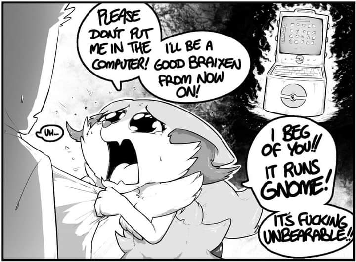
It's not as bad nowadays that apps yielded to GNOME's bullshit. Back when GTK2 apps were still common... Urgh. Plenty of apps were broken without it for no good reason.
I like opinionated UX - I use sway - but GNOME's approach is incompatible with "general use" and only works (for now) because of canonical's weight and ability to impose their vision as the only vision.
Also they didn't replace the tray with a better way to manage background apps, so they can suck a dick on the UX front.
Ah okay I would likely have missed those days since until this year I kept hoping windows wouldn’t completely shit the bed for my gaming PC.
I’ll have to take a look sway; think I’m still figuring out what I like best and GNOME felt familiar to the MacBook I like using for productivity (although now that I think about it, even Apple has a system-tray-like thing on the top of the screen). KDE was also fine but if I have a choice I usually like picking something with a spotlight-search equivalent; GNOME’s just looks more like spotlight so it activates the dumb part of my brain that likes familiarity.
Thanks for sticking with me through this conversation. Sometimes it’s hard to convey over text that I’m more ignorant than asshole on most Linux things.
I wouldn't recommend sway to someone who isn't actively looking for a tiling WM, I would recommend finding a good spotlight equivalent to use on KDE as that will still be less customization work than it would require on barebones sway (which is hardly usable).