this post was submitted on 07 Jun 2024
373 points (98.4% liked)
Technology
59039 readers
3203 users here now
This is a most excellent place for technology news and articles.
Our Rules
- Follow the lemmy.world rules.
- Only tech related content.
- Be excellent to each another!
- Mod approved content bots can post up to 10 articles per day.
- Threads asking for personal tech support may be deleted.
- Politics threads may be removed.
- No memes allowed as posts, OK to post as comments.
- Only approved bots from the list below, to ask if your bot can be added please contact us.
- Check for duplicates before posting, duplicates may be removed
Approved Bots
founded 1 year ago
MODERATORS
you are viewing a single comment's thread
view the rest of the comments
view the rest of the comments
The biggest problem GIMP has is the name. We need activists to decry the name as ableist or something. I’m sure it was a hilarious joke at the time, but anyone who had seen Pulp Fiction has a pretty strong mental image when they hear the name. They ought to just drop the P and call it GIM. Then it can be a fun play off GIF. Is it pronounce Ghim or Jim?
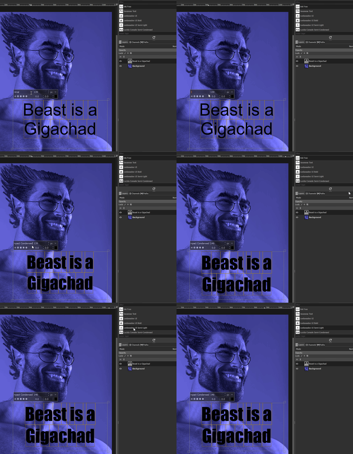
The biggest issue with GIMP is its weird UX choices. They should just make it more like Adobe's UX. I know there's tools that bring it closer, but the fact still is that they do some really dumb shit when it comes to experience decisions. Like if I want to change the font of what I'm typing, it works like this...
I have to TYPE in the font I want, no dropdown, and the font selection toolbar off to the side just straight up doesn't apply to what I've typed or selected... and this is AFTER I ran one of those GIMP retrofit tools that tries to make it more in line with Photoshop.
Seriously, I've used Photoshop since 5.5 (not CS 5.5... FIVE POINT FIVE in 1999), and I STILL have to watch a tutorial for almost every single action I could intuit in 5 seconds from Adobe's garbage malware tool.
That being said... the one important thing that GIMP is not... is Adobe garbage malware... GIMP just has a janky UX that no one's going to bother fixing b/c the tool is free so no complaining!
And in any case, just like with Blender coming on to the scene in earnest like a decade ago to end Autodesk's defacto monopoly with its $$$$ per year licensing scheme for proprietary 3D modelling tools... with Adobe rapidly getting worse, and just like with Unity's "pay us per install" debacle made people jump ship to Godot - never to look back... I'd bet that GIMP is going to begin accelerating its improvement... or that Krita will do the same and overtake it in popularity.
...And once that happens, Adobe is cooked. And it can't happen soon enough.
I think Blender, and to a lesser extent Godot, were able to start making leaps and bounds like that due to funding as well. My memory is hazy on it but I recall probably 5-ish years ago the Blender foundation got a massive capital boost, and Godot has seen a lot of big name donors recently due to the Unity debacle. As far as I know, that hasn’t really happened for GIMP yet. I used early builds of both Blender and Godot, and the difference is night and day with how much they’ve managed to mature. GIMP on the other hand looks and feels largely like it did in 2010 IMO.
I have you beat then! My first experience with Photoshop was either 2 or 2.5 on my Mac IIci in 1992-93. All that means is that I’m likely older than you. We bought the Mac to run pagemaker after a failed attempt to use it on Windows 3. I started using Illustrator around the same time. I still use it, but mostly I’m throwing my money away on CC because I don’t have the skill necessary to care about AI stealing my work.
I agree with you about the terrible name. It also doesn’t betray its purpose. Photoshop… hmm something to do with photos? Ok. It makes sense. GIMP? It’s… what, now?
But I disagree that making everyone wonder how to pronounce GIM is the solution 😆