this post was submitted on 25 Apr 2024
1133 points (97.6% liked)
People Twitter
5230 readers
463 users here now
People tweeting stuff. We allow tweets from anyone.
RULES:
- Mark NSFW content.
- No doxxing people.
- Must be a tweet or similar
- No bullying or international politcs
- Be excellent to each other.
founded 1 year ago
MODERATORS
you are viewing a single comment's thread
view the rest of the comments
view the rest of the comments

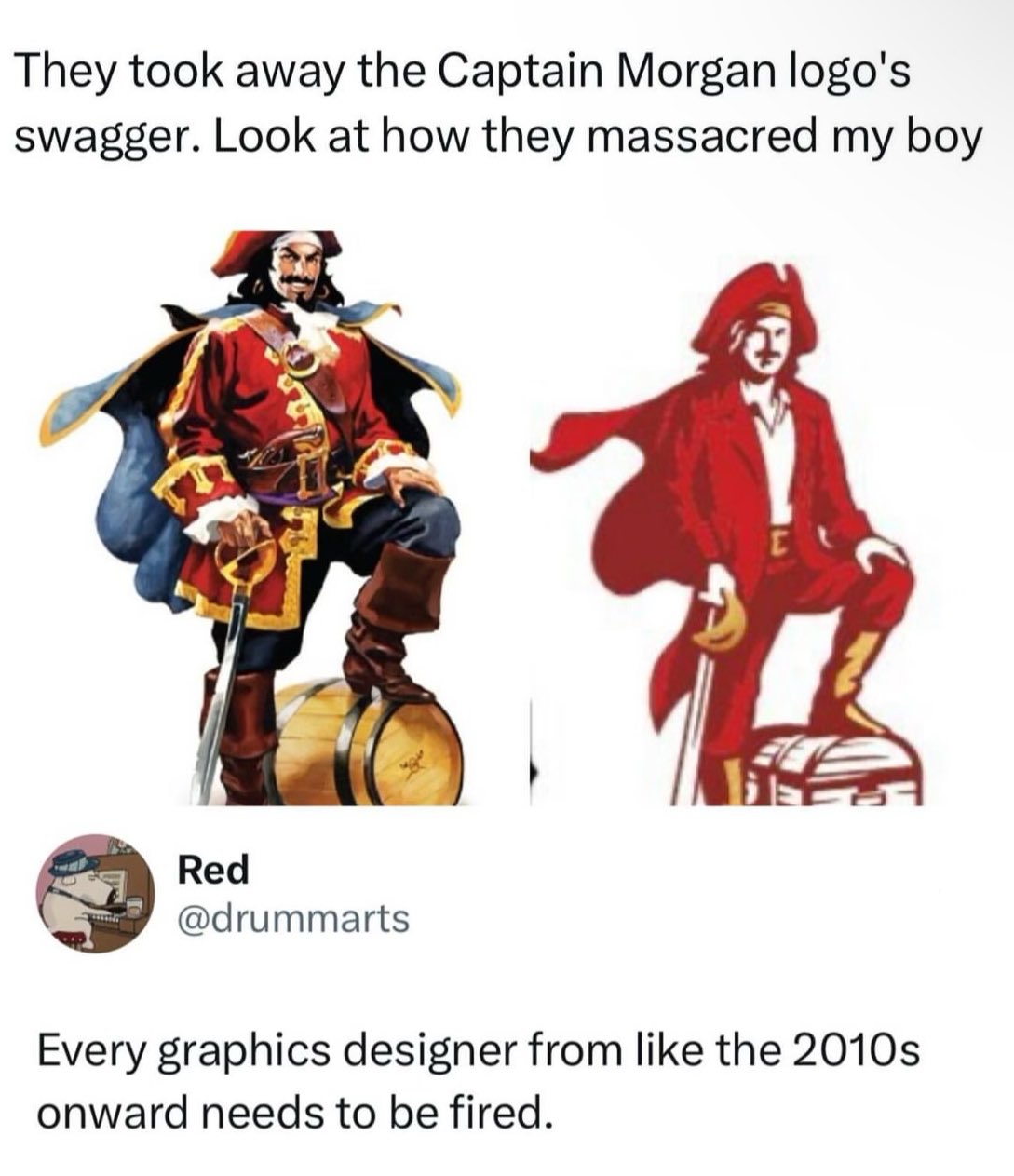
It's the shitty contagion of Flat design. Back around 10 years ago or so, the Flat craze began and everything that had details or depth was pounded down into simple flat design. Now everything has to look basic and boring, and it sucks.
This doesn't have anything to do with flat design. It's the fact that people take hammers and look at everything as a nail and go pounding things. Everything like this is a "contagion", people just latch onto hot button ideas and go crazy. Flat design in itself is fine, and extremely beneficial for what it was designed for, it's just overused because people chase trends.
Before flat it was skeumorphism and that was even worse. You had everything in tech trying to look like real things which made things way too busy and hard to read. And then people tried to make it work on tiny phones with low res displays and it was difficult to use.
Hence, flat design was born as a solution. It made icons easy to read on tiny devices. And it did a good job at that. It solved a problem and did it well and everything was well and good.
The problem was the next step where people decided they needed "consistent branding" so they did it on their website too. And then their marketing materials. And then their products. Then you had a problem.
Flat design works well for what it was made for: iconography. And for legibility of small UI. But it's not for everything. But people can't think for themselves and solve different problems in different ways. And Google made it easily available everywhere. And people picked that up and use it everywhere. And THAT is the problem.
I think flat design makes sense for logos too, for the exact same reason it makes sense for icons. Flat logos are easier to recognize and see, especially from far away.
I’m not saying this logo great or anything but I don’t think it’s fair to claim that everyone using flat design is just a trend chaser.
I never claimed they were all trend chasers - my point was that it had a good place and then trend chasers over did it, and those areas are problematic. There is a place for it where I think it deserves to stay, but people have used it in the wrong places and overdone it in others to the point where the overuse had started showing issues.