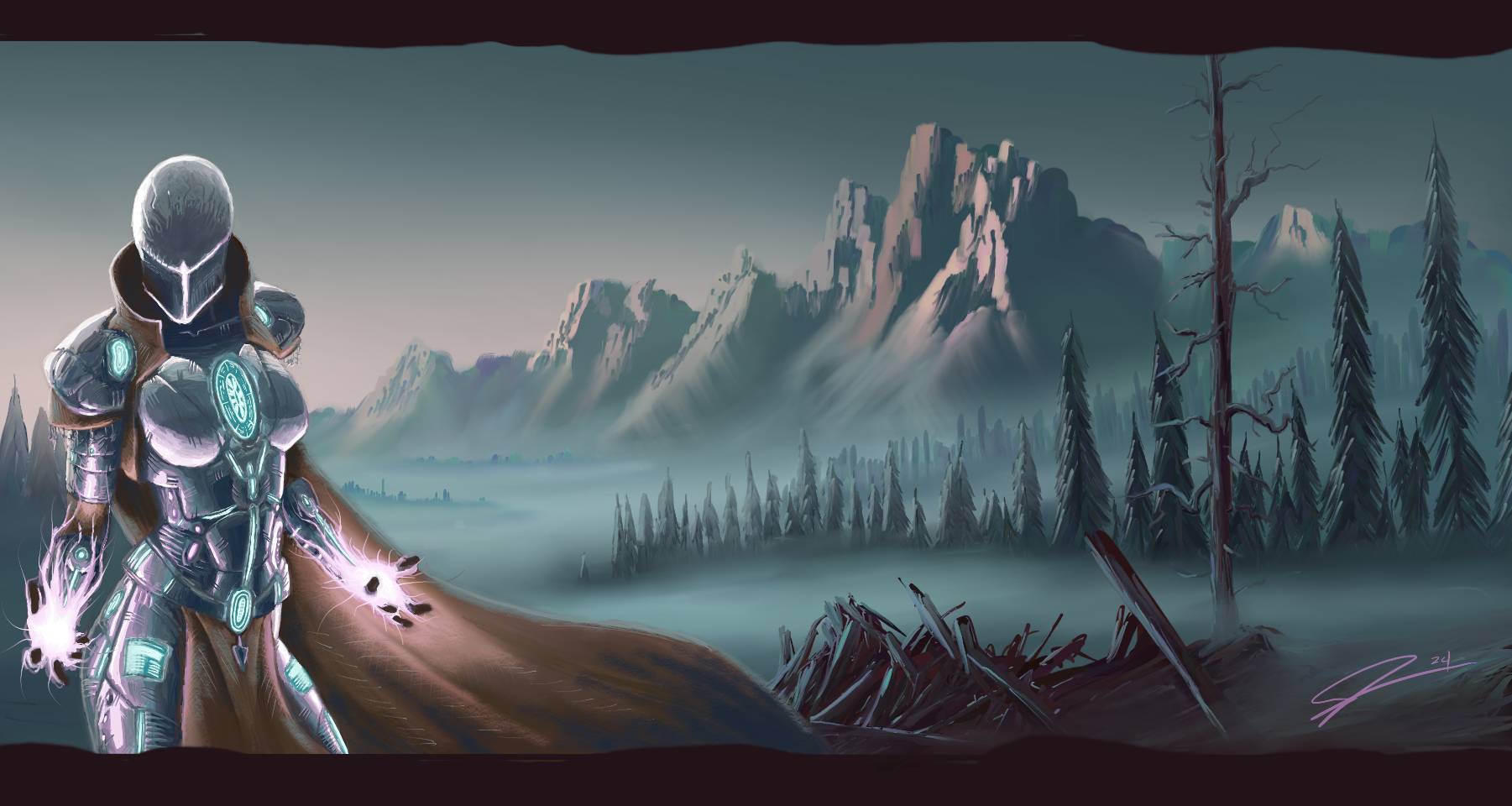
Looking great, love the way you did the lightning! Also it's awesome to see you exploring new styles and techniques! :)
As for the background... hmm. I can think of only two things and these are nitpicky because I think you did an awesome job on it: (1) I feel like the tall tree in the fore/midground is disrupting the overall composition with its verticality. Maybe if it were cut down / broken / tilted or something? (2) Maybe set a filter layer on the background and try a bit of hue shifting. Sometimes when I'm not happy with a background I try to change the hue a bit (or drastically) to see if that changes anything to the better. It's not worldchanging but a quick and easy trick that can make quite a difference.
