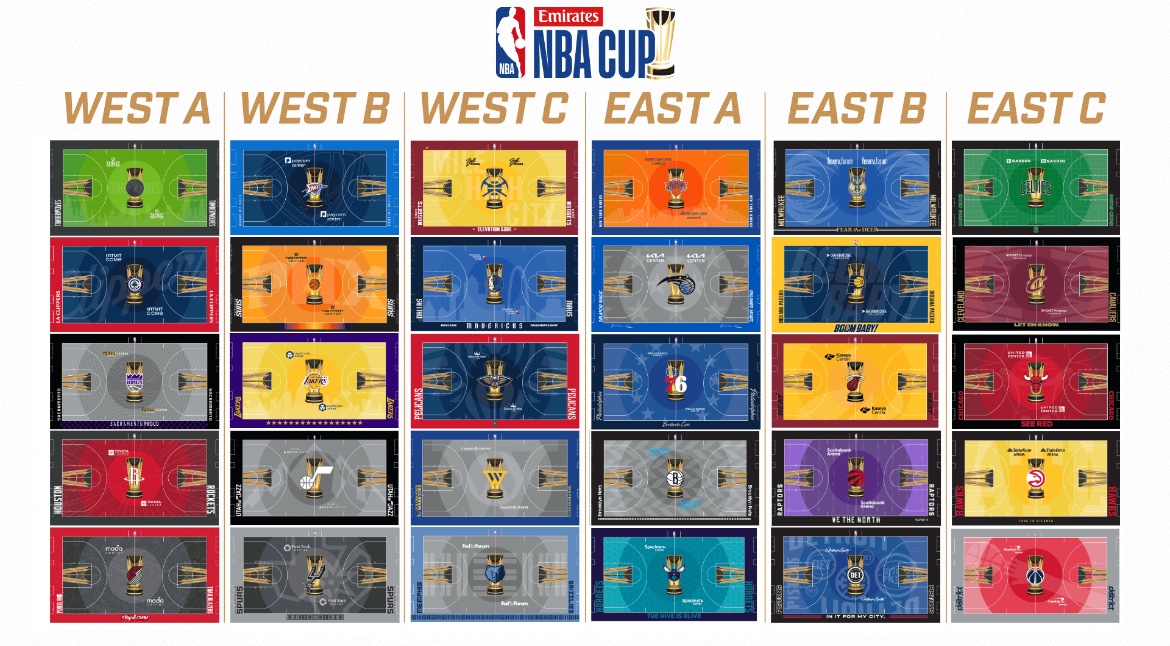
Wish the Nuggets would do the Mountain or city skyline, kinda boring court as is.
NBA
| East - Atlantic |
|---|
| Boston Celtics |
| Brooklyn Nets |
| New York Knicks |
| Philadelphia Sixers |
| Toronto Raptors |
| East - Central |
|---|
| Chicago Bulls |
| Cleveland Cavaliers |
| Detroit Pistons |
| Indiana Pacers |
| Milwaukee Bucks |
| East - Southeast |
|---|
| Atlanta Hawks |
| Charlotte Hornets |
| Miami Heat |
| Orlando Magic |
| Washington Wizards |
| West - Northwest |
|---|
| Denver Nuggets |
| Minnesota Timberwolves |
| Oklahoma City Thunder |
| Portland Trailblazers |
| Utah Jazz |
| West - Pacific |
|---|
| Golden State Warriors |
| Los Angeles Clippers |
| Los Angeles Lakers |
| Phoenix Suns |
| Sacramento Kings |
| West - Southwest |
|---|
| Dallas Mavericks |
| Houston Rockets |
| Memphis Grizzlies |
| New Orleans Pelicans |
| San Antonio Spurs |
I thought the same, such wasted potential!
Oof, still not super excited about that Emirates part of all this.
Yeah I cringed typing it but it was shorter than “In Season Tournament”.
I'd like to take this moment to congratulate the Raptors on their uniquely purple court. Raptors fans are going to have to try to find wins this season wherever we can 😅
why are gray courts so fucking popular. I get it for the spurs and nets because they probably can't do black or white for TV, but no one else should be choosing to have a gray court.
The gray looks weird, but I think I'd rather have all gray than some of the crazy bright ones
In its simplicity - yet effective - I really like Houston's. Sacramento is very good too, thanks to the shape of the crown, then Boston (always hated their pattern, now it's fixed) and Brooklyn
Some are pretty nice but the top left one (think it’s the pelicans) is terrible with that green.
Wish the bucks wouldn’t go with blue, don’t like their blue jerseys either.
That top left is TWolves. Not pretty
The Bucks blue is always weird (their yellow was even worse imo), but I think the antlers on the court look a lot better than whatever shadows and text and clipart are on the rest of them.
