this post was submitted on 05 Oct 2024
11 points (100.0% liked)

CSS

484 readers
1 users here now

founded 1 year ago
MODERATORS
 

Making a site JavaScript-less with bootstrap but the CSS is kicking my ass- I do the code directly as it is meant to be, then I try to add one thing and it breaks. I'm gripping on w3schools for dear life and I just can't seem to wrap my head around anything other than the basics. CSS is pain ESPECIALLY when I'm doing it on an external sheet. (I don't want to do internal because all the text gets overwhelming.) Anyone have some ideas to help with this?

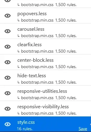
Edit: So I realized the browser tool thing is really easy for visuals + that BOOTSTRAP IS INSANELY VAST. For just about every CSS element theirs another 1.5k sub rules which is great for getting specific but not great when you are basically creating a rule for a already ruled element that you have no way of finding easily. Bootstrap is just a functionality CSS sheet I think and not the equivalent to a HTML DLC

(Image is my CSS sheet compared to the crazy amount of CSS sub sheets that exist in bootstrap. My measly little 16 rules look pathetic)

top 10 comments
sorted by: hot top controversial new old
[–] [email protected] 9 points 3 weeks ago (1 children)

If you add Bootstrap to your site, you write bootstrap-configuration for it, not normal CSS. You can't use any of the usual code people pass around.

Also, it seems you are doing it for learning, so it wouldn't apply, but a lot of the tricks for eliminating aren't really practical and are best not deployed on real things.

That said, insulating Bootstrap into a layer deeper than your code may help (look at CSS layers). And yeah, like the sibling said, writing it on the browser dev tools is much better than reloading.
[–] [email protected] 1 points 3 weeks ago (1 children)

I am doing it for learning as well as it being my personal site. It's an "indie-web" kind of project not for any sort of business thing but just to be my corner of the web.

I'll try to do it in the dev browser tools

[–] [email protected] 2 points 3 weeks ago

I reinforce the suggestion of insulating Bootstrap on a layer.

And also, don't be afraid to delete code that is demanding too much maintenance. Don't get attached to it.

Outside of that, have fun!

[–] [email protected] 7 points 3 weeks ago

My workflow for editing css mostly revolves around playing around with the live css directly in the browser until it looks the way I want it to then making those changes in the file and reloading to make sure it's correct. The immediate feedback of seeing the changes happen makes it rather pleasant

[–] [email protected] 5 points 3 weeks ago (1 children)

Bootstrap is highly opinionated imho, i.e. it's great if you want to do something that lies within its style or else you'll have a hard time. If that's your case, and of course if this is a possibility, you can consider moving to another framework - say, Tailwind.

[–] [email protected] 1 points 3 weeks ago (1 children)

I like that it has built in mobile friendliness and a way to just make text fit buy filling in and auto adding the padding needed. What is tailwind?

[–] [email protected] 0 points 3 weeks ago (1 children)
[–] [email protected] 0 points 3 weeks ago

Tailwind leads to just as much class soup as bootstrap, so avoid it all together.

Your website shouldn't need classes everywhere to work. Use something that sets proper defaults then only use classes where they're needed. Like picocss or purecss.

[–] [email protected] 4 points 3 weeks ago

Use the browsers inspector to see the computed sheet and visualize margins and padding. Also helps detect selectors that aren't quite right as you can see the selector stack.

Small and incremental changes. Test after each change.

Also using the inspector, you can adjust values to find to find the desired computed value. Useful for getting margins/padding pixel perfect.

Break it down. Widgets are ideally reactive to the parent container. Layout is done separate and should be maintained without any widgets.

Be aware of selector precedence. This is why the inspector is helpful. You may need to use something like !important to deal with precedence.

If you are doing a lot with absolutes and relatives (e.g., menus), maybe look at the z-attribute to define how layers should overlap.

[–] [email protected] 4 points 3 weeks ago

CSS was when I stopped being interested in web development.